

The Architecture of Impasto: Creating Physical Depth in Hospitality Spaces
 Impasto
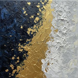
Impasto is a technique used in painting where paint is laid on an area of the surface thickly, usually thick enough that the brush or painting-knife strokes are visible. Paint can also be mixed right on the canvas. When dry, impasto provides texture;...
In the realm of high-end hospitality design, a wall is rarely just a boundary; it is a canvas for sensory engagement. When we discuss the architecture of impasto, we are moving beyond the two-dimensional limitations of traditional prints and entering a world where paint becomes sculpture. The technique of impasto—derived from the Italian word for dough or mixture—involves laying pigment so thickly that the very movement of the artist’s palette knife remains etched in the surface. For the designer, this provides a literal topography of color. Imagine a hotel lobby where the artwork does not merely hang but emerges from the wall, offering ridges and valleys that catch the ambient light. This physical presence creates a sense of permanence and luxury, transforming a flat corridor into a curated gallery experience. By utilizing heavy, impast-driven masses, as seen in the works of masters like David Moreau, designers can introduce a structural weight to a room, anchoring large, open-concept spaces with pieces that possess their own gravitational pull.
Luminous Layers: How Light Interaction Defines Abstract Compositions
 Top 25 Masterpieces by Christian Noiret: A Journey Through Abstract Texture and Light
Introduction To step into the world of Christian Noiret is to abandon the safety of recognizable forms and surrender to a profound, silent dialogue between light and matter. As one wanders through his most significant works, one does not merely obser...
Light is the silent protagonist in any successful abstract composition. In professional interior curation, the way light interacts with a surface can dictate the entire mood of a suite or lounge. When working with layered textures, light does not simply illuminate; it explores. A masterfully executed oil painting, characterized by its luminous depth, allows light to become lost within the layers of pigment before reflecting back to the viewer. This creates a dynamic visual dialogue that shifts as guests move through a space. Consider the profound impact of works like those by Christian Noiret, where the boundaries between shape and shadow dissolve. As sunlight streams through a floor-to-ceiling window or as evening dimness settles in a fine-dining room, the shadows cast by raised impasto ridges change, giving the artwork a living, breathing quality. This rhythmic interplay of light and matter ensures that the art remains a focal point of discovery, offering new perspectives at every hour of the day.
Tactile Serenity: Using Organic Textures to Anchor Large-Scale Interiors
 Monolithic Silence: An Abstract Study of Organic Form and Tactile Impasto Depth
A Vision of Tactile Serenity Monolithic Silence: An Abstract Study of Organic Form and Tactile Impasto Depth is a profound exploration of texture, weight, and meditative space. This piece emerges as a fresh, modern evolution within the AllPaintingsStore.com S...
In the pursuit of creating tranquil, biomorphic environments, texture serves as an essential tool for emotional regulation. The modern trend in luxury hotel design often leans toward organic modernity—a palette of earthy browns, beiges, and creams that evoke the monumental stillness of the natural world. By integrating artworks that feature flowing, organic shapes and tactile surfaces, designers can ground a space in primordial balance. Pieces such as Laurent Fabre’s explorations of earth tones utilize heavy color blocks to create a sense of stability and weight. These textures invite a visceral encounter; they demand that the viewer look closer, tracing the ridges of terracotta or sage green with their eyes. This tactile serenity is particularly effective in wellness retreats or high-end residential lobbies, where the goal is to provide a sanctuary from the digital noise of the outside world through the presence of something undeniably physical and real.
Chromatic Weight: Balancing Color and Form for Visual Stability
 John Hoyland
A Life Immersed in Color: The Journey of John Hoyland John Hoyland, born in Sheffield in 1934, emerged as one of Britain’s most significant abstract painters, a figure whose canvases vibrated with an audacious use of color and a profound commitment t...
The successful integration of abstract art into a commercial interior requires a sophisticated understanding of chromatic weight. It is not merely about selecting colors that match the upholstery, but about managing the tension between color and form to achieve visual equilibrium. An audacious use of color, reminiscent of the vibrant canvases of John Hoyland, can provide an energetic pulse to a corporate boardroom, yet it must be balanced against the structural density of the composition. A well-planned piece uses heavy, sculptural blocks of pigment to anchor asymmetrical structures, preventing a large wall from feeling visually overwhelming. For the procurement manager, this balance is key to ensuring that art complements rather than competes with the architectural elements. Through the careful application of color—from deep, velvety shadows to bright, prismatic highlights—the artwork becomes a stabilizing force that harmonizes the entire interior design scheme.
From Canvas to Corridor: Integrating Textured Art into Commercial Design
 Top 25 Masterpieces by David Moreau: A Journey Through Texture and Light
Introduction Step into a world where the canvas ceases to be a flat surface and transforms into a living, breathing landscape of shadow and light. To experience the top 25 works of David Moreau is to witness a masterclass in the architecture of textu...
Integrating large-scale abstract works into commercial corridors and staircases requires both logistical precision and creative vision. The modern "multi-panel" trend offers an elegant solution for expansive walls, allowing a single, cohesive composition to be split across three, four, or even five panels. This approach creates a rhythmic movement that guides the guest through the building, turning a simple transition space into a journey of discovery. Whether it is a massive mural painted on canvas rolls for a grand ballroom or a series of coordinated textured pieces for a hotel hallway, the goal is seamlessness. The brushstrokes must flow across every panel to maintain the integrity of the visual narrative. For large-scale projects, the ability to customize scale and format—from heavy, framed oil reproductions to frameless wraps that continue around the edges of the canvas—allows designers to treat art as an architectural component, as integral to the building's identity as the stone or wood used in its construction.
The Technical Edge: Ensuring Longevity and Durability in Textured Oil Works
 Texture (visual arts)
In the visual arts, texture refers to the perceived surface quality of a work of art. It is an element found in both two-dimensional and three-dimensional designs, and it is characterized by its visual and physical properties. The use of texture, in ...
For the hospitality professional, the aesthetic value of art must be matched by its durability and long-term preservation. High-traffic environments demand works that can withstand atmospheric changes and dust without losing their brilliance. This is why the chemistry of the medium is paramount. The use of flexible gesso to prevent cracking, specific oils like safflower to prevent the yellowing of whites, and a final protective coat of Damar varnish are essential technical standards. These elements ensure that the thick, sculptural ridges of an impasto painting remain intact for generations. Furthermore, professional-grade construction—such as reinforced, braced stretcher bars to prevent warping and acid-free matting to protect against moisture—is non-negotiable. When sourcing art for long-term investments, understanding these technical safeguards ensures that the visual impact of the collection remains as profound on the tenth anniversary of a hotel's opening as it was on the first.