


 Переглянути в інтер'єрі
 Надіслати
 Поділитися
 Деталі
 Посібник

 Завантажити
 Схожі предмети колекціонування
 Рентгенівське дослідження
 Слайд-шоу
 Статистика переглядів
No. 1
 Олія на полотні
- Настінне мистецтво
- Color Field Abstraction
 1961
1961- — Модерн
 259.0 x 228.0 cm
 Читати далі
Мистецький твір, представлений на цій сторінці, захищений законом про авторське право, що унеможливлює легальне створення або продаж його ідентичної репродукції. Цей захист забезпечується відповідно до міжнародних угод, таких як Бернська конвенція та національним законодавством, зокрема положеннями, що викладені в Законодавство США про авторське право — Розділ 17. Всі права захищені. Будь-яке використання без дозволу заборонено.
Цей метод повністю відповідає нормам авторського права, оскільки він не передбачає копіювання чи дублювання захищеного твору мистецтва. Натомість це творче переосмислення — створення нового малюнка під впливом оригіналу, який не є його точним відтворенням.
Гікле / Художній принт
Музейна якість друку جيкле або на полотні з оперативним виготовленням та різноманітними варіантами фінішної обробки. ( Купити картину ручної роботи Перейти до цифрових зображень)


P118B ₴10

P118H ₴10
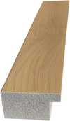
P118W ₴10

P438Z ₴10
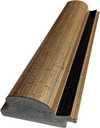
P508JH ₴12

P508YH ₴12

P805H ₴10

P805Z ₴10

P919BZ ₴10

P919G ₴10
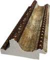
P919XJ ₴10
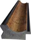
P959ZH ₴10

P968JZ ₴12

W106C ₴8

W218G ₴10

W218JH ₴8

W218Y ₴10

W307PJ ₴10

W316G ₴10

W316PJ ₴8

W316Y ₴10

W398PJ ₴8

W4111J ₴10

W500HY ₴15

W500JH ₴15

W692G ₴12

W849H ₴8
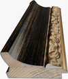
W940BG ₴15

W953PJ ₴8


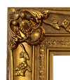
Обирайте з наших стандартних розмірів, що відповідають оригінальним пропорціям твору мистецтва.

Ви можете вказати власні розміри, щоб репродукція ідеально підійшла до конкретної рами або інтер'єру. Якщо обраний вами розмір не відповідає пропорціям оригіналу, ми або обріжемо полотно, або розширимо зображення за допомогою дзеркального відображення чи суцільної заливки країв. Перед початком виробництва вам буде надіслано цифровий макет для затвердження.
Будь ласка, зверніть увагу, що попередній перегляд на екрані не відображає фактичне обрізання або розширення. Тільки макет точно покаже фінальну композицію.
Хоча можливість замовлення індивідуальних розмірів доступна, ми рекомендуємо обирати формат із попередньо визначеного списку, щоб зберегти оригінальні пропорції.
Доставка по всьому світу () за 2 тижні замість стандартних 4/5 тижнів. (10 Жовтень)

Безкоштовна експрес-доставка по всьому світу

Високоякісне лляне полотно

Повне страхове покриття доставки

Гарантія повернення митних зборів

Гарантія точного відтворення кольорів

Політика повернення протягом 100 днів (лише у разі виявлення дефектів)

Гарантія повернення 100% коштів

Знижка на оптові замовлення
 Скляний варіант доступний лише для розмірів до 110 см

No. 1
Гікле / Художній принт
Розмір репродукції
-


Загальна вартість
₴ 2856
Зародження кольору: Історія та філософія "No. 1"
У серці абстрактного експресіонізму, у світі, де форми розчиняються в емоції, картина Марка Рота здерева “No. 1” (1961) випромінює незвичну тишу та глибину. Це не просто набір кольорів на полотні; це запрошення у світ внутрішнього спокою, заглиблення в лабіринт відчуттів. Рота, що народився в Латвії, в сім’ї, позначеній невизначеністю та втратами, навмисно створив твір, який резонує з найглибшими шарами людського досвіду – з пам'яттю про минуле, з роздумами про теперішнє і з надією на майбутнє. Його прагнення вийти за межі фігуративного зображення, щоб передати не об’єкт, а сам процес сприйняття, стало ключовим у розвитку Color Field painting – руху, який відкрив нові горизонти для абстрактного мистецтва.
Три кольори та їх симфонія: Композиція та техніка
“No. 1” – це мінімалістична симфонія, де лише три кольори – насичений червоний, глибокий фіолетовий і землисто-коричневий – долають обмеження простору. Вертикальна композиція, що нагадує монумент або архітектурний елемент, створює відчуття незвичайності та глибини. Рота майстерно поєднує плоскі форми, ніби розчиняючи їх у повітрі. Він використовував alla prima техніку – безпосереднє нанесення фарби, що дозволяє побачити кожен мазок, кожну текстуру. Товсті шари кольору, з видимими смужками та краплями, додають картині органічності та живої енергії. Зверніть увагу на нерівність нанесеного кольору – це не випадковість, а свідома демонстрація руки художника, його зв’язку з матеріалом.
Секрети фіолетового: Символізм і емоційний вплив
Фіолетовий колір у “No. 1” – це не просто один із кольорів, а ключовий елемент картини, що викликає асоціації з таємницею, глибоким задумом, і навіть з супутниковим світлом. Він створює відчуття глибини та простору, ніби занурюючи глядача у внутрішній світ художника. Інтерпретувати значення кожного кольору – завдання для глядача. Рота не намагався дати чіткі відповіді, він хотів лише створити простір для спогадів, для роздумів, для емоційного резонансу. Картина викликає відчуття меланхолії, але водночас і спокою, натякаючи на незбагненне, на щось більше, ніж просто видиме.
Ехо епохи: Контекст та спадщина
Створена у 1961 році, “No. 1” є свідченням епохи післявоєнних потрясінь і пошуків нових форм вираження. Після Другої світової війни митці прагнули звільнитися від традиційних канонів, щоб передати не лише зовнішній світ, а й внутрішні переживання. Рота, як один із провідників Color Field painting, створив новий підхід до абстракції – він зосередився на кольорі та його здатності викликати емоції. Його прагнення до мінімалізму та відмова від фігуративного зображення вплинули на ціле покоління митців. “No. 1” – це не просто картина, а символ нового напряму в мистецтві, що відкрив двері до глибшого розуміння людського досвіду.
Запитання та відповіді
Якому художнику приписують роботу "No. 1"?
Автором твору «No. 1» є Марк Ротко. Робота внесена до каталогу під іменем Марк Ротко.
Яка дата створення «No. 1» Марк Ротко?
Створення «No. 1» Марк Ротко датоване 1961 роком.
Де я можу знайти статистику про «No. 1» Марк Ротко?
Для «No. 1» існує сторінка Статистика, на якій відображено щомісячну кількість переглядів цього твору та інших робіт митця з розподілом за країнами та мовами.
Чи доступне завантаження для "No. 1"?
Цифрову копію роботи «No. 1» Марк Ротко можна завантажити на сторінці Завантажити, обравши варіант завантаження цифрового зображення високої роздільної здатності.
Кому варто подарувати "No. 1" і для якого використання?
«No. 1» рекомендується як подарунок для Річниця, з огляду на Атмосфера.
У якому віці Марк Ротко створив(ла) "No. 1"?
Коли у 1961 році було створено «No. 1», художнику Марк Ротко (народився/лася у 1903) було 58 років.
Яке місце посідає "No. 1" серед постійних тем Марк Ротко?
Повторювані теми Марк Ротко включають color field, abstract expressionism, existential angst, spiritual search, post-war anxiety, reflection, rothko’s signature style”, “emotional landscape”; «No. 1» зосереджується на color fields, rothko, abstraction, emotion, red, purple, layered.


Біографія митця
Early Life and the Seeds of Artistic Vision
Mark Rothko, born Markus Yakovlevich Rothkowitz in Dvinsk, Latvia, in 1903, carried within him from the outset a sense of displacement that would profoundly shape his artistic journey. His early years were marked by the anxieties of a Jewish family living within the Pale of Settlement, shadowed by pogroms and political unrest. This atmosphere instilled a deep sensitivity to human suffering, a theme that would resonate throughout his oeuvre. The 1913 immigration to Portland, Oregon, represented not just a geographical shift but a cultural upheaval for the young Rothko. While his father, a pharmacist and intellectual with socialist leanings, fostered a home filled with debate and learning, the loss of Jacob Rothkowitz shortly after their arrival cast a long shadow. This early experience of loss, coupled with the challenges of assimilation, fueled a lifelong exploration of existential themes – mortality, trauma, and the search for meaning in a chaotic world. Though he excelled academically at Yale University, Rothko found himself drawn more to the vibrant energy of New York City, abandoning formal studies to pursue his passion for art at the Art Students League. These formative years laid the groundwork for an artistic vision that would ultimately challenge conventional notions of painting and redefine the emotional power of color.From Figurative Beginnings to Abstract Expressionism
Rothko’s initial artistic explorations were firmly rooted in realism, depicting urban scenes and portraits with a keen eye for detail. However, these early works already hinted at the psychological depth that would become his hallmark. As the 1940s unfolded, and the world grappled with the horrors of World War II, Rothko’s art underwent a dramatic transformation. Influenced by Surrealism and mythology, he began to move away from representational imagery, seeking instead to express universal human emotions through symbolic forms. This period saw the emergence of multi-form paintings – canvases populated by ambiguous, biomorphic shapes that seemed to hover between figuration and abstraction. These works were not merely experiments in form; they were deeply felt responses to the anxieties and uncertainties of a world at war. By the late 1940s, Rothko had arrived at his signature style: large-scale canvases featuring rectangular blocks of color that appeared to float and resonate with one another. He stripped away all vestiges of recognizable imagery, focusing instead on the pure emotional impact of color and form. This marked a pivotal moment in the development of Abstract Expressionism, and established Rothko as a leading figure in this groundbreaking movement.The Color Field and the Pursuit of Transcendence
Rothko’s mature work is defined by what came to be known as “Color Field” painting – vast expanses of luminous color that envelop the viewer in an immersive experience. These paintings are not about *what* they depict, but rather *how* they make you feel. Rothko believed that art should engage the viewer viscerally, bypassing intellectual analysis and speaking directly to the emotions. He meticulously layered thin washes of paint, creating subtle variations in tone and texture that seemed to emanate from within the canvas. The edges of his rectangular forms are often blurred, allowing them to blend and interact with one another, creating a sense of depth and movement. Rothko deliberately avoided titles beyond numbers – “No. 1,” “No. 6” – encouraging viewers to confront the paintings without preconceived notions and allow their own emotional responses to guide their experience. He sought to create a space for contemplation, a sanctuary where viewers could connect with something larger than themselves. His ambition was nothing less than to evoke profound spiritual experiences through the language of color.Major Achievements and Lasting Legacy
Among Rothko’s most significant achievements are “No. 10 (1950),” a pivotal work that exemplifies his evolving style, and the Seagram Murals (1958). Commissioned for the Four Seasons Restaurant in New York City, these murals were ultimately rejected by Rothko, who felt they would be compromised by their intended environment. He instead donated them to the Tate Gallery in London, where they continue to inspire awe and contemplation. Perhaps his most ambitious project was the Rothko Chapel (1971) in Houston, Texas – a non-denominational sanctuary housing fourteen of his paintings. Designed as a space for quiet reflection, the chapel is considered a sacred place by many, embodying Rothko’s belief in the spiritual power of art. Rothko's influence on subsequent generations of artists has been immense. He paved the way for Minimalist art and continues to inspire contemporary painters who explore the emotional possibilities of abstraction. Despite struggling with depression throughout his life, culminating in his tragic suicide in 1970, Mark Rothko remains one of the most important and influential artists of the 20th century – a master of color whose work continues to resonate with audiences around the world.- Rothko’s paintings are celebrated for their ability to convey universal human emotions—tragedy, ecstasy, despair, and hope.
- His exploration of color as a vehicle for emotional expression revolutionized abstract painting.
- The Rothko Chapel stands as a testament to his belief in the spiritual power of art.
- He remains a pivotal figure in Abstract Expressionism and a major influence on contemporary artists.
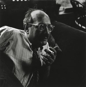
Марк Ротко
1903 - 1970 , Латвія
Довідкова інформація
- Artistic Movement Or Style: Поле кольору
- Artists Or Movements Influenced By This Artist: ['Мінімалізм']
- Date Of Birth: 25 вересня 1903 р.
- Date Of Death: 25 лютого 1970 р.
- Full Name: Маркус Якововвич Ротако́вський
- Nationality: Американський
- Notable Artworks:
- №10 (1950)
- Мюрали Се́грамм
- Хаппель Ро́тка
- Place Of Birth: Девґавпільс, Латвія
Схожі статті

Beyond the Brushstroke: A Definitive Guide to the Emotional Power of Color Field Painting
Explore the profound history and emotional depth of Color Field painting. From Mark Rothko to Barnett Newman, discover how pure color redefined modern art through our expert-led guide for students and collectors alike.

The Sublimity of Color: Exploring the Emotional Landscapes of Mark Rothko's Abstract Expressionism
Explore the profound emotional depth of Mark Rothko's abstract expressionism. Discover the history, techniques & lasting impact of this pivotal Color Field painter. Expert insights for collectors and art enthusiasts.

25 шедеврів Марка Ротко: глибокі емоції та колірні симфонії для вашого дому | AllPaintingsStore
Відкрийте 25 найвідоміших шедеврів Марка Ротко! Пориньте у світ емоційного абстрактного експресіонізму, колірних симфоній та глибокого психологічного живопису. Купуйте репродукції картин Ротко преміум-якості для вашого дому на AllPaintingsStore.com.

Color Field Painting: The Emotional Power of Pure Abstraction and Chromatic Depth
Explore the profound emotional depth of Color Field painting. Discover the history of mid-century abstraction, from Rothko to Newman, and learn how pure color transforms the viewer's experience through our expert art history guide.

Топ-10 шедеврів абстрактного експресіонізму: мистецтво, яке змінила епоху | AllPaintingsStore.com
Відкрийте для себе 10 шедеврів абстрактного експресіонізму! Дізнайтесь історію Поллока, Ротко та інших геніїв. Репродукції картин преміум-якості для вашого дому від AllPaintingsStore.com. Дослідіть колекцію онлайн!


