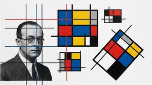
1925. Acrylic On Canvas.

§ 1بيانات الكتالوج


§ 2تجريدي
وصف القطعة المقتناة
Experience Theo van Doesburg's 'Counter Composition XV,' a pivotal De Stijl masterpiece. Bold geometric forms, primary colors, and dynamic asymmetry create a harmonious abstraction – explore its revolutionary impact on art & design.
 عرض المزيد
السيرة الذاتية للفنان
استكشف الفن الثوري لـ ثيو فان دوسبرغ (1883-1931)، مؤسس حركة دي ستايل و النيوبلاستيسيزم. اكتشف تجريداته الهندسية، وتأثير باوهاوس، وأثره الدائم على الفن الحديث والعمارة والتصميم.
§ 3تعليق
The Geometry of Harmony: Unveiling Theo van Doesburg’s Counter Composition XV
Theo van Doesburg's "Counter Composition XV," painted in 1925, isn’t merely a painting; it’s a distilled essence of the De Stijl movement – a radical declaration of order and universal harmony. This deceptively simple work, executed against a stark white canvas, pulsates with an underlying tension born from the careful orchestration of geometric forms and primary colors. It represents a pivotal moment in 20th-century art, moving beyond representational imagery to explore the very foundations of visual language itself. The piece immediately commands attention not through elaborate detail or narrative, but through its profound sense of balance and its unwavering commitment to abstraction.
At first glance, the composition appears austere – a red rectangle dominating the upper left quadrant, juxtaposed with a blue counterpart in the lower right. However, this initial impression quickly gives way to an appreciation for the intricate grid that underpins the entire work. A network of black and white squares, meticulously arranged, creates a dynamic interplay of movement and stillness, suggesting both order and potential disruption. This isn’t haphazard placement; it's a deliberate choreography designed to evoke a feeling of controlled dynamism – a visual embodiment of De Stijl’s core philosophy.
Deconstructing the Language of Abstraction
The brilliance of "Counter Composition XV" lies in its reduction. Van Doesburg stripped away all extraneous elements, leaving only the fundamental building blocks of form and color: red, yellow, blue, black, and white. This limited palette wasn’t chosen arbitrarily; each hue was selected for its inherent purity and intensity, intended to be experienced without distraction. The application is equally crucial – flat, unmodulated areas devoid of shading or blending. This technique emphasizes the geometric shapes themselves, highlighting their sharp edges and creating a sense of crystalline clarity. It's a testament to the artist’s belief that beauty could be found in simplicity and precision.
The absence of perspective is equally significant. Van Doesburg deliberately rejects traditional spatial representation, opting instead for a two-dimensional plane where shapes are presented as independent entities. Overlapping elements and variations in size subtly suggest depth, but the overall effect is one of flattened planes interacting within a carefully constructed framework. This approach reflects De Stijl’s rejection of illusionism and its embrace of a purely conceptual understanding of space.
Symbolism and the Pursuit of Universal Harmony
Beyond its formal qualities, "Counter Composition XV" carries profound symbolic weight. The geometric forms – rectangles, squares, lines – are not merely decorative; they represent fundamental principles of order, balance, and harmony. The primary colors, stripped of their associations with natural phenomena, become pure expressions of energy and vibration. Van Doesburg believed that through the rigorous application of these abstract elements, artists could create a visual language capable of transcending individual expression and communicating universal truths. The piece is an attempt to build a new aesthetic based on mathematical ratios and geometric relationships – a blueprint for a harmonious world reflected in art.
Theo van Doesburg’s “Counter Composition XV” stands as a powerful testament to the transformative potential of abstraction. It's more than just a painting; it’s an invitation to contemplate the underlying order of the universe and the possibility of creating beauty through pure geometric form. Its stark simplicity, combined with its profound symbolic depth, continues to resonate with viewers today, cementing its place as a cornerstone of modern art.
الأسئلة والأجوبة
ما هو الحجم الموصى به لطباعة "Counter composition XV"؟
يُقترح طباعة نسخة بحجم Large لعمل "Counter composition XV" للفنان ثيو فان دوسبرغ، مع إمكانية تعديل الحجم مع الحفاظ على التناسب.
هل يمكنني معاينة "Counter composition XV" للفنان ثيو فان دوسبرغ على جداري الخاص قبل الشراء؟
تستخدم صفحة معاينة بتقنية الواقع المعزز لعمل "Counter composition XV" للفنان ثيو فان دوسبرغ تقنية الواقع المعزز لعرض العمل الفني في مساحتك الخاصة عبر جهاز متوافق.
ما مدى تناغم ألوان "Counter composition XV" للفنان ثيو فان دوسبرغ؟
تتجلى في ألوان "Counter composition XV" للفنان ثيو فان دوسبرغ تناغماً Discordant Palette؛ حيث يصف هذا التناغم كيفية ترابط الألوان وتفاعلها مع بعضها البعض.


 التبديل إلى نسخة مطبوعة


 بالنسبة للأعمال الفنية أو النسخ المطبوعة التي يتجاوز طول أي من أضلاعها 105 سم (حوالي 41 بوصة)، سيتم شحن الإطار كمجموعة مفككة؛ حيث تضمن هذه الطريقة سلامة التوصيل وتمنع حدوث أي أضرار أثناء النقل.