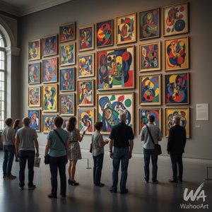
1949. Acrylic On Canvas, 229.0 x 112.0 cm.

§ 1Catalogue data
 Acrylic On Canvas
- WallArt
- Color Field Painting
 1949
1949 229.0 x 112.0 cm
Това произведение е защитено от авторско право
Изкуството, представено на тази страница, е защитено от законите за авторско право, което означава, че не можем законно да създаваме или продаваме идентични репродукции. Тази защита се прилага съгласно международни споразумения като Бернска конвенция и от националното законодателство, включително разпоредбите на Закон за авторското право на САЩ – Раздел 17.
Като уважителна и законна алтернатива, ние предлагаме изработени по поръчка, ръчно рисувани произведения на изкуството, вдъхновени от оригинала. Нашите умени и професионални артисти внимателно изучават стила, настроението и артистичната същност на оригиналното произведение, за да създадат ново, уникално творческо произведение, което предизвиква същото чувство – оставайки в същото време самостоятелно оригинално творение.
Този метод е напълно съвместим с законите за авторско право, тъй като не включва копиране или дублиране на защитеното произведение. Вместо това става въпрос за творческа реинтерпретация – нова картина, която е вдъхновена от оригинала, но не е идентична с него.
 Прочетете повече
§ 2Abstract
Описание на колекционерския предмет
Experience Mark Rothko's 'Untitled' (1949) – a vibrant color field painting showcasing red, green, yellow, and brown hues. Explore its emotional depth and minimalist design in this iconic work by the American abstract expressionist.
Биография на художника
Открийте иконичните цветни полета на Марк Рошко и абстрактния експресионизъм – революционен художник, който преобразява изкуството с дълбоки емоционални послания и трайно влияние.
§ 3Commentary
The Genesis of a Field: Mark Rothko's 1949 Untitled
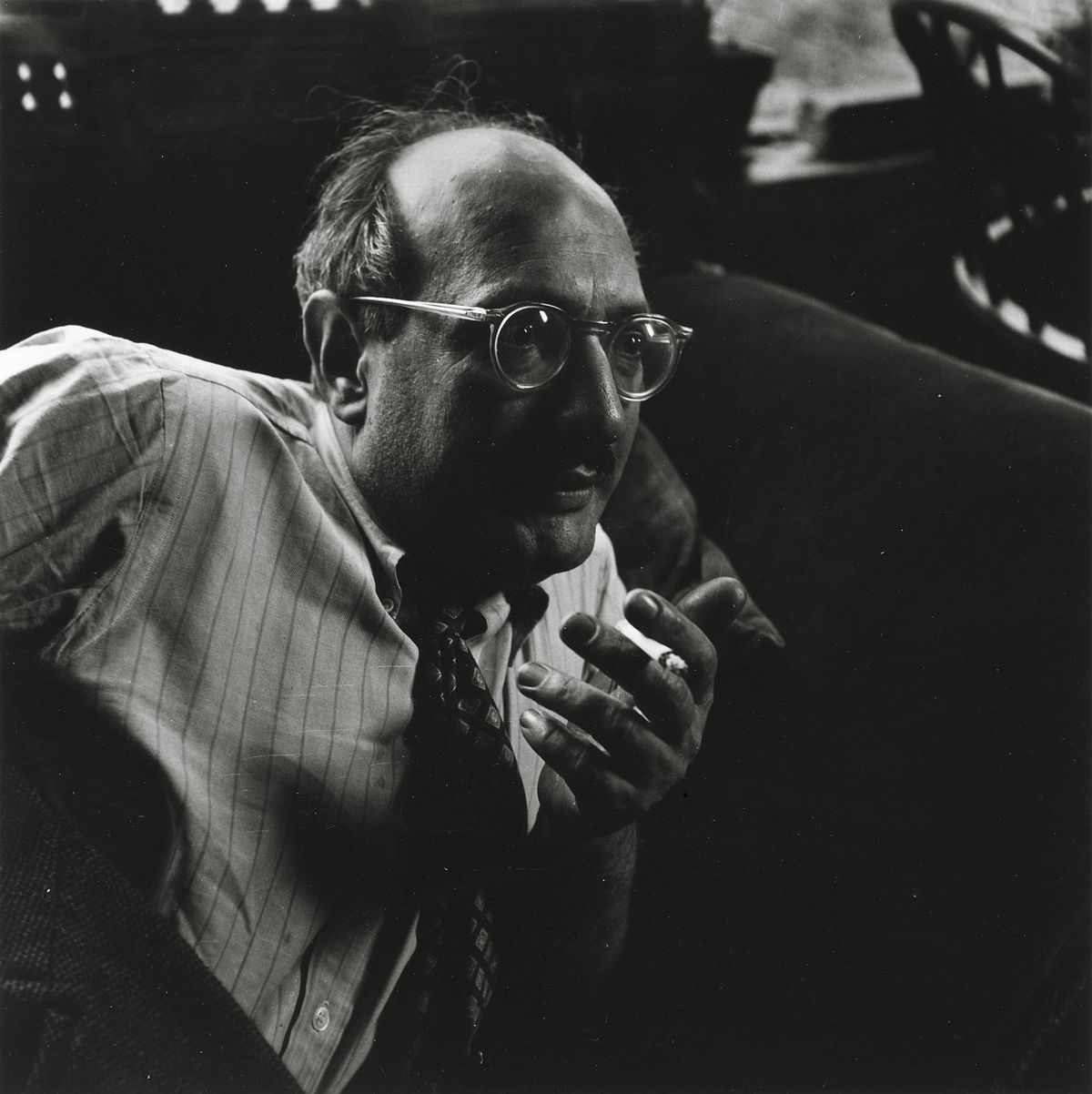
This captivating reproduction offers an intimate glimpse into one of the most significant works from Mark Rothko’s mature period, painted in 1949. At first glance, it appears deceptively simple – four distinct blocks of color: a vibrant red, a deep green, a sunny yellow, and a grounding brown – arranged across the canvas with an almost meditative precision. However, to reduce this piece to mere hues is to profoundly misunderstand Rothko’s revolutionary approach to abstraction. Born in Dvinsk (now Daugavpils), Latvia, in 1903, Mark Rothko's early life was shaped by displacement and a deep-seated sensitivity to human suffering – experiences that would become recurring themes in his art. His emigration to the United States in 1913, following the death of his father, marked a pivotal shift, yet the anxieties of assimilation and the lingering shadow of loss continued to inform his artistic vision. This particular painting, created during a period of intense experimentation with color and form, embodies Rothko’s core philosophy: to evoke profound emotional responses through the pure essence of color itself.
Color as Feeling: A Deeper Dive into Technique
Rothko’s technique is deceptively straightforward, yet incredibly complex in its execution. He applied the paint in thin layers, often building up multiple coats to achieve a luminous, almost velvety surface. Crucially, he avoided sharp edges or defined forms, opting instead for gradual transitions and blurred boundaries between the colors. This deliberate lack of definition isn’t an absence of detail; rather, it creates an immersive experience for the viewer – inviting them to lose themselves within the fields of color and allow their own emotions to resonate with the artwork. The pigments themselves were carefully chosen not just for their visual impact but also for their ability to interact optically, creating subtle shifts in hue and intensity as the light changes. Notice how the red seems to vibrate against the green, or how the yellow subtly bleeds into the brown – these are not merely aesthetic choices; they’re deliberate attempts to manipulate perception and evoke a specific emotional state.
The Language of Abstraction: Symbolism and Context
While Rothko vehemently resisted any attempt to interpret his paintings as representing concrete objects or narratives, there's no denying the profound symbolism embedded within these color fields. The choice of colors themselves is laden with meaning. Red often represents passion, energy, and even violence; green evokes nature, growth, and renewal; yellow symbolizes joy, optimism, and spirituality; and brown grounds the composition, suggesting stability and connection to the earth. The arrangement of these colors – the deliberate lack of hierarchy or focal point – suggests a state of equilibrium, a striving for harmony amidst existential uncertainty. This painting aligns with Rothko’s broader exploration of themes such as mortality, trauma, and the search for meaning—a quest that resonated deeply within his personal life and artistic practice. It's important to note that Rothko was part of the American Abstract Expressionist movement, a period marked by a shift away from representational art towards non-objective forms and an emphasis on subjective experience.
A Legacy in Light: The Rothko Chapel and Beyond
The influence of Mark Rothko extends far beyond this single painting. His work profoundly impacted the development of color field painting, inspiring generations of artists to explore the expressive potential of pure color. His later years were spent refining his style, culminating in monumental works like those installed at the Rothko Chapel in Houston, Texas – a space designed specifically to showcase and enhance the emotional impact of his paintings. The chapel’s octagonal shape and darkened interior create an environment that mirrors the contemplative atmosphere of Rothko's art, allowing viewers to fully immerse themselves in the experience. Reproductions like this offer a tangible connection to this extraordinary artist and his enduring legacy—a testament to the power of color to evoke profound emotion and transcend the boundaries of language.
Въпроси и отговори
Как се препоръчва да бъде отпечатана творбата "Untitled" – какъв размер и каква ориентация?
За „Untitled“ препоръчителният формат за печат е размер Medium и ориентация Tall.
Присъства ли в „Untitled“ типичното за творчеството на Марк Ротко?
"Untitled" изобразява color palette, rothko, abstraction, geometry, red green yellow, emotional, 1949, latvia, докато утвърдените теми на Марк Ротко са jewish displacement, existentialism, color theory, trauma, abstract expressionism. Сравнението между двете показва как произведението се свързва с обичайните сюжети на художника.
Какъв е основният нюанс, който прелива през „Untitled“ на Марк Ротко?
Доминиращият нюанс на „Untitled“ на Марк Ротко е Golden Yellow Range. Този нюанс е основният тон на палитрата.


 Превключване към принт


 За произведения на изкуството или репродукции, чийто размер е над 105 см (приблизително 41 инча) във всяка страна, рамката ще бъде изпратена в разглобен вид като комплект за сглобяване. Този метод гарантира безопасна доставка и предотвратява повреди по време на транспортиране.