




The Biological Basis of Visual Impact
The human eye does not process light in absolute values, but rather through the detection of relative differences. This biological reality means that the impact of an artwork is dictated by the luminance gap between an object and its background. When designing hospitality environments, understanding this mechanism is essential for controlling guest perception. High-contrast environments trigger an instinctive engagement because the retina is specifically tuned to detect these sharp transitions. A sudden shift from deep shadow to bright highlight creates a visual friction that demands immediate recognition, ensuring the artwork is not overlooked in a busy lobby or a large dining hall.
This physiological response finds its historical roots in the development of early drawing techniques. During the Renaissance, artists began working from a base tone on colored paper, using white gouache to build up light and dark ink to define form. This method of building light from a dark ground established the fundamental principle that visibility is a product of contrast rather than mere illumination.
By utilizing high-contrast compositions, designers can leverage this biological predisposition to ensure that specific focal points remain stable and legible, even when the ambient lighting of a commercial space fluctuates.
Chiaroscuro and the Perception of Spatial Volume
 Raphael
. Italian High Renaissance master of harmonious Madonnas and monumental Vatican frescoes, known for clarity of form and graceful composition.
Chiaroscuro functions as a technical tool for achieving a sense of three-dimensional volume on a two-dimensional surface. By employing graduated transitions between light and dark, an artist can model the contours of a figure or an object, giving it a physical presence that appears to occupy real space. In large-scale hospitality settings, where walls can often feel flat or imposing, the use of chiaroscuro in art helps to break the plane, adding a perceived depth that makes a room feel more layered and architecturally complex.
The Raphael painting style demonstrates this principle through delicate modeling, where light hitting a subject from a specific angle creates a soft transition into shadow, providing the body of the model with a tangible, rounded quality. This technique prevents the artwork from appearing as a mere flat image, instead presenting it as a volumetric entity.
For procurement managers, selecting works that utilize these modeling techniques is a strategic way to add perceived architectural depth to a space without requiring structural changes.
Tenebrism: Directing the Eye through Extreme Shadow
When the use of shadow is pushed to its extreme, it becomes tenebrism. This is not merely a stylistic choice but a method of visual hierarchy. Tenebrism uses intense, uncompromising shadows to isolate the subject, effectively stripping away the surrounding environment to focus the viewer's attention entirely on a single point of light. In a high-traffic hotel corridor or a dimly lit lounge, tenebristic works act as visual anchors, pulling the gaze toward the subject and creating a sense of drama and focus.
This technique reached its peak in the works of Caravaggio, whose use of extreme light and dark created a sense of intense psychological presence. The shadow does not just exist as the absence of light; it becomes an active compositional element that dictates exactly where the viewer is permitted to look.
Implementing tenebristic-style art allows designers to manage the "visual noise" of a room, using darkness to hide clutter and light to highlight the intended aesthetic experience.
Chromatic Contrast and Atmospheric Modulation
Beyond the interplay of light and dark, contrast is also a matter of color. The difference in hue and saturation can modulate the atmosphere of a room just as effectively as lighting. High-contrast color palettes—such as the clashing of complementary colors—create an energetic, high-frequency visual pulse. This can be used to energize a breakfast area or a bar, whereas more subtle, low-contrast color shifts can be used to calm a spa or a private suite.
The history of color theory shows that artists have long used these shifts to create mood. While some artists used gentle transitions to create a sense of harmony, others utilized heavy, saturated contrasts to evoke romantic or intense emotional responses.
For large-scale projects, selecting a series of works with consistent chromatic contrast ensures that the color temperature remains controlled across multiple rooms, maintaining a cohesive brand identity throughout the property.
Managing Visual Weight in Large-Scale Installations
In the context of large-scale hospitality design, the concept of visual weight becomes a logistical consideration. High-contrast art carries significant visual weight; it is "heavy" and commands attention. When installing art in a wide hallway or a grand staircase, the placement of high-contrast pieces must be balanced against the surrounding architecture to avoid overwhelming the space.
The "multi-panel" trend, which involves splitting a single image across three, four, or five panels, is an effective way to manage this weight. This layout allows a high-contrast composition to flow seamlessly across a large wall, breaking up the visual impact into manageable, rhythmic segments that guide the guest through the space.
This approach provides a modern, architectural look that is particularly suited for contemporary hotels, allowing for a grand scale without the visual density of a single, massive canvas.
Materiality and Durability in High-Contrast Reproductions
The effectiveness of high-contrast art is heavily dependent on the quality of the medium. To achieve the deep blacks and bright highlights required for true chiaroscuro, the material must have a significant tonal range. Digital prints often struggle with this, frequently resulting in a "brush stroke effect" that lacks the necessary depth. For professional environments, the choice between a Giclée print and a hand-painted oil reproduction is a matter of both aesthetic impact and long-term durability.
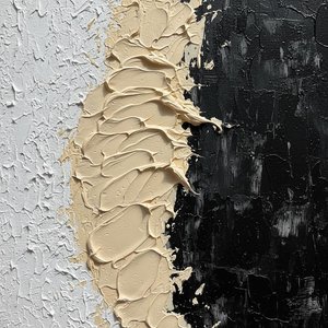
Hand-painted oils on 100% cotton canvas provide a physical texture—impasto—that catches actual light, enhancing the chiaroscuro effect through real-world shadows on the paint surface. Furthermore, the use of specific oils, such as safflower for whites to prevent yellowing, and a final coat of Damar varnish, ensures that the high-contrast elements remain stable and do not degrade under the lighting conditions of a commercial space.
For procurement professionals, investing in hand-painted reproductions ensures that the visual tension intended by the artist is preserved for decades, maintaining the guest's first impression through the life of the property.


