


 Eelvaade
 Saada
Saada Jaga
Jaga
 Teave teose kohta
 Juhend

 Laadi alla
 Sarnased teosed
 Röntgenuuring
 Slaidietendus
 Statistika
Red and Orange


 Loe lähemalt
Sellel lehel kuvatav kunstiteos on kaitstud autoriõigusega, mis tähendab, et meil ei ole seaduslikku õigust luua või müüa identset reproduktsiooni. Seda kaitset rakendatakse rahvusvaheliste kokkulepete alusel, nagu näiteks Berne konventsioon ning riiklike seadustega, sealhulgas nendega, mida on sätestatud USA autoriõiguse seadus – 17. peatükk.
Austasena ja seaduslikuna alternatiivina pakume originaalist inspireeritud, käsitsi maalitud isikupärastatud teoseid. Meie osutavad ja professionalsed kunstnikud uurivad hoolikalt originaali stiili, meelemoi ja kunstilist olemust, et luua uus, ainulaadne teos, mis tekitab sama tunnet – olles samal ajal omaette originaalne looming.
See meetod järgib täielikult autoriõiguse reegleid, kuna see ei põhine kaitstud kunstiteose kopeerimisel või dupliteerimisel. Selle asemel on tegu loova reinterpreetatsiooniga – uue maaldisega, mis on algteosest inspireeritud, kuid ei ole sellest identiline.
Käsitsi valmistatud õlimaalireproduktsioon
Meie kunstnike poolt tellimusel valmistatud käsitsi maalitud õli-kainaste teos teie soovitud suuruses ja raamis. ( Lülita trükkitoodetele Lülita digitaalse pildi juurde)

P118B €10

P118H €10

P118W €10

P438Z €10
P508JH €12

P508YH €12

P805H €10

P805Z €10
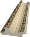
P919BZ €10
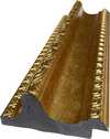
P919G €10
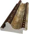
P919XJ €10
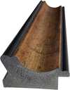
P959ZH €10
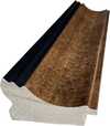
P968JZ €12

W106C €8

W218G €10

W218JH €8

W218Y €10
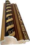
W307PJ €10

W316G €10
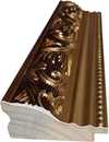
W316PJ €8

W316Y €10

W398PJ €8

W4111J €10

W500HY €15

W500JH €15

W692G €12

W849H €8
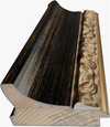
W940BG €15

W953PJ €8

Vali meie eelmääratud suurused, mis vastavad teose algupärastele proportsioonidele.

Sisestage vajalik laius ja kõrgus, et teos sobiks teie raamile või seinale. Kuna tegu on käsipainatud teosega, siis erineva kujuga suuruse korral võib kunstnik jätta pildi ümber veidi rohkem marginaali või lõigata osa ära — valik on teie. Enne maali alustamist saadame teile kinnitamiseks digitaalse näidisprojektsiooni. Sellel lehel näidatud pilt ei kajasta tegelikku tulemust — seda näitab ainult näidisprojektsioon.
Pärast tellimust saadab AllPaintingsStore.com meeskond kliendile e-posti juhised ning esitab eelvaate kavandi
Maailmline tarne 3–4 nädala jooksul tavalise 5 nädala asemel. (28 oktoober). Kvaliteedis kompromisse ei tehta.

Tasuta ekspresssaatmine üle maailma

Kõrgekvaliteediline lina-kangas

Täielik transpordikindlustus

Tollimaksude tagastamise garantii

Värvitoime täpsuse garantii

100 päeva tagastusõigus (ainult valmistusdefektide korral)

100% raha tagasi garantii

Hulgusoodustus
 Klaasivalik on saadaval ainult kuni 110 cm suuruses teostes

Red and Orange
Reproduktsiooni tehnika
Reproduktsiooni suurus
-


Koguhind
€ 227
Red and Orange: A Journey Through Rothko’s Emotional Landscape
Mark Rothko, one of the towering figures of 20th-century art, didn't simply paint pictures; he crafted portals into the depths of human emotion. His work, particularly pieces like ‘Red and Orange,’ invites a profound engagement, demanding that we surrender to its quiet intensity rather than seeking immediate visual gratification. This painting, a cornerstone of his mature style, exemplifies Rothko’s revolutionary approach to color field abstraction – a deliberate move away from representational imagery towards pure feeling expressed through the luminous interaction of hues. It's a piece designed not to be ‘looked at,’ but *felt*. The genesis of ‘Red and Orange’ lies within the vibrant, yet turbulent, context of Abstract Expressionism, a movement that emerged in post-war America as artists sought new ways to grapple with the anxieties and uncertainties of the time. Rothko, however, forged his own distinct path within this broad movement. He wasn't interested in grand gestures or dramatic narratives; instead, he focused on distilling emotion into its most elemental form – color itself. His technique involved applying layers upon layers of oil paint, often mixed with turpentine to achieve a remarkable luminosity and subtle textural variations. The canvas isn’t merely a surface for pigment; it becomes an active participant in the creation of atmosphere, absorbing and reflecting light in ways that subtly shift the painting's mood throughout the day. Notice the delicate blending at the heart of the composition – a deliberate ambiguity that encourages contemplation rather than definitive interpretation. The painting’s structure is deceptively simple: two dominant rectangles of color—a rich, pulsating red on the left and an equally vibrant orange on the right—are juxtaposed within a larger field of muted tones. However, this apparent simplicity belies a complex interplay of visual and emotional forces. Rothko wasn't simply placing colors side-by-side; he was creating a dynamic tension between them, suggesting both harmony and discord. The red, often associated with passion, energy, and even danger, dominates the left portion of the canvas, while the orange—linked to warmth, optimism, and vitality—takes precedence on the right. This division isn’t rigid or absolute; rather, it creates a sense of movement and flow as the eye travels across the surface, drawn into the merging point where the two colors meet. The subtle gradations within each rectangle, achieved through meticulous layering and blending, add depth and complexity to the composition, preventing it from feeling flat or static. Rothko’s intention wasn't to depict a specific scene or object but to evoke universal human emotions – tragedy, ecstasy, doom—as he famously articulated in his writings. In ‘Red and Orange,’ the bold hues can be interpreted as symbols of these fundamental experiences. The intensity of the red might represent moments of profound sorrow or struggle, while the warmth of the orange suggests hope, joy, or a sense of transcendence. It’s important to recognize that Rothko deliberately avoided providing viewers with easy answers; he wanted them to project their own feelings and associations onto the canvas, creating a deeply personal experience. The painting becomes a mirror reflecting our own inner landscape. The legacy of ‘Red and Orange,’ and indeed of Mark Rothko's entire body of work, is undeniable. His color field paintings have profoundly influenced generations of artists, from abstract expressionists to contemporary painters exploring the expressive potential of color. Reproductions of this piece offer a remarkable opportunity to bring Rothko’s emotional intensity into any space, transforming interiors into contemplative sanctuaries. Consider how the rich hues interact with your existing décor – will they enhance the sense of warmth and tranquility, or add a touch of dramatic tension? The choice is yours, but one thing is certain: ‘Red and Orange’ remains a powerful testament to the transformative power of art.The Artistic Movement: Abstract Expressionism and Rothko's Place Within It
Rothko’s work stands as a pivotal contribution to Abstract Expressionism, a movement that fundamentally shifted the focus of American art away from representational imagery towards subjective experience and emotional expression. Emerging in the aftermath of World War II, Abstract Expressionism was characterized by its emphasis on spontaneity, gesture, and the artist's inner world. Artists like Jackson Pollock, Willem de Kooning, and Barnett Newman sought to capture the raw energy and anxieties of the post-war era through large-scale canvases and unconventional techniques. However, Rothko distinguished himself from his contemporaries with his deliberate restraint and focus on color as a primary means of communication. Unlike the gestural brushstrokes favored by Pollock or the fragmented figures of de Kooning, Rothko’s paintings are defined by their smooth, almost meditative surfaces. He rejected the notion of the artist's hand as a visible element in the work, striving instead to create an illusion of seamlessness and luminosity. This pursuit of pure color was deeply influenced by his interest in spirituality and Eastern philosophy, which he believed could provide access to profound emotional states. Rothko’s paintings aren’t about depicting something; they *are* the feeling itself – a distillation of experience rendered in pigment and light. The influence of earlier artistic traditions is also evident in Rothko's work. He drew inspiration from Byzantine icons, which are characterized by their flattened forms, luminous colors, and symbolic content. Similarly, he was fascinated by the color theories of Goethe, who proposed that colors could be understood as having specific psychological effects. Rothko’s use of complementary colors – red and orange in ‘Red and Orange,’ for example – is a deliberate attempt to create visual tension and evoke particular emotional responses. He wasn't simply arranging colors on a canvas; he was conducting an experiment in color psychology, seeking to harness the power of hue to communicate profound human experiences.The Painting: 'Red and Orange' - A Detailed Examination
‘Red and Orange’ is a prime example of Rothko’s distinctive technique and his unwavering commitment to expressing emotion through color. The painting measures approximately 39 ½ x 31 ¾ inches (100.5 x 80.6 cm), a size that allows the colors to dominate the viewer's field of vision, creating an immersive experience. As mentioned previously, the composition is built around two rectangular fields of color: a deep, saturated red on the left and a vibrant orange on the right. These rectangles are not sharply defined; rather, they bleed into one another at their edges, creating a sense of fluidity and ambiguity. The layering technique employed by Rothko is crucial to understanding the painting’s luminosity. He applied multiple thin layers of oil paint, often mixed with turpentine to achieve a translucent effect. This process allowed light to penetrate through the pigments, creating an almost ethereal glow. The texture of the canvas itself plays a significant role in this effect – it's subtly uneven and slightly rough, adding depth and complexity to the surface. Notice how the red seems to vibrate and pulsate within its rectangular frame, while the orange radiates warmth and vitality. The subtle variations in color intensity are also noteworthy. Rothko didn’t simply apply a uniform shade of red or orange; he carefully modulated the hues throughout each rectangle, creating areas of lighter and darker tones. This technique adds depth and dimension to the composition, preventing it from feeling flat or static. The blending at the point where the two colors meet is particularly intriguing – it creates a sense of ambiguity and suggests that the painting is in a state of constant flux. It’s as if the red and orange are merging and separating simultaneously, reflecting the complexities of human emotion.Emotional Resonance: Rothko's Pursuit of Universal Feeling
Rothko believed that color possessed the power to evoke profound emotional responses in viewers – tragedy, ecstasy, doom—as he himself articulated. He wasn’t interested in creating beautiful or aesthetically pleasing paintings; his primary goal was to communicate these fundamental human experiences directly and without mediation. This conviction stemmed from his belief that art could serve as a bridge between individuals, fostering empathy and understanding. The success of ‘Red and Orange,’ and indeed of Rothko's entire body of work, lies in its ability to tap into these universal emotions. The painting doesn’t require any specific interpretation or explanation; it simply *is* – a luminous field of color that invites the viewer to contemplate their own feelings and associations. It’s not uncommon for people to experience tears or a sense of profound emotion when viewing Rothko's paintings, suggesting that he has succeeded in creating works that resonate deeply with our shared human condition. Rothko’s approach was radical for its time, challenging traditional notions of art as representation and inviting viewers to engage with the work on an emotional level. His paintings are not meant to be ‘looked at’; they are meant to be *felt*. They are a testament to the transformative power of color and a profound exploration of the human psyche.Korduvad küsimused
Millises suunand ja millises ajastu kontekstis on „Red and Orange“, autor Mark Rothko paikati?
Teos „Red and Orange“, autor Mark Rothko kuulub Abstract Expressionism suunasse ning on loodud autori Modernism ajastul.
Mis on teose „Red and Orange“, autor Mark Rothko üldine meeleolu?
Teose "Red and Orange" atmosfäär on Rahustav."
Kui intensiivsed on värvid teoses „Red and Orange“, autor Mark Rothko?
Teoses „Red and Orange“, autor Mark Rothko on Eeremad värvitoon.
Sarnased teosed


Kunstniku elulugu
Mark Rothko: Värvide ja Hingede Sümfoonia
Mark Rothko, sündinud Markus Yakovlevitš Rotkovitš 1903. aastal Läti Daugavpilsis, oli kunstnik, kes suunas abstraktse ekspressionismi radikaalselt uutesse horisontidesse. Tema elu oli värvitud nii loovuse kui ka sisemise võitlusega, mis peegeldus tema maalidel sügavalt ja haaravalt. Lapsepõlv Läti juudi kogukonnas, hilisem immigratsioon Ameerika Ühendriikidesse ning isa ärajätmine – need sündmused kujundasid Rothko maailmavaadet ja andsid aluse tema kunstile, mis käsitleb eksistentsiaalseid teemasid, nagu kaotus, trauma ja inimhinge otsinguid. Varaseimad aastad Portlandis Oregoni osariigis olid täis akadeemilisi saavutusi, kuid Rothko tunnetas kutset suundumata kunstile, mis viis ta New Yorki, kus ta õppis Art Students League'is ja hakkas kujundama oma ainulaadset stiili.Figuratiivsusest Värvikäibeni: Kunstniku Arenemine
Rothko algusaegade looming oli seotud realistliku maalimisega – täpsed vaated linnavaadetele ja portreed, mis näitasid juba tol ajal tema teoste psühholoogilist sügavust. Teise maailmasõja aegsed aastad tõid aga kaasa radikaalse muutuse. Surrealismi ja müütoloogia mõjul pöördus Rothko ära esinduslikest kujutistest, otsides võimalusi väljendada universaalseid inimemotsioone sümbolite vahendusel. Nii tekkis periood, kus ta lõi mitme vormiga maalijaid – lained abstraktselt hõljuvaid biomorfseid kujusid, mis asetsesid figuurse ja abstraktse vahel. Need tööd ei olnud pelgud vormikatsumusi, vaid sügavalt tunda vastuseid maailma sõja aegsetele muredele. 1940ndate lõpuks jõudis Rothko oma tuntud stiilini: suurtes mõõtmetes lõuenditel paiknevad ristkülikukujulised värviblokid, mis näisid hõljuvat ja resoniseerivat omavahel. Ta hülgas kõik äratuntavad kujutised, keskendudes puhtalt värvi ja vormi emotsionaalsele mõjule. See oli pöördepunkt abstraktse ekspressionismi arendamisel ning Rothko kinnitas oma positsiooni selle liikumise juhi hulgas.Värvikute Põllud ja Vaimulikkuse Püüdlus
Rothko hilisem looming on määratletav kui "värvikute põldude" maalijad – tohutu värvilaigade süles, mis neelavad vaataja sisse immersiivsesse kogemusse. Need maalid ei käsitle seda, *mida* nad kujutavad, vaid pigem *kui palju* need tekitavad tundeid. Rothko uskus, et kunst peaks rääkima vaatajaga visceralselt, möödes intellektuaalse analüüsiga ja pöördudes otse emotsioonide poole. Ta kihastas hoolikalt õhukesi värvikihte, luues peeneid toonimuutusi ja tekstuurseid variatsioone, mis näisid lähtivat lõuendist endast. Tema ristkülikukujuliste vormide servad on sageli hägused, lubades neil seguneda ja interakteerida omavahel, luues sügavuse ja liikumise tunde. Rothko vältis tahtlikult pealkirju, piirdudes ainult numbritega – "Nr. 1", "Nr. 6" –, julgustades vaatajaid kohtuma maalidega eelarvamuseta ja lasta oma emotsionaalsetel reaktsioonidel juhendada kogemust. Ta püüdis luua ruumi meditatsioonile, varjupaiga, kus vaatajad saaksid ühendust midagi endast suurema miljööga. Tema ambitsioon oli mitte midagi vähemat kui tekitada sügavaid vaimulikke kogemusi värvi keele abil.Peamised Saavutused ja Püsiv Järelmõju
Rothko olulisemate saavutuste hulka kuuluvad "Nr. 10 (1950)", mis kehastas tema stiili arengut, ning Seagrami seinamaalingud (1958). Algselt tellitud New Yorki Four Seasons restorani jaoks, Rothko keelas need lõpult ära, tundetades, et nad oleksid kahjustatud oma kavandatavas keskkonnas. Selle asemel annetas ta need Tate Gallerysse Londonis, kus need jätkuvad inspiratsiooniallikana ja imetluse tekitajana. Ilmselt tema ambitsioonikaim projekt oli Rothko kabel Houstoni osariigis Texases (1971) – mittkonfessionaalne pühakoda, mis majutab neljateist tema maali. Kavandatud kui ruum vaikseks peegluseks, on kabel paljude jaoks püha koht, mis kehastab Rothko uskumust kunsti vaimulikus jõus. Rothko mõju järgnevatele kunstnike põlvkondadele on olnud tohutu. Ta rajas tee minimalistlikule kunstile ja jätkab kaasaegsete maalijate inspireerimist, kes uurivad abstraktse värvi emotsionaalseid võimalusi. Vaatamata depressiooniga võitlemisele kogu elaja jooksul, mille lõppjõudmeks oli tragöödia 1970. aastal, jääb Mark Rothko 20. sajandi üheks olulisimaks ja mõjukamaks kunstnikuks – värvimeistriks, kelle looming jätkab publiku haaranud maailmas.Emotsionaalse Resonantsi Püsiv Jõud
- Rothko maal on tähistatud nende võimega väljendada universaalseid inimemotse – traagikat, ekstaasi, meelehärmatust ja lootust.
- Tema värvi emotsionaalseks väljendusvahendiks kasutamine revolutsioonitas abstraktset maali.
- Rothko kabel seisab tõestusena tema uskumuses kunsti vaimulikus jõus.
- Ta jääb oluliseks tegelaseks abstraktse ekspressionismi seas ja suureks mõjutajaks kaasaegsete kunstnike jaoks.
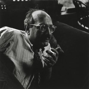
Mark Rothko
1903 - 1970 , Läti
Lühikest infot
- Artistic Movement Or Style: Abstraktne ekspressionism
- Artists Or Movements Influenced By This Artist:
- Minimalism
- Abstraktne ekspressionism
- Date Of Birth: 25. september 1903
- Date Of Death: 25. veebruar 1970
- Full Name: Mark Rothko
- Nationality: Ameerika Ühendriigid
- Notable Artworks:
- No. 10 (1950)
- Seagrami furaažid
- Rothko kabel
- Valge keskus
- Place Of Birth: Daugavpils, Läti
Sarnased artiklid
Kandinsky's Masterpieces: 25 Paintings That Define Abstract Art | AllPaintingsStore
Journey through Wassily Kandinsky's 25 most iconic abstract paintings. Explore his revolutionary use of color, form & spiritual expressionism. Find museum-quality Kandinsky reproductions and elevate your home decor with AllPaintingsStore.com. Discover all masterpieces on AllPaintingsStore.com!

Mark Rothko 25 Parimat Teost: Emotsionaalsed Värvid ja Sügav Sisu | AllPaintingsStore
Avastage Mark Rothko 25 parimat teost! Sukelduge ekspressionismi sügavustesse, emotsionaalsetesse värvimaalid ja kunstniku lugudesse. Leidke täiuslik seinakaunistus AllPaintingsStore.com-ist – kvaliteetsed reproduktsioonid ja interjööride inspiratsioon.
Beyond Representation: Exploring the Emotional Landscape of Abstract Expressionism
Explore the profound emotional world of Abstract Expressionism with AllPaintingsStore. Discover key artists like Pollock & Rothko, learn about collecting, and find museum-quality reproductions to inspire your space.

Abstract Ekspressionismi 10 Meisterteost: Kunsti ja Sisustamise Klassikat
Sukeldu abstraktse ekspressionismi maailma! Avasta 10 legendaarset kunstiteost – Pollock, Rothko jt. – ja nende loo. Leia inspiratsiooni interjööriks ning kaunista kodu AllPaintingsStore.com kvaliteetsete reproduktsioonidega. Uuri kollektsiooni!

The Sublimity of Color: Exploring the Emotional Landscapes of Mark Rothko's Abstract Expressionism
Explore the profound emotional depth of Mark Rothko's abstract expressionism. Discover the history, techniques & lasting impact of this pivotal Color Field painter. Expert insights for collectors and art enthusiasts.


