


 Esikatselu
 Jaa
Jaa Jaa
Jaa
 Tarkemmat tiedot

 Lataa
Lataa
 Samanlaisia
 Röntgenkuva
 Diaesitys
Pref – ARTSCAPE FORM

 Näytä lisää
Giclée-printit ja taideprintit
Museolaatuisia giclée- tai kankaitaulun tulosteita nopealla tuotannolla ja joustavilla viimeistelyvaihtoehdoilla. ( Osta käsintehty maalaus Osta kuva)
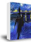
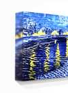
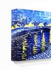
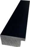
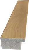
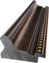
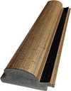
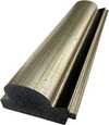
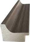
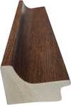
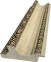
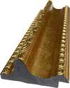
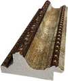
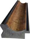
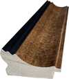
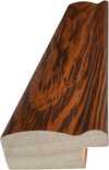
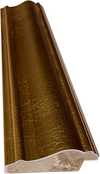
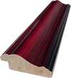
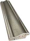
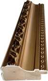
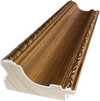
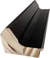
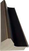
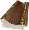
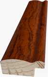
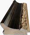
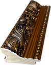
Valitse valmiista mitoistamme sellaiset, jotka vastaavat teoksen alkuperäisiä mittasuhteita.

Voit syöttää omat mitat sopiaksesi tiettyyn kehykseen tai tilaan. Jos valittu koko ei vastaa alkuperäisen kuvan mittasuhteita, rajaamme teosta tai laajennamme kuvaa peilatulla tai yhtenäisellä reunalla. Digitaalinen mallikuva lähetetään hyväksyttäväksi ennen tuotannon aloittamista.
Huomaathan, että näytöllä näkyvä esikatselu ei vastaa lopullista rajausta tai laajennusta. Vain mallikuva näyttää lopullisen sommittelun tarkasti.
Vaikka räätälöityjä kokoja on saatavilla, suosittelemme valitsemaan mitat valmiista listasta alkuperäisten mittasuhteiden säilyttämiseksi.
Toimitus maailmanlaajuisesti () kahdessa viikossa tavallisen 4–5 viikon sijaan. (23 elokuu)

Ilmainen pikatoimitus ympäri maailman

Korkealaatuinen pellavakangas

Kattava kuljetusvakuutus

Tulliveron palautustakuu

Täydellinen värien vastaavuustakuu

60 päivän palautusoikeus (vain valmistusvirheet)

100% rahat takaisin -takuu

Määräalennus tarjous
 Lasivaihtoehto on saatavilla vain alle 110 cm kokoisina teoksina

Pref – ARTSCAPE FORM
Giclée-printit ja taideprintit
Replikaatin koko
-


Kokonaishinta
$ 64
Samankaltaisia teoksia


Taiteilijan elämäkerta
The Typographic Alchemy of Peter Prefington
In the vibrant, often chaotic landscape of contemporary street art, few voices resonate with as much intellectual clarity and visual splendor as Peter Prefington. Known to the art world simply as Pref, this British muralist has mastered a unique form of linguistic alchemy, transforming the grit of urban surfaces into profound meditations on language itself. Born in West London, Pref’s journey is not merely one of rebellion against the blank wall, but a sophisticated evolution from the disciplined halls of formal education to the expansive freedom of the cityscape. His early training at the Chelsea College of Arts provided him with a rigorous foundation in typography and spatial design, an academic grounding that would later allow him to deconstruct and rebuild the very fabric of communication through his spray cans and acrylics.
The essence of Pref’s work lies in its ability to challenge the viewer's perception through a mesmerizing, multi-layered approach. He does not simply paint words; he orchestrates them. By utilizing a range of modern and traditional typefaces, he creates intricate puzzles where letters overlap, intersect, and hide within one another. This technique invites a physical engagement with the art—a demand for the viewer to stop, squint, and tilt their head to untangle the hidden messages buried within the color. His fascination with Dadaist experimentation and the conceptual provocations of Marcel Duchamp is evident in this way; much like the Dadaists sought to disrupt established hierarchies of meaning, Pref disrupts the legibility of the street, turning common vernacular into a complex visual game.
A Symphony of Layers and Illusion
To witness a Pref mural is to experience a masterclass in trompe-l'oeil and dimensional depth. His technique involves a meticulous layering process where spray paint and acrylic mediums are applied to monumental urban walls to create an illusion of three-dimensionality. He often takes commonplace, comforting phrases—such as “Don’t Worry” or “You Are Loved”—and subjects them to a rigorous typographic dissection. Through this process, he can achieve breathtaking effects, such as his celebrated work where the words “more” and “less” are painted as a single, interconnected entity, playing on the philosophical tension between the two concepts. In other instances, he might use smoky, vaporous textures to render the word “mirrors” within a piece titled “smoke and mirrors,” blurring the boundaries between reality and artistic artifice.
This evolution from his early days in London's underground stencil scene to large-scale, high-concept murals reflects a deepening interest in how much information can be compressed into a single visual space. He has spent years experimenting with the density of his compositions, pushing the limits of how many words can inhabit the silhouette of a single letter before the piece loses its soul. This pursuit of “visual puns” and linguistic depth ensures that his work remains far more than mere decoration; it is an active dialogue between the artist’s hand and the public's consciousness.
Legacy and Global Resonance
Beyond the confines of the street, Pref’s influence has permeated the worlds of high fashion and graphic design, bridging the gap between fine art and commercial elegance. His ability to translate his typographic language into other mediums was notably demonstrated in 2019, when he collaborated with the Italian luxury house Fendi to create a bespoke capsule collection. This intersection of street culture and luxury prestige underscores his significance as a contemporary icon who refuses to be confined by traditional boundaries. His career, spanning over two decades, has seen him move from the meticulous world of fashion magazine design for Wonderland to becoming a central figure in global events like the London Mural Festival.
Ultimately, the historical significance of Peter Prefington lies in his ability to make the ephemeral nature of graffiti feel permanent and profound. He has taken the fleeting energy of the street and infused it with the structural integrity of graphic design, creating a body of work that serves as a testament to human connection and resilience. Through his vibrant, layered tapestries of text, he reminds us that even in our most common expressions, there are hidden depths waiting to be discovered by those willing to look closer.

peter preffington
United Kingdom
Pikatiedot
- Artistic Movement Or Style: Graffiti Fine Art
- Date Of Birth: West London, United Kingdom ()
- Date Of Death: Living
- Full Name: Peter Prefington
- Nationality: British
- Notable Artworks: ['Pref']
- Place Of Birth: United Kingdom


