
 Partager
Marron et Orange


Giclées et impressions d'art
Impressions giclées ou sur toile de qualité musée, avec une production rapide et des finitions au choix. (![]() Acheter la peinture faite à la main
Acheter la peinture faite à la main![]() Acheter l'image)
Acheter l'image)
P118B $10
P118H $10
P118W $10
P438Z $10
P508JH $12

P508YH $12
P805H $10
P805Z $10
P919BZ $10
P919G $10
P919XJ $10
P959ZH $10
P968JZ $12
W106C $8
W218G $10
W218JH $8
W218Y $10
W307PJ $10
W316G $10
W316PJ $8
W316Y $10
W398PJ $8
W4111J $10
W500HY $15
W500JH $15
W692G $12
W849H $8
W940BG $15
W953PJ $8
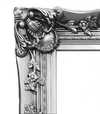
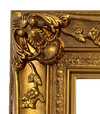
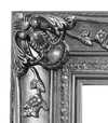
Choisissez parmi nos formats prédéfinis qui respectent les proportions originales de l’œuvre.
Vous pouvez saisir vos propres dimensions pour vous adapter à un cadre ou à un espace spécifique. Si la taille sélectionnée ne correspond pas aux proportions de l'image originale, nous recadrerons l'œuvre ou étendrons l'image avec une bordure en miroir ou une couleur unie. Une maquette numérique vous sera envoyée pour approbation avant le début de la production.
Veuillez noter que l'aperçu à l'écran ne reflète pas le recadrage ou l'extension réelle. Seule la maquette montrera avec précision la composition finale.
Bien que des tailles personnalisées soient disponibles, nous vous recommandons de choisir une dimension dans la liste prédéfinie afin de préserver les proportions originales.
Livraison dans le monde entier () en 2 semaines au lieu des 4/5 semaines habituelles. (22 août)

Livraison express gratuite dans le monde entier

Toile de lin de haute qualité

Assurance transport complète

Garantie de remboursement des droits de douane

Garantie de fidélité des couleurs

Politique de retour de 60 jours (uniquement en cas de défaut)

Garantie de remboursement à 100%

Tarifs dégressifs sur quantité
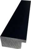
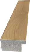
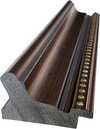
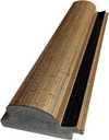
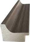
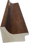
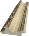
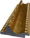
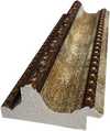
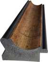
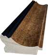
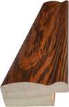
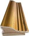
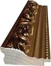
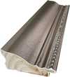
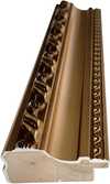
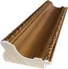
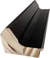
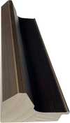
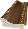
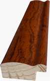
 L'option verre n'est disponible que pour les dimensions inférieures à 110 cm.

Marron et Orange
Giclées et impressions d'art
Format de la reproduction
-


Prix total final
$ 64
Description de la pièce
Maroon and Orange : A Symphony of Color and Silence
Mark Rothko’s “Maroon and Orange” stands as an emblem of Abstract Expressionism, encapsulating the movement's core tenets—bold color palettes, monumental scale, and a deliberate rejection of representational imagery. Created in 1960, this painting embodies Rothko’s singular vision: to evoke profound emotional responses through pure pigment fields rather than depicting recognizable subjects. It resides within the Rothko Chapel in Houston, Texas, where its contemplative atmosphere underscores its artistic significance.Composition and Style : The Essence of Color Field Painting
The artwork's simplicity is deceptive; it represents a masterful application of Color Field painting principles. Two rectangular blocks of color—a deep maroon hue juxtaposed with a vibrant orange shade—dominate the canvas, separated by a thin white line. This deliberate arrangement eschews traditional compositional techniques, prioritizing visual impact over narrative structure. Rothko’s method involved applying thin layers of pigment onto unstretched linen canvases, allowing for gradual blending and creating an ethereal quality that transcends mere surface appearance. The resulting surfaces are remarkably matte, absorbing light rather than reflecting it—a technique designed to foster a meditative experience for the viewer.Historical Context : Amidst Existential Anxiety
“Maroon and Orange” emerged during a period of intense intellectual and artistic ferment in postwar America. The anxieties stemming from World War II and the Cold War fueled existential questioning, influencing artists like Rothko who sought to express profound emotions—fear, grief, transcendence—without resorting to explicit symbolism. Color Field painting arose as a reaction against Abstract Impressionism’s focus on capturing fleeting moments of light and color; instead, it aimed for a more enduring connection with the viewer's subconscious mind. The Chapel itself was conceived as a space for spiritual contemplation, reflecting Rothko’s belief that art could serve as a conduit to universal human experience.Symbolism : Beyond Representation
Rothko deliberately avoided assigning symbolic meaning to his canvases, asserting that he wished to bypass intellectual interpretation and allow the colors themselves to communicate directly with the viewer's emotions. However, scholars have noted correlations between color psychology and Rothko’s artistic intentions. Maroon, often associated with passion, grief, and introspection, contrasts sharply with orange—a hue linked to warmth, optimism, and vitality. The white line acts as a visual separator, creating a sense of balance and highlighting the interdependence of the two colors. It symbolizes the boundaries between consciousness and unconsciousness, mirroring Rothko’s philosophical preoccupation with existential themes.Emotional Impact : A Journey Into Inner Space
Viewing “Maroon and Orange” is intended to be an immersive experience—a descent into inner space where color becomes a language of emotion. The painting's subtle gradations of hue invite contemplation and encourage viewers to confront their own feelings. As Color Field Painting Art Movement Introduction notes, Rothko’s goal was not merely to depict something visually stimulating but to elicit a visceral response that transcends rational thought. The artwork’s stillness—its refusal to engage in visual trickery—promotes a state of receptivity, allowing the colors to resonate within the viewer's psyche and fostering a sense of profound connection with the sublime.


Biographie de l'artiste
enfance et influences
Mark Rothko (Marcus Rothkowitz), un artiste américain renommé, est né le 25 septembre 1903 à Dvinsk, Lettonie. Sa famille a immigré aux États-Unis lorsqu'il n’avait que dix ans. Ce changement culturel aura influencé plus tard son style artistique.évolution artistique
Le travail précoce de Rothko était caractérisé par l’expressionnisme abstrait, un style qui mettait l’accent sur le processus de création d'une œuvre d'art plutôt que sur le produit final. Ses peintures, telles que No. 18 (1948) et Untitled (1948), mettaient en valeur son approche unique de la couleur et de la forme.- Champ de couleurs : L'utilisation par Rothko de champs de couleurs audacieux et rectangulaires, souvent en contraste saisissant les uns avec les autres, créait une sensation de profondeur et d’émotion.
- Structure organique : Ses peintures semblaient respirer la vie, comme si les couleurs étaient des entités vivantes.
œuvres notables et expositions
- No. 10 (1950), une peinture qui marquait un tournant significatif dans le style de Rothko, est maintenant au sein de la collection du Museum of Modern Art.
- Les Seagram Murals, une série de peintures commandées pour le restaurant Four Seasons, mettait en valeur la capacité de Rothko à adapter son style à différents environnements.
- No. 3 (1950), une peinture qui exemplifie l'utilisation par Rothko de champs de couleurs audacieux et rectangulaires.
vie tardive et héritage
La vie de Rothko a été marquée par des luttes contre la santé mentale et un mariage tumultueux. Il est décédé le 25 février 1970, à l'âge de 66 ans. Malgré ses difficultés, Rothko a laissé une marque indélébile sur le monde de l’art. Ochre et rouge sur rouge (champ de couleurs), une peinture qui met en valeur l'approche unique de Rothko à la couleur, peut être trouvée dans la collection AllPaintingsStore.com. La page Wikipédia de Mark Rothko fournit des informations supplémentaires sur sa vie et son style artistique.
Mark Rothko
1903 - 1970 , Lettonie
En bref
- Artistes Influents:
- Sigmund Freud
- Marcel Proust
- Date De Décès: 25 février 1970
- Date De Naissance: 25 septembre 1903
- Influences Artistiques:
- Minimalisme
- Art contemporain
- Lieu De Naissance: Daugavpils, Lettonie
- Mouvement Artistique: Expressionnisme abstrait
- Nationalité: Américaine
- Nom Complet: Mark Rothko / Marcus Rothkowitz
- Œuvres Notables:
- No. 18 (1948)
- No. 10 (1950)
- Murals Seagram
- White Center (1957)
Articles similaires

Mark Rothko : Les 25 Œuvres Maîtresses de l'Abstraction Coloriste | AllPaintingsStore
Plongez dans l'univers émotionnel de Mark Rothko avec les 25 œuvres clés du maître de l'abstraction. Découvrez l'histoire, la technique et le pouvoir des couleurs de ces tableaux iconiques. Reproductions d'art de qualité musée sur AllPaintingsStore.com

The Sublimity of Color: Exploring the Emotional Landscapes of Mark Rothko's Abstract Expressionism
Explore the profound emotional depth of Mark Rothko's abstract expressionism. Discover the history, techniques & lasting impact of this pivotal Color Field painter. Expert insights for collectors and art enthusiasts.

Expressionnisme Abstrait : Les 10 Chefs-d'Œuvre Incontournables pour Décorer avec Art et Histoire
Plongez au cœur de l'Expressionnisme Abstrait avec ! Découvrez les 10 œuvres majeures de Pollock, Rothko et De Kooning. Histoire, techniques & inspiration déco. Explorez la collection complète en ligne.

Color Field Painting: The Emotional Power of Pure Abstraction and Chromatic Depth
Explore the profound emotional depth of Color Field painting. Discover the history of mid-century abstraction, from Rothko to Newman, and learn how pure color transforms the viewer's experience through our expert art history guide.

Beyond the Brushstroke: A Definitive Guide to the Emotional Power of Color Field Painting
Explore the profound history and emotional depth of Color Field painting. From Mark Rothko to Barnett Newman, discover how pure color redefined modern art through our expert-led guide for students and collectors alike.


