

Luminosity and the Physics of Reflection
The visual impact of metallic gold is not a matter of simple pigment, but a complex interaction between light and surface. Unlike a flat color, which absorbs and reflects light uniformly, the metallic finish of gold relies on its ability to vary its reflective brightness based on the viewer's angle. This creates a sense of movement within a static object. In a hospitality setting, where lighting conditions shift from morning sun to evening dimness, this reactivity ensures that an artwork remains dynamic rather than static. It is the difference between a surface that merely sits in a room and one that actively engages with the environment.
This phenomenon finds its historical echo in the use of gold leaf in sacral art. In Christian iconography, the gold ground was used to create a sense of divine light that seemed to emanate from within the painting itself. By using real gold leaf, artists ensured that as a candle flickered or a viewer moved, the halo of a saint would appear to shimmer and react. Today, we achieve a similar atmospheric effect through high-quality metallic paints and specialized pigments, ensuring that even in a modern corporate lobby, the art possesses a living, breathing quality.
Understanding this physics is essential for designers managing large-scale installations. A surface that lacks this reflective depth will appear dull under professional LED lighting, whereas a true metallic finish maintains its integrity across various light temperatures.
Tactile Depth: From Sacred Leaf to Impasto Texture
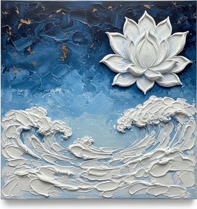
 Celestial Fracture: A Monumental Study in Midnight Navy and Gilded Impasto Texture
, Laurent Fabre
Texture provides the physical weight that distinguishes high-end art from mere decoration. When gold is applied through impasto techniques, it ceases to be a color and becomes a sculptural element. The way light catches the ridges of thick, textured paint creates a play of shadow and highlight that adds significant perceived value to a space. This is particularly effective in large-format works where the physical presence of the medium can command a room.
The history of this tactile approach is rooted in the ancient tradition of goldbeating. For centuries, artisans have hammered gold into incredibly thin sheets, often as thin as 0.1 micrometers, to create a surface that is both delicate and incredibly dense. This process of layering and burnishing allows for a level of detail that flat printing cannot replicate. Whether it is the subtle sheen of a gold-leafed relief or the heavy, textured strokes of a contemporary abstract piece, the physical topography of the work is what captures the eye.
For procurement managers, this distinction is vital. A hand-painted impasto work with metallic accents offers a sensory experience that a flat Giclée print simply cannot provide. The tactile nature of the medium ensures the work feels substantial and intentional.
The Nuance of Tonal Variation: Alloys and Aesthetics
Gold is rarely a singular, monolithic tone. The chemistry of the metal allows for a vast spectrum of hues, from the pale, silvery-yellow of high-purity alloys to the deep, warm tones of rose gold, which is created by adding copper. In interior design, these subtle shifts in temperature—warm versus cool gold—can dictate the entire mood of a hospitality suite. A designer might choose a "Vegas gold" for a high-energy casino environment or a more muted, "old gold" for a sophisticated, traditional lounge.
This variety has been utilized since the early days of metallurgy to denote status and specific aesthetic goals. In the 16th century, crown gold was a specific 22k alloy used for English coinage, providing a distinct, recognizable luster. Similarly, the addition of silver or palladium to create white gold has allowed artists to play with a palette that spans from the warmth of the sun to the coolness of moonlight. These variations allow for a highly customized approach to color matching in large-scale projects.
When selecting a series of works for a hotel corridor, understanding these tonal nuances prevents a visual clash. A cohesive palette requires a deliberate choice between the yellow-dominant tones and the more copper-heavy alloys.
Material Permanence and the Gilded Surface
Durability is the primary concern for any professional designing for high-traffic environments. Gold is a noble metal, meaning it is remarkably resistant to most acids and environmental degradation. This chemical stability is why gold has been used for millennia to protect and decorate important structures. In a commercial setting, where art is subject to varying humidity and cleaning protocols, the stability of the medium is a logistical necessity.
Historically, the use of gold was often a matter of both beauty and preservation. In architecture, gold leaf has been used to adorn wrought iron gates and facades, such as those at the Palace of Versailles, because its non-reactive nature provides a protective finish that resists the elements. This longevity ensures that the initial investment in high-quality art remains a permanent fixture of the space.
Modern art production mirrors this commitment to longevity. By using stable oils and protective Damar varnishes, contemporary artists ensure that the metallic elements and the pigments beneath them remain secure, preventing the yellowing or cracking that can plague lesser materials.
Monumental Scale: Gold in Architectural Contexts
When art moves from the easel to the wall, its relationship with the architecture changes. Large-format murals and ceiling frescoes utilize gold to define the boundaries of a space. A gold-accented ceiling can draw the eye upward, increasing the perceived height of a room, while a massive, multi-panel gold work can serve as a focal point that anchors an entire lobby. The scale of the work must be proportional to the room count and the volume of the space to avoid being swallowed by the architecture.
This sense of scale is echoed in the grand traditions of mosaic and fresco. In the Early Christian era, the "gold-ground" style was used in mosaics to create vast, shimmering walls that transformed the interior of a cathedral into a celestial environment. The scale was not just about size, but about the total immersion of the viewer in a golden atmosphere.
For designers, the ability to commission large-scale, custom-sized works is essential. Whether it is a single massive canvas or a multi-panel series that flows across a staircase, the scale must be engineered to the specific dimensions of the site.
The Logistics of Execution: Precision in Large-Scale Commissions
Executing a large-scale commission requires more than just artistic talent; it requires rigorous project management. For hospitality professionals, the timeline is often as critical as the aesthetic. A seamless workflow—from the initial digital mockup to the final shipping of a reinforced, double-walled box—is the difference between a successful installation and a logistical failure. Precision in color matching and the ability to review work via digital photos before it leaves the studio are non-negotiable requirements for large-scale procurement.
The complexity of these works is reflected in the specialized techniques used to create them. From the careful application of gold leaf to the precise layering of impasto, every step is a controlled process. This level of craftsmanship is what separates a professional commission from a standard stock item. It requires a dedicated Project Coordinator to manage the interface between the artist's studio and the client's site.
At AllPaintingsStore.com, we understand that for the professional designer, reliability is the ultimate luxury. We provide the logistical infrastructure—from VAT-compliant documentation for international shipping to custom framing and global delivery via DHL and FedEx—to ensure that your vision is realized on time and on budget. Whether you are looking for a single statement piece or a coordinated series for a global hotel chain, our process is designed for efficiency and excellence.