


 실제 크기로 보기
 보내기
보내기 공유하기
공유하기
 상세 보기
상세 보기 가이드 보기

 이미지 다운로드
 유사 작품 더 보기
 X-레이
X-레이 슬라이드 쇼 보기
 통계 정보
통계 정보Databank I


 상세 보기
상세 보기
이 페이지에 표시된 작품은 저작권법의 보호를 받으며, 이에 따라 동일한 복제품을 제작하거나 판매하는 것은 법으로 금지되어 있습니다. 이러한 권리 보호는 다음과 같은 국제 협약에 따라 시행됩니다. 베른 협약 또한 다음에서 명시하는 법률을 포함한 국내법에 의해 보호됩니다. 미국 저작권법 제17조.
이 방식은 저작권 보호를 받는 예술 작품을 복제하거나 그대로 재현하는 것이 아니기에 저작권 규정을 완벽히 준수합니다. 대신, 이는 창의적인 재해석의 과정을 거칩니다. 즉, 원작에서 영감을 받되 원작과 동일하지 않은 새로운 회화 작품을 의미합니다.
지클레 / 아트 프린트
빠른 제작과 다양한 마감 옵션을 선택할 수 있는 박물관 수준의 지클레이 및 캔버스 프린트. ( 수작업 채색 복제본 주문하기 디지털 이미지 판매 채널로 전환)
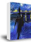









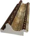
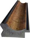





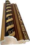









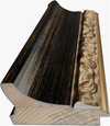





작품의 원본 비율을 그대로 유지하는 프리셋 사이즈 중에서 선택해 보세요.

액자나 벽면 크기에 맞춰 필요한 가로와 세로 길이를 입력해 주세요. 프린트는 원본 이미지보다 크게 제작할 수 없으며 오직 자르는 것만 가능하므로, 비율이 다른 사이즈를 선택할 경우 이미지의 일부가 잘려 나갈 수 있습니다. 인쇄 작업에 들어가기 전, 최종 확인을 위해 디지털 목업을 보내드립니다. 이 페이지에 표시된 이미지는 실제 잘리는 영역을 나타내지 않으며, 오직 목업을 통해서만 정확한 확인이 가능합니다.


 유리 옵션은 110cm 미만 크기에서만 선택 가능합니다.

Databank I
지클레 / 아트 프린트
복제본 규격
-


총 결제 금액
₩ 86851
질의응답
"Databank I"의 작가인 Boy & Erik Stappaerts는 다른 이름으로도 알려져 있나요?
Boy & Erik Stappaerts은(는) Boy Stappaerts, Erik Stappaerts, Bes Institute, Boy & Erik Stappaerts (Bes)(으)로도 알려져 있습니다.
"Databank I"에서 가장 돋보이는 색상은 무엇인가요?
Boy & Erik Stappaerts의 "Databank I"의 주요 색상은 Putty (#e1e2e3)입니다.
"Databank I"의 규격은 어떻게 되나요?
Boy & Erik Stappaerts의 "Databank I"은(는) Panoramic 형식입니다. 이 형식은 작품 구성의 비율을 나타냅니다.
관련 작품들


작가 소개
A Chromatic Cartographer of Contemporary Identity: The World of Boy & Erik Stappaerts
Born in Antwerp, Belgium, in 1969, boy & erik stappaerts is an artist whose work transcends the boundaries of traditional painting, functioning instead as a complex visual language for exploring the multifaceted nature of sociological and political identities. He isn’t merely depicting the world around him; he's dissecting it, labeling its components, and reassembling them into layered narratives that challenge viewers to confront their own preconceptions. Stappaerts’ journey began with formal training at the Saint-Luc Institute in Brussels and further refinement at the prestigious Rijksacademie in Amsterdam, institutions that provided a solid foundation but ultimately served as launching pads for his intensely individualistic artistic vision.
Early Influences and Conceptual Foundations
Stappaerts’ path wasn't predetermined. Growing up in an entrepreneurial family instilled a sense of self-reliance and resourcefulness, qualities that would prove invaluable as he navigated the art world. However, it was the influence of his artistic grandfather and a neighbor with a keen eye for abstract art that truly ignited his passion. These early exposures fostered a fascination with color, form, and the power of abstraction to convey meaning beyond literal representation. His work is deeply rooted in observation—not simply *what* he sees, but *how* society categorizes and interprets what is seen. This led him to develop a unique methodology centered around conceptual labels as integral components of his paintings. These aren’t afterthoughts; they are the keys to unlocking the deeper layers of symbolism embedded within each canvas.
The Development of a Unique Visual Language
Stappaerts' artistic process is characterized by meticulous layering, both physically in the application of paint and conceptually through the addition of text. He often employs automotive lacquer—a material chosen for its vibrant saturation and synthetic perfection—to create fields of intense color that immediately command attention. But it’s the labels superimposed upon these chromatic surfaces that truly set his work apart. These aren't descriptive titles; they are sociological, political, or emotional identifiers, acting as signposts within a complex map of contemporary experience. The “Conflict Paintings,” perhaps his most recognizable series, visually represent the ethnical and cultural diversity found in urban landscapes. He sees color itself as a reflection of identity—a way to express personality and navigate the inherent tensions between peace and conflict that exist within any relationship or society.
Major Themes and Artistic Achievements
Beyond the “Conflict Paintings,” Stappaerts has explored themes of noise, polarization, and the overwhelming influx of information in contemporary life. The "Noise Paintings" are a direct response to this digital age—visual representations of the impossibility of clear communication amidst constant overstimulation. The “Polarisation Paintings”, stark black and white canvases overlaid with transparent color, embody the increasing divisions within society. His work isn’t about offering solutions; it's about acknowledging the complexities and contradictions inherent in the human condition. Stappaerts is represented by the Callewaert Vanlangendonck Gallery in Antwerp, a testament to his growing recognition within the art world. He has exhibited extensively throughout Belgium and internationally, consistently challenging viewers with his thought-provoking and visually arresting creations.
Historical Significance and Ongoing Legacy
Boy & Erik Stappaerts occupies a unique position within contemporary art. He isn’t easily categorized—his work draws from abstraction, conceptualism, and social commentary, creating a hybrid style that is both intellectually stimulating and emotionally resonant. His founding of the BES Institute and Associations in Antwerp further demonstrates his commitment to fostering dialogue and research within the artistic community. He has trained himself throughout the years to not only meticulously manufacture pieces but also to communicate his grammar of works. He walks his path freely, without compromise but always open to conversation. Stappaerts’ legacy lies in his ability to transform paint and labels into a powerful tool for understanding—and questioning—the world around us. He is a chromatic cartographer, mapping the complexities of contemporary identity with unwavering honesty and profound artistic vision.

Boy & Erik Stappaerts
1969 - , Belgium
작가 정보 요약
- Full Name: Boy & Erik Stappaerts
- Nationality: Belgian
- Date Of Birth: 1969
- Place Of Birth: Antwerp, Belgium
- Notable Artworks: ['Databank I']
- Artistic Movement Or Style: Conceptual Painting

