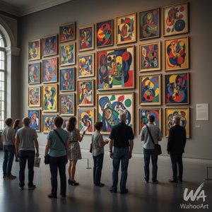
1951. Oil On Canvas.

§ 1Catalogusgegevens


Dit kunstwerk is auteursrechtelijk beschermd
De kunstwerken die op deze pagina worden weergegeven, zijn beschermd door de auteursrechtwetgeving, wat betekent dat het ons wettelijk niet is toegestaan om identieke reproducties te maken of te verkopen. Deze bescherming wordt gehandhaafd onder internationale overeenkomsten zoals de Conventie van Bern en door nationale wetgeving, waaronder de bepalingen van de Amerikaanse auteurswet - Titel 17. Alle rechten voorbehouden. Reproduceren of distribueren van afbeeldingen is niet toegestaan zonder uitdrukkelijke schriftelijke toestemming van WahooArt.com en de rechthebbenden.
Als een respectvol en legaal alternatief bieden wij op maat gemaakte, handgeschilderde kunstwerken aan die geïnspireerd zijn op het origineel. Onze bekwame en professionele kunstenaars bestuderen zorgvuldig de stijl, sfeer en artistieke essentie van het origineel om een nieuw, uniek werk te creëren dat dezelfde emotie oproept – terwijl het een op zichzelf staande, originele creatie blijft.
Deze methode voldoet volledig aan de auteursrechtwetgeving, omdat het niet gaat om het kopiëren of dupliceren van het beschermde kunstwerk. In plaats daarvan is er sprake van een creatieve herinterpretatie — een nieuw schilderij dat door het origineel wordt geïnspireerd, maar er niet identiek aan is.
 Lees meer over
§ 2Abstract
Beschrijving verzamelobject
No.18 by Mark Rothko – A striking color field painting featuring layered hues of red, white, and orange, created in 1951 amidst the backdrop of Latvian Jewish heritage.
Biografie kunstenaar
Ontdek Mark Rothko (1903-1970), een Amerikaanse kunstenaar die kleurgebruik revolutioneerde en emotionele kunst creëerde met zijn iconische Color Field schilderijen & Abstract Expressionisme.
§ 3Toelichting
A Symphony of Saturated Silence
Mark Rothko’s No.18 stands as a profound testament to the enduring power of color field painting, a movement that fundamentally revolutionized artistic expression in the mid-20th century. Created in 1951, this monumental canvas embodies Rothko's signature approach: the deliberate layering of saturated hues onto a textured surface to evoke a deep, visceral emotional resonance. To gaze upon No.18 is to enter a space where the boundaries between the viewer and the canvas begin to dissolve. The painting eschews traditional representational imagery, opting instead for amorphous, bleeding rectangles of crimson red and luminous white that seem to pulse with a life of their own. This technique was never merely about visual aesthetics; it was a conscious effort by Rothko to bypass intellectual analysis and tap directly into the subconscious mind, inviting a sensory engagement that transcends the spoken word.
The technical mastery behind this piece lies in its subtle, tactile complexity. Through the application of multiple coats of oil paint, Rothko achieved a surface depth that invites the eye to wander through layers of light and shadow. The composition is dominated by a striking contrast: a powerful red area commands the left side of the frame, bleeding softly into a vast expanse of white that covers much of the right. A sudden, unexpected flicker of orange in the top right corner provides a momentary spark of warmth, breaking the tension between the primary tones. This interplay of color and texture creates a breathing, living organism of paint, making it an extraordinary centerpiece for any collection or a sophisticated focal point in a thoughtfully curated interior.
Echoes of History and Spiritual Yearning
To understand the gravity of No.18, one must look toward the historical landscape from which it emerged. The painting was birthed in the aftermath of World War II, an era defined by widespread disillusionment and a global sense of existential questioning. Rothko himself carried a profound personal history of loss—most notably the death of his father in 1937—which fueled his lifelong preoccupation with themes of mortality and spiritual yearning. These themes, deeply rooted in Jewish mysticism, find their way into the very fabric of the canvas. The painting serves as a bridge between the trauma of the post-war world and a search for transcendence.
The symbolism within the work is both universal and deeply personal. The choice of red and white is far from arbitrary; it reflects Rothko's belief in the primal language of color. Red symbolizes passion, vitality, and the raw energy of human existence, while the expansive white represents purity, light, and spiritual illumination. Together, they create a dialectic between the earthly and the divine, the heavy and the ethereal. For collectors and designers alike, No.18 offers more than just visual beauty; it offers an invitation to contemplation. It is a piece that demands presence, making it an ideal acquisition for those seeking to infuse their spaces with a sense of profound peace, intellectual depth, and timeless elegance.
Veelgestelde vragen
Welk gevoel roept "No.18" door Mark Rothko op?
De vastgelegde stemming van "No.18" door Mark Rothko is Serene, en de emotionele toon ervan is Reflective.
Zijn de kleuren van "No.18" door Mark Rothko verzadigd of gedempt?
De kleuren van "No.18" door Mark Rothko hebben een Clear Color Presence verzadiging. Verzadiging beschrijft hoe levendig of gedempt de kleuren zijn.
Uit welke periode stamt "No.18"?
"No.18" door Mark Rothko dateert uit de Modern-periode. Deze periode biedt de historische context van het werk.


 Schakel over naar print


 Voor kunstwerken of reproducties die aan één zijde groter zijn dan 105 cm (ongeveer 41 inch), wordt de lijst als een losse set verzonden. Deze methode garandeert een veilige levering en voorkomt schade tijdens het transport.