


 Forhåndsvisning
 Send
Send Del
Del
 Vis detaljer
 Utskriftsvennlig guide

 Last ned bilde
 Liknende objekter
 Røntgenundersøkelse
 Lysbildefremvisning
 Q&A
Q&A Statistikk
Chopin stamp design


 Vis hele teksten
Kunstverket som vises på denne siden er beskyttet av opphavsretten, noe som betyr at vi ikke har juridisk tillatelse til å lage eller selge identiske reproduksjoner. Denne beskyttelsen håndheves i henhold til internasjonale avtaler som for eksempel Bernerkonvensjonen og av nasjonale lover, inkludert de som er fastsatt i Amerikansk lov om opphavsrett – Tittel 17.
Denne metoden er i fullt samsvar med opphavsrettslige regler, da den ikke innebærer kopiering eller duplisering av det beskyttede kunstverket. I stedet er det snakk om en kreativ nytolkning – et nytt maleri som er inspirert av originalen, men ikke identisk med den.
Giclée / Kunsttrykk
Giclée- eller lerretsprint av museumskvalitet med rask produksjon og fleksible valgmuligheter for etterbehandling. ( Kjøp håndmalt maleri Bytt til digitalt bilde)
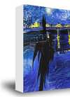
P118B Nkr10
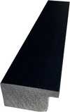
P118H Nkr10
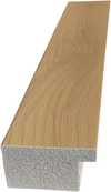
P118W Nkr10
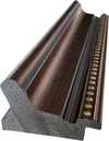
P438Z Nkr10
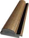
P508JH Nkr12

P508YH Nkr12
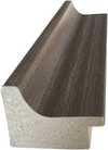
P805H Nkr10
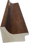
P805Z Nkr10
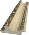
P919BZ Nkr10
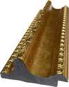
P919G Nkr10
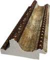
P919XJ Nkr10
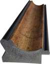
P959ZH Nkr10
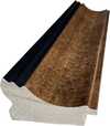
P968JZ Nkr12
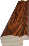
W106C Nkr8
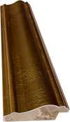
W218G Nkr10

W218JH Nkr8
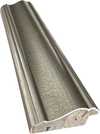
W218Y Nkr10
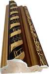
W307PJ Nkr10

W316G Nkr10
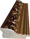
W316PJ Nkr8
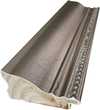
W316Y Nkr10
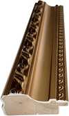
W398PJ Nkr8
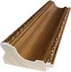
W4111J Nkr10
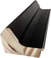
W500HY Nkr15
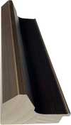
W500JH Nkr15
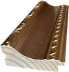
W692G Nkr12
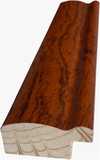
W849H Nkr8
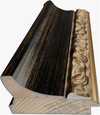
W940BG Nkr15
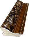
W953PJ Nkr8

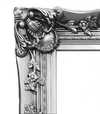
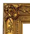
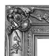
Velg mellom våre forhåndsdefinerte størrelser som bevarer kunstverkets opprinnelige proporsjoner.

Skriv inn ønsket bredde og høyde for å tilpasse trykket til din ramme eller vegg. Et trykk kan kun beskjæres, aldri skaleres opp utover motivets opprinnelige størrelse, noe som betyr at et format med andre proporsjoner vil føre til tap av deler av bildet. Vi sender deg en digital mockup for godkjenning før vi starter trykkeprosessen. Bildet som vises på denne siden viser ikke den faktiske beskjæringen — det er kun mockuppen som viser dette.
Verdensomspennende levering () på 2 uker i stedet for standard 4/5 uker. (31 October)

Gratis ekspressfrakt over hele verden

Lerretsduk av lin av høy kvalitet

Full transportforsikring

Garanti for refusjon av toll og importavgifter

Garantert fargegjengivelse

100 dagers returrett ved fabrikasjonsfeil

100% pengene tilbake-garanti

Rabatt ved flere kjøp
 Glassalternativet er kun tilgjengelig i størrelser under 110 cm

Chopin stamp design
Giclée / Kunsttrykk
Størrelse på reproduksjon
-


Totalpris for valgte alternativer
Nkr 616
Chopin Stamp Design - Leon Urbanski: A Legacy of Polish Typography
Leon Urbanski (1926 – 1998) stands as a monumental figure in the history of Polish graphic design and typography, shaping the visual landscape of his nation for decades. Born in Tarnów, Poland, Urbanski’s artistic journey began amidst the turbulent backdrop of post-war Europe, fostering an unwavering dedication to craftsmanship and innovation that would define his prolific career. He wasn't merely a designer; he was a storyteller who meticulously crafted images and lettering to convey meaning and emotion—a legacy that continues to inspire contemporary artists. Early Influences & Artistic Formation Urbanski’s formative years were marked by exposure to European avant-garde movements, particularly Surrealism and Constructivism. These influences instilled in him a belief in experimentation and a rejection of decorative excess, prioritizing clarity and functionality as guiding principles. Studying at Kraków Academy of Fine Arts honed his skills and cemented his commitment to exploring new visual languages—a perspective that would permeate his entire oeuvre. His work consistently sought to communicate complex ideas with elegance and precision, reflecting the intellectual ferment of his time. The Chopin Stamp Design: A Singular Achievement The “Chopin stamp design” represents Urbanski’s most recognizable contribution to Polish graphic art. It's a deceptively simple image—a stylized portrait of a man within a circular frame—yet it embodies profound artistic considerations. Urbanski deliberately chose Delacroix’s portrait as his inspiration, recognizing the artist’s mastery of capturing psychological depth and emotional nuance. However, he undertook a transformative process: subjecting the portrait to monochrome processing using the halftone effect. This technique wasn't merely about replicating color; it was about conveying atmosphere and texture—a deliberate decision that speaks volumes about Urbanski’s artistic vision. Technique & Illusionistic Depth The preparatory drawing reveals the meticulous attention to detail invested in this procedure, based on illusion and simulation. Urbanski skillfully employed halftone printing – a method rooted in pointillism-like dots – to create tonal variations without resorting to multiple colors. By varying the size and density of these dots, he achieved an astonishing degree of realism, mimicking the subtleties of light and shadow. This technique demanded considerable technical skill but ultimately served to amplify Urbanski’s artistic intent: to evoke a sense of nostalgia and to honor the traditions of historical printing processes. Symbolism & Emotional Resonance Beyond its formal execution, the Chopin stamp design carries significant symbolic weight. The circular frame symbolizes completeness and unity—a visual metaphor that underscores Urbanski's belief in the power of art to encapsulate complex ideas within a contained form. Furthermore, the portrait itself represents an individual—Fryderyk Chopin—a celebrated composer whose music embodies Polish cultural identity. Urbanski’s masterful rendering captures not only Chopin’s likeness but also his spirit—a testament to the artist’s ability to imbue images with emotional resonance and intellectual depth. Conclusion: An Enduring Influence Leon Urbanski's legacy extends far beyond a single artwork; it resides in his unwavering dedication to artistic excellence and his pioneering exploration of graphic design techniques. The Chopin stamp design stands as an exemplar of his stylistic approach—characterized by clarity, precision, and a subtle embrace of illusionistic depth. It continues to inspire artists today who strive to achieve similar levels of sophistication and emotional impact—a testament to Urbanski’s enduring influence on the history of Polish visual culture.Spørsmål og svar
Hvilken fargepalett brukes i "Chopin stamp design" av Leon Urbanski?
Fargepaletten i "Chopin stamp design" av Leon Urbanski beskrives som Nøytrale toner. Det er en kortfattet beskrivelse av verkets farger.
Hvilken farge dominerer komposisjonen i "Chopin stamp design" av Leon Urbanski?
Den dominerende fargen i "Chopin stamp design" av Leon Urbanski er Gråbeige (#e2dbd1).
Er fargene i "Chopin stamp design" sterke eller dempede?
Fargene i "Chopin stamp design" har en metning på Dempet og en intensitet på Monokromatisk.
Lignende kunstverk


Om kunstneren
The Architect of Polish Typography
Leon Urbanski (1926 – 1998) stands as a monumental figure in the history of Polish graphic design and typography, shaping the visual landscape of his nation for decades. Born in Tarnów, Poland, Urbanski’s artistic journey began amidst the turbulent backdrop of post-war Europe, fostering an unwavering dedication to craftsmanship and innovation that would define his prolific career. He was far more than a mere designer; he was a storyteller who meticulously crafted images and lettering to convey profound meaning and emotion—a legacy that continues to inspire contemporary artists today.
His formative years were deeply marked by exposure to the powerful currents of European avant-garde movements, particularly Surrealism and Constructivism. These influences instilled in him a lifelong belief in experimentation and a resolute rejection of decorative excess, prioritizing clarity, functionality, and structural integrity as his guiding principles. While studying at the Kraków Academy of Fine Arts, he honed his skills in painting and drawing, gaining a foundational understanding of visual composition that would later breathe life into his typographic endeavors. Notably, Urbanski collaborated closely with Leon Kozłowski, another prominent Polish artist and educator, whose mentorship solidified Urbanski's commitment to intellectual rigor alongside aesthetic sensitivity.
A Mastery of Form and Function
Urbanski’s true brilliance resided in his unparalleled mastery of typography, where he transformed the printed word into a visual experience. He embarked on a remarkable career designing over 200 books—a staggering accomplishment that cemented his reputation as Poland's foremost book designer. His approach was never simply about the arrangement of text; rather, it was about creating a rhythmic, visual dialogue between words and images, reflecting the unique spirit of each project with meticulous attention to detail. Renowned publishers such as Ossolineum, Państwowy Instytut Wydawniczy, Wydawnictwo Iskry, Wydawnictwo Czytelnik, and Nasza Księgarnia all benefited immensely from his expertise, commissioning him to create works that were as intellectually profound as they were aesthetically striking.
In his more ephemeral works, Urbanski demonstrated a remarkable ability to elevate even the smallest medium. His collection of over 100 low-circulation ephemera—including invitations, programs, and greeting cards created between the early 1960s and the early 1990s—serves as a testament to his versatility. Many of these pieces were commissioned for high-level diplomatic meetings and international delegations, making them rare historical documents that capture the social and organizational fabric of Poland during that era. In these works, he often drew upon Renaissance printing traditions and utilized the ancient Greek principle of the "golden ratio," ensuring that even a simple invitation possessed a timeless, classical harmony.
The Chopin Stamp: A Singular Vision
Perhaps his most celebrated achievement is the Chopin Stamp Design, a project commissioned by the Fryderyk Chopin Institute in Warsaw. This artwork encapsulates the very essence of his stylistic approach, demanding a delicate balance between honoring Poland's musical heritage and communicating its ethereal spirit through visual representation. To achieve this, Urbanski skillfully employed a monochrome halftone technique, mirroring the muted, nostalgic tones found in vintage printing processes. This method allowed him to create an illusionistic detail that felt both modern and deeply rooted in artistic tradition.
The historical significance of Leon Urbanski lies in his ability to bridge the gap between fine art and functional design. His work remains a cornerstone of Polish graphic identity, characterized by:
- Intellectual Rigor: A commitment to clarity and the rejection of unnecessary ornamentation.
- Technical Innovation: The masterful use of halftone printing and typographic experimentation.
- Cultural Preservation: The integration of classical proportions and historical printing traditions into modern graphic language.
- Narrative Depth: The ability to treat every letterform and image as a vital component of a larger story.

Leon Urbanski
1926 - 1998 , Poland
Kort om kunstneren
- Full Name: Leon Urbanski
- Nationality: Polish
- Date Of Birth: 1926
- Date Of Death: 1998
- Place Of Birth: Tornow, Poland
- Notable Artworks: ['Chopin stamp design']
- Artistic Movement Or Style: Graphic Design
- Artists Who Influenced This Artist: ['Leon Kozłowski']
- Artists Or Movements Influenced By This Artist: ['Léon Bakst']
Relaterte artikler

Timeless Elegance: A Procurement Guide to Sourcing Vintage-Style Artworks for Large-Scale Commercial Projects
Streamline large-scale commercial decor with professional art procurement solutions. Discover expert strategies for sourcing vintage-style oil reproductions, bulk orders, and custom multi-panel artworks designed for hotels, restaurants, and corporate spaces.
