Pengene tilbake-garanti · 100 dager Gratis levering over hele verden
449564kunstverk 30613kunstnere 4658museer 32språk
Katalogoppføring

No.18

1951. Oil On Canvas.

Fig. 1. Mark Rothko, No.18, 1951. Vist som den reproduksjonen du har spesifisert: , .

§ 1Katalogdata

§ 2Abstrakt

Beskrivelse av objektet

No.18 by Mark Rothko – A striking color field painting featuring layered hues of red, white, and orange, created in 1951 amidst the backdrop of Latvian Jewish heritage.

Om kunstneren

Utforsk Mark Rothko (1903-1970) sin ikoniske Color Field kunst og Abstract Expressionisme! Opplev følelsenes dybde og kunstnerens varige arv – en sentral figur i moderne kunst.

§ 3Kommentarer

A Symphony of Saturated Silence

Mark Rothko’s No.18 stands as a profound testament to the enduring power of color field painting, a movement that fundamentally revolutionized artistic expression in the mid-20th century. Created in 1951, this monumental canvas embodies Rothko's signature approach: the deliberate layering of saturated hues onto a textured surface to evoke a deep, visceral emotional resonance. To gaze upon No.18 is to enter a space where the boundaries between the viewer and the canvas begin to dissolve. The painting eschews traditional representational imagery, opting instead for amorphous, bleeding rectangles of crimson red and luminous white that seem to pulse with a life of their own. This technique was never merely about visual aesthetics; it was a conscious effort by Rothko to bypass intellectual analysis and tap directly into the subconscious mind, inviting a sensory engagement that transcends the spoken word.

The technical mastery behind this piece lies in its subtle, tactile complexity. Through the application of multiple coats of oil paint, Rothko achieved a surface depth that invites the eye to wander through layers of light and shadow. The composition is dominated by a striking contrast: a powerful red area commands the left side of the frame, bleeding softly into a vast expanse of white that covers much of the right. A sudden, unexpected flicker of orange in the top right corner provides a momentary spark of warmth, breaking the tension between the primary tones. This interplay of color and texture creates a breathing, living organism of paint, making it an extraordinary centerpiece for any collection or a sophisticated focal point in a thoughtfully curated interior.

Echoes of History and Spiritual Yearning

To understand the gravity of No.18, one must look toward the historical landscape from which it emerged. The painting was birthed in the aftermath of World War II, an era defined by widespread disillusionment and a global sense of existential questioning. Rothko himself carried a profound personal history of loss—most notably the death of his father in 1937—which fueled his lifelong preoccupation with themes of mortality and spiritual yearning. These themes, deeply rooted in Jewish mysticism, find their way into the very fabric of the canvas. The painting serves as a bridge between the trauma of the post-war world and a search for transcendence.

The symbolism within the work is both universal and deeply personal. The choice of red and white is far from arbitrary; it reflects Rothko's belief in the primal language of color. Red symbolizes passion, vitality, and the raw energy of human existence, while the expansive white represents purity, light, and spiritual illumination. Together, they create a dialectic between the earthly and the divine, the heavy and the ethereal. For collectors and designers alike, No.18 offers more than just visual beauty; it offers an invitation to contemplation. It is a piece that demands presence, making it an ideal acquisition for those seeking to infuse their spaces with a sense of profound peace, intellectual depth, and timeless elegance.

Spørsmål og svar

Hvilken følelse formidler "No.18" av Mark Rothko?

Stemningen i "No.18" av Mark Rothko kan beskrives som Serene, og den emosjonelle tonen er Reflective.

Er fargene i "No.18" av Mark Rothko mettede eller dempede?

Fargene i "No.18" av Mark Rothko har en Clear Color Presence metning. Metning beskriver hvor levende eller dempede fargene er.

Fra hvilken epoke stammer "No.18"?

"No.18" av Mark Rothko stammer fra Modern-perioden. Denne perioden gir verkets historiske kontekst.
§ 4Kunstneren

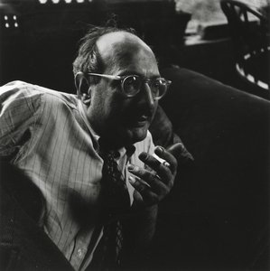
Mark Rothko

Mark Rothko

1903 - 1970, Latvia

Kort om Mark Rothko

  • Artistic Movement Or Style: Color Field Painting
  • Artists Or Movements Influenced By This Artist: ['Minimalism']
  • Date Of Birth: September 25, 1903
  • Date Of Death: February 25, 1970
  • Full Name: Markus Yakovlevich Rothkowitz
  • Nationality: Russisk Empire- Amerikansk (fra 1938)
  • Notable Artworks:
    • No. 10 (1950)
    • Seagram Murals
    • Rothko Chapel
  • Place Of Birth: Dvinsk, Latvia

Om kunstneren

Early Life and the Seeds of Artistic Vision

Mark Rothko, born Markus Yakovlevich Rothkowitz in Dvinsk, Latvia, in 1903, carried within him from the outset a sense of displacement that would profoundly shape his artistic journey. His early years were marked by the anxieties of a Jewish family living within the Pale of Settlement, shadowed by pogroms and political unrest. This atmosphere instilled a deep sensitivity to human suffering, a theme that would resonate throughout his oeuvre. The 1913 immigration to Portland, Oregon, represented not just a geographical shift but a cultural upheaval for the young Rothko. While his father, a pharmacist and intellectual with socialist leanings, fostered a home filled with debate and learning, the loss of Jacob Rothkowitz shortly after their arrival cast a long shadow. This early experience of loss, coupled with the challenges of assimilation, fueled a lifelong exploration of existential themes – mortality, trauma, and the search for meaning in a chaotic world. Though he excelled academically at Yale University, Rothko found himself drawn more to the vibrant energy of New York City, abandoning formal studies to pursue his passion for art at the Art Students League. These formative years laid the groundwork for an artistic vision that would ultimately challenge conventional notions of painting and redefine the emotional power of color.

From Figurative Beginnings to Abstract Expressionism

Rothko’s initial artistic explorations were firmly rooted in realism, depicting urban scenes and portraits with a keen eye for detail. However, these early works already hinted at the psychological depth that would become his hallmark. As the 1940s unfolded, and the world grappled with the horrors of World War II, Rothko’s art underwent a dramatic transformation. Influenced by Surrealism and mythology, he began to move away from representational imagery, seeking instead to express universal human emotions through symbolic forms. This period saw the emergence of multi-form paintings – canvases populated by ambiguous, biomorphic shapes that seemed to hover between figuration and abstraction. These works were not merely experiments in form; they were deeply felt responses to the anxieties and uncertainties of a world at war. By the late 1940s, Rothko had arrived at his signature style: large-scale canvases featuring rectangular blocks of color that appeared to float and resonate with one another. He stripped away all vestiges of recognizable imagery, focusing instead on the pure emotional impact of color and form. This marked a pivotal moment in the development of Abstract Expressionism, and established Rothko as a leading figure in this groundbreaking movement.

The Color Field and the Pursuit of Transcendence

Rothko’s mature work is defined by what came to be known as “Color Field” painting – vast expanses of luminous color that envelop the viewer in an immersive experience. These paintings are not about *what* they depict, but rather *how* they make you feel. Rothko believed that art should engage the viewer viscerally, bypassing intellectual analysis and speaking directly to the emotions. He meticulously layered thin washes of paint, creating subtle variations in tone and texture that seemed to emanate from within the canvas. The edges of his rectangular forms are often blurred, allowing them to blend and interact with one another, creating a sense of depth and movement. Rothko deliberately avoided titles beyond numbers – “No. 1,” “No. 6” – encouraging viewers to confront the paintings without preconceived notions and allow their own emotional responses to guide their experience. He sought to create a space for contemplation, a sanctuary where viewers could connect with something larger than themselves. His ambition was nothing less than to evoke profound spiritual experiences through the language of color.

Major Achievements and Lasting Legacy

Among Rothko’s most significant achievements are “No. 10 (1950),” a pivotal work that exemplifies his evolving style, and the Seagram Murals (1958). Commissioned for the Four Seasons Restaurant in New York City, these murals were ultimately rejected by Rothko, who felt they would be compromised by their intended environment. He instead donated them to the Tate Gallery in London, where they continue to inspire awe and contemplation. Perhaps his most ambitious project was the Rothko Chapel (1971) in Houston, Texas – a non-denominational sanctuary housing fourteen of his paintings. Designed as a space for quiet reflection, the chapel is considered a sacred place by many, embodying Rothko’s belief in the spiritual power of art. Rothko's influence on subsequent generations of artists has been immense. He paved the way for Minimalist art and continues to inspire contemporary painters who explore the emotional possibilities of abstraction. Despite struggling with depression throughout his life, culminating in his tragic suicide in 1970, Mark Rothko remains one of the most important and influential artists of the 20th century – a master of color whose work continues to resonate with audiences around the world. ## The Enduring Power of Emotional Resonance
  • Rothko’s paintings are celebrated for their ability to convey universal human emotions—tragedy, ecstasy, despair, and hope.
  • His exploration of color as a vehicle for emotional expression revolutionized abstract painting.
  • The Rothko Chapel stands as a testament to his belief in the spiritual power of art.
  • He remains a pivotal figure in Abstract Expressionism and a major influence on contemporary artists.

§ 5Relaterte verk

§ 6Spørsmål

Kort om verket

  • Location: Collection of The Solomon R Guggenheim Museum
  • Title: No.18
  • Movement: Color Field Painting
  • Artist: Mark Rothko
  • Medium: Oil on Canvas

Kunnequiz om kunst

Det er kun ett riktig svar på hvert spørsmål.

Spørsmål 1:
What artistic movement is No.18 by Mark Rothko primarily associated with?
Spørsmål 2:
In what year was No.18 created?
Spørsmål 3:
What are the dominant colors featured in No.18?
Spørsmål 4:
Mark Rothko’s style is characterized by:
Spørsmål 5:
Where was Mark Rothko born?

§ 7Sitér dette oppslaget

AllPaintingsStore.com, “Mark Rothko, No.18 (1951)”, https://allpaintingsstore.com/no/art/mark-rothko-no-18-8XYHKW-en/ArtistReproduction/ (hentet 11 October 2026).

§ 8Reproduksjonen

Håndlaget oljereproduksjon

Håndmalt olje på lerret i din valgte størrelse og ramme, laget på bestilling av våre kunstnere. ( Bytt til trykk Bytt til digitalt bilde)

Det er spesifisert i margen på ordreskjemaet; den nåværende statusen for dette skjemaet lyder som følger.

No.18

Trykkmetode

Størrelse på reproduksjon

-

Utvalgte mesterkunstnere

Mer detaljrikdom, finesse og ekstra produksjonstid

-

Innramming av reproduksjon

-

-

For kunstverk eller reproduksjoner som er større enn 105 cm (ca. 41 tommer) på noen side, vil rammen bli sendt som et sett som må monteres. Denne metoden sikrer trygg levering og forhindrer skader under transport.

Krever profesjonell montering – dette er ikke et DIY-produkt.
Settet må monteres og lerretet strammes av en erfaren profesjonell rammelegger, ved bruk av trelim (følger ikke med), en lerretstang og klemmer for å holde rammelisten vinkelrett mens limet tørker. Feilaktig montering eller ujevn stramming av lerretet kan påføre kunstverket permanente skader og er ikke dekket av vår garanti.

  • Alle massive trelister er inkludert, presist tilpasset i størrelse.

  • Monteres med de medfølgende skruene, samt trelim til hjørnene, som ikke er inkludert og må anskaffes av din rammehandler.

  • Profesjonelt verktøy er nødvendig og er ikke inkludert: en lerretstang (strammer) og klemmer for å holde rammene vinkelrette mens limet tørker.

Viktig:
Hjørnene krever trelim, listene må holdes på plass med tvinger til limet er helt tørt, og stramming av lerretet på den ferdige rammen krever en lerretstang. Ingen av disse produktene er inkludert i settet. Vennligst sørg for tilgang til en erfaren profesjonell rammehandler før du bestiller denne størrelsen.

Navneskilt

-

-

Beskyttende ferniss

Blank lakk (forsterker farger, beskytter mot lys og fuktighet)

-

Tilpass mitt kunstverk

Eksempler på hva som kan endres: Erstatt ansikt med bilde av kunden; Legg til kjæledyr (f.eks. bytt ut katt med hund); Inkluder en skjult melding i bakgrunnen; Endre bakgrunnslandskap eller elementer.

-

Ekspresslevering

Verdensomspennende levering () på 3–4 uker i stedet for standard 5 uker. (8 November). Ingen kompromisser med kvaliteten.

-

Ekspresslevering

Verdensomspennende levering til innen 5 uker. (15 November).

Inkludert frakt

Totalpris for valgte alternativer

Nkr 2467

Inkludert med hver bestilling

  • Gratis ekspressfrakt over hele verden
  • Lerretsduk av lin av høy kvalitet
  • Full transportforsikring
  • Garanti for refusjon av toll og importavgifter
  • Garantert fargegjengivelse
  • 100 dagers returrett ved fabrikasjonsfeil
  • 100% pengene tilbake-garanti
  • Rabatt ved flere kjøp
Bestillingsskjema