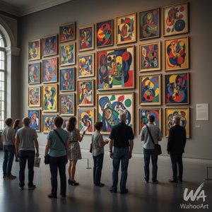
1949. Acrylic On Canvas, 229.0 x 112.0 cm.

§ 1Catalogue data
 Acrylic On Canvas
- WallArt
- Color Field Painting
 1949
1949 229.0 x 112.0 cm
Această lucrare este protejată de drepturile de autor
Lucrarea de artă afișată pe această pagină este protejată de legile privind drepturile de autor, ceea ce înseamnă că nu putem crea sau vinde în mod legal o reproducere identică. Această protecție este garantată prin acorduri internaționale, precum Convenția de la Berna și de legile naționale, inclusiv cele prevăzute de Legea dreptului de autor din S.U.A. – Titlul 17. Toate drepturile rezervate. Orice reproducere neautorizată este interzisă.
Ca alternativă respectuoasă și legală, oferim tablouri pictate manual, personalizate, inspirate de original. Artistii noștri experimentați și profesioniști studiază cu atenție stilul, starea de spirit și esența artistică a originalului pentru a crea o piesă nouă și unică, care evocă aceeași emoție – rămânând, în același timp, o creație originală în sine.
Această metodă respectă pe deplin reglementările privind drepturile de autor, deoarece nu implică copierea sau duplicarea operei protejate. În schimb, este o reinterpretare creativă – o pictură nouă, influențată de original, dar care nu este identică cu acesta.
 Citește mai mult
§ 2Abstract
Descriere obiect de colecție
Experience Mark Rothko's 'Untitled' (1949) – a vibrant color field painting showcasing red, green, yellow, and brown hues. Explore its emotional depth and minimalist design in this iconic work by the American abstract expressionist.
Biografie artist
Descoperă operele impresionante ale lui Mark Rothko (1903-1970), pionierul picturii Color Field și al expresionismului abstract! Explorează emoțiile profunde și moștenirea artistică a acestui artist emblematic.
§ 3Commentary
The Genesis of a Field: Mark Rothko's 1949 Untitled
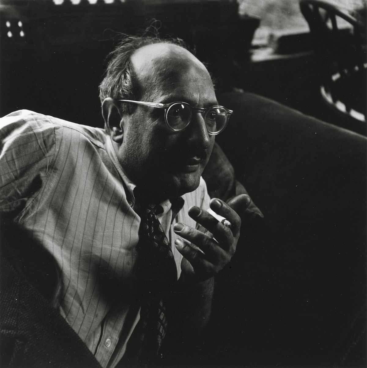
This captivating reproduction offers an intimate glimpse into one of the most significant works from Mark Rothko’s mature period, painted in 1949. At first glance, it appears deceptively simple – four distinct blocks of color: a vibrant red, a deep green, a sunny yellow, and a grounding brown – arranged across the canvas with an almost meditative precision. However, to reduce this piece to mere hues is to profoundly misunderstand Rothko’s revolutionary approach to abstraction. Born in Dvinsk (now Daugavpils), Latvia, in 1903, Mark Rothko's early life was shaped by displacement and a deep-seated sensitivity to human suffering – experiences that would become recurring themes in his art. His emigration to the United States in 1913, following the death of his father, marked a pivotal shift, yet the anxieties of assimilation and the lingering shadow of loss continued to inform his artistic vision. This particular painting, created during a period of intense experimentation with color and form, embodies Rothko’s core philosophy: to evoke profound emotional responses through the pure essence of color itself.
Color as Feeling: A Deeper Dive into Technique
Rothko’s technique is deceptively straightforward, yet incredibly complex in its execution. He applied the paint in thin layers, often building up multiple coats to achieve a luminous, almost velvety surface. Crucially, he avoided sharp edges or defined forms, opting instead for gradual transitions and blurred boundaries between the colors. This deliberate lack of definition isn’t an absence of detail; rather, it creates an immersive experience for the viewer – inviting them to lose themselves within the fields of color and allow their own emotions to resonate with the artwork. The pigments themselves were carefully chosen not just for their visual impact but also for their ability to interact optically, creating subtle shifts in hue and intensity as the light changes. Notice how the red seems to vibrate against the green, or how the yellow subtly bleeds into the brown – these are not merely aesthetic choices; they’re deliberate attempts to manipulate perception and evoke a specific emotional state.
The Language of Abstraction: Symbolism and Context
While Rothko vehemently resisted any attempt to interpret his paintings as representing concrete objects or narratives, there's no denying the profound symbolism embedded within these color fields. The choice of colors themselves is laden with meaning. Red often represents passion, energy, and even violence; green evokes nature, growth, and renewal; yellow symbolizes joy, optimism, and spirituality; and brown grounds the composition, suggesting stability and connection to the earth. The arrangement of these colors – the deliberate lack of hierarchy or focal point – suggests a state of equilibrium, a striving for harmony amidst existential uncertainty. This painting aligns with Rothko’s broader exploration of themes such as mortality, trauma, and the search for meaning—a quest that resonated deeply within his personal life and artistic practice. It's important to note that Rothko was part of the American Abstract Expressionist movement, a period marked by a shift away from representational art towards non-objective forms and an emphasis on subjective experience.
A Legacy in Light: The Rothko Chapel and Beyond
The influence of Mark Rothko extends far beyond this single painting. His work profoundly impacted the development of color field painting, inspiring generations of artists to explore the expressive potential of pure color. His later years were spent refining his style, culminating in monumental works like those installed at the Rothko Chapel in Houston, Texas – a space designed specifically to showcase and enhance the emotional impact of his paintings. The chapel’s octagonal shape and darkened interior create an environment that mirrors the contemplative atmosphere of Rothko's art, allowing viewers to fully immerse themselves in the experience. Reproductions like this offer a tangible connection to this extraordinary artist and his enduring legacy—a testament to the power of color to evoke profound emotion and transcend the boundaries of language.
Întrebări și răspunsuri
Care este dimensiunea și orientarea recomandate pentru printarea lucrării „Untitled”?
Pentru "Untitled", dimensiunea de imprimare recomandată este Medium, cu orientarea Tall.
Este "Untitled" reprezentativ pentru temele abordate de obicei de Mark Rothko?
"Untitled" înfățișează color palette, rothko, abstraction, geometry, red green yellow, emotional, 1949, latvia, în timp ce temele recurente ale lui Mark Rothko sunt jewish displacement, existentialism, color theory, trauma, abstract expressionism. Compararea celor două relevă modul în care această lucrare se raportează la subiectele obișnuite ale artistului.
Ce nuanță dominantă străbate întregul "Untitled" de Mark Rothko?
Culoarea dominantă a operei "Untitled" de Mark Rothko este Golden Yellow Range. Această nuanță constituie tonul de bază al paletei cromatice.


 Comută pe versiunea Print


 Pentru opere de artă sau reproduceri care depășesc 105 cm (aproximativ 41 de inch) pe oricare dintre laturi, cadrul va fi livrat demontat, sub formă de kit. Această metodă asigură o livrare sigură și previne deteriorarea în timpul transportului.