


 Predogled v realnem okolju
 Pošlji
 Deli
Deli
 Podrobnosti o delu
 Priročnik

 Prenesi sliko
 Podobni izdelki
 Rentgenski posnetek
 Predvajaj diaporama
 Q&A
Q&A Statistika
Chopinova pečat


 Preberi več
Umetniška dela, prikazana na tej strani, so zaščitena z avtorskimi pravicami, kar pomeni, da po zakonu ne moremo ustvarjati ali prodajati identičnih reprodukcij. Ta zaščita se izvaja v skladu z mednarodnimi sporazumi, kot so Bernska konvencija in po nacionalnih zakonih, vključno s tistimi, ki jih določa Zakon o avtorskih pravicah ZDA – naslov 17.
Ta način v celoti upošteva zakonodajo o avtorskih pravicah, saj ne vključuje kopiranja ali podvajanja zaščitenga umetniškega dela. Namesto tega gre za kreativno preinterpretacijo – novo sliko, ki je navdihnjen rezultat originala, vendar ni z njim identična.
Giclée tisk / Umetniški tisk
Giclée ali platnati odtis muzejske kakovosti z hitro proizvodnjo in prilagodljivimi možnostmi končne obdelave. ( Kupite ročno slikano delo Preklop na digitalno sliko)

P118B €10
P118H €10
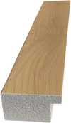
P118W €10
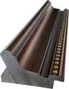
P438Z €10
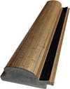
P508JH €12

P508YH €12

P805H €10
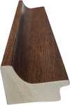
P805Z €10
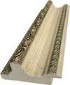
P919BZ €10
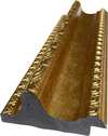
P919G €10
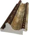
P919XJ €10
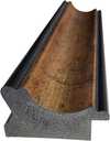
P959ZH €10
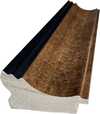
P968JZ €12

W106C €8
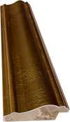
W218G €10

W218JH €8

W218Y €10
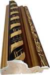
W307PJ €10

W316G €10
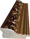
W316PJ €8
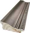
W316Y €10
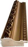
W398PJ €8
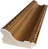
W4111J €10
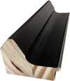
W500HY €15
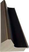
W500JH €15
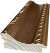
W692G €12
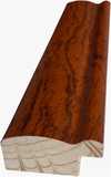
W849H €8
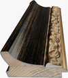
W940BG €15
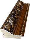
W953PJ €8

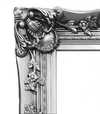
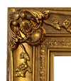
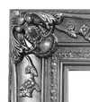
Izberite eno od naših vnaprej določenih velikosti, ki ustrezajo prvotnim proporcijam umetničkega dela.

Vnesite širino in višino, ki jih potrebujete za svoj okvir ali steno. Tiskanje se lahko le odreže, vendar ga ni mogoče narediti večjega od slike, zato format z drugačno obliko pomeni izgubo dela slike. Pred tiskanjem vam pošljemo digitalni predogled za potrditev. Slika, prikazana na tej strani, ne prikazuje dejanskega izrezka — le predogled to omogoča.
Globalna dostava () v 2 tednih namesto standardnih 4/5 tednov. (31 oktober)

Brezplačna ekspresna dostava po vsem svetu

Visokokakovostno laneno platno

Popolno zavarovanje pošiljke

Garancija povračila carine in uvoznih davkov

Garancija popolnega barvnega ujemanja

100-dnevna politika vračil (le v primeru okvar)

Garancija 100% povračila denarja

Popust pri večjem naročilu
 Možnost stekla je na voljo le za velikosti pod 110 cm

Chopinova pečat
Giclée tisk / Umetniški tisk
Velikost reprodukcije
-


Skupna cena
€ 57
Chopin Stamp Design - Leon Urbanski: A Legacy of Polish Typography
Leon Urbanski (1926 – 1998) stands as a monumental figure in the history of Polish graphic design and typography, shaping the visual landscape of his nation for decades. Born in Tarnów, Poland, Urbanski’s artistic journey began amidst the turbulent backdrop of post-war Europe, fostering an unwavering dedication to craftsmanship and innovation that would define his prolific career. He wasn't merely a designer; he was a storyteller who meticulously crafted images and lettering to convey meaning and emotion—a legacy that continues to inspire contemporary artists. Early Influences & Artistic Formation Urbanski’s formative years were marked by exposure to European avant-garde movements, particularly Surrealism and Constructivism. These influences instilled in him a belief in experimentation and a rejection of decorative excess, prioritizing clarity and functionality as guiding principles. Studying at Kraków Academy of Fine Arts honed his skills and cemented his commitment to exploring new visual languages. This intellectual curiosity would permeate his entire artistic output, resulting in designs that were both aesthetically striking and conceptually profound. The Chopin Stamp Design: A Singular Vision The “Chopin stamp design” represents Urbanski’s most recognizable achievement—a project that encapsulates the essence of his stylistic approach. It's more than just a logo; it’s an embodiment of Polish cultural heritage, skillfully rendered in a technique that speaks volumes about Urbanski’s artistic sensibilities. The commission itself demanded precision and subtlety, reflecting the values he championed throughout his career: intellectual rigor combined with aesthetic elegance. Technique & Innovation – Halftone Printing as Illusion Urbanski's mastery lay in harnessing innovative printing methods to achieve remarkable visual effects. Specifically, he employed halftone printing—a technique that utilizes varying densities of dots to simulate tonal gradations and create depth without resorting to color. This method, rooted in the principles of illusionism, allowed Urbanski to capture the nuances of Delacroix’s portrait with breathtaking accuracy. The preparatory drawing reveals a detailed examination of this process, demonstrating Urbanski's meticulous attention to technical detail—a hallmark of his artistic practice. Symbolic Resonance & Emotional Impact Beyond its formal qualities, the Chopin stamp design carries significant symbolic weight. Urbanski deliberately chose monochrome – black and white – to evoke a sense of timelessness and nostalgia, referencing historical printing traditions while simultaneously emphasizing the purity of form. The circular frame surrounding the portrait symbolizes unity and completeness, mirroring the enduring spirit of Chopin’s music—a connection that Urbanski skillfully conveyed through his design choices. Ultimately, the artwork invites contemplation on themes of heritage, memory, and artistic expression. Conclusion: An Enduring Influence Leon Urbanski's contribution to Polish graphic art is undeniable. His unwavering dedication to craftsmanship, coupled with his intellectual curiosity and stylistic innovation—particularly his masterful use of halftone printing—established him as a pioneer whose influence continues to resonate today. The Chopin stamp design stands as a testament to his artistic vision—a beautiful reminder that true artistry lies in capturing not just what is seen but also what is felt.Vprašanja in odgovori
Kakšna barvna paleta je uporabljena v delu "Chopinova pečat" avtorja Leon Urbanski?
Paleta dela "Chopinova pečat" avtorja Leon Urbanski je opisana kot Nevtralne barve, kar predstavlja jedinkaven povzetek barv v tem delu.
Katera barva prevladuje v kompoziciji dela "Chopinova pečat" avtorja Leon Urbanski?
Prevladujoča barva dela "Chopinova pečat" avtorja Leon Urbanski je Bež s sivim odtenkom (#e2dbd1).
Ali so barve dela "Chopinova pečat" živahne ali utemeljene?
Barvna zasičenost dela "Chopinova pečat" znaša Zamegljeno, njegova intenzivnost pa je Monokromatski.
Sorodna umetniška dela


Biografija umetnika
The Architect of Polish Typography
Leon Urbanski (1926 – 1998) stands as a monumental figure in the history of Polish graphic design and typography, shaping the visual landscape of his nation for decades. Born in Tarnów, Poland, Urbanski’s artistic journey began amidst the turbulent backdrop of post-war Europe, fostering an unwavering dedication to craftsmanship and innovation that would define his prolific career. He was far more than a mere designer; he was a storyteller who meticulously crafted images and lettering to convey profound meaning and emotion—a legacy that continues to inspire contemporary artists today.
His formative years were deeply marked by exposure to the powerful currents of European avant-garde movements, particularly Surrealism and Constructivism. These influences instilled in him a lifelong belief in experimentation and a resolute rejection of decorative excess, prioritizing clarity, functionality, and structural integrity as his guiding principles. While studying at the Kraków Academy of Fine Arts, he honed his skills in painting and drawing, gaining a foundational understanding of visual composition that would later breathe life into his typographic endeavors. Notably, Urbanski collaborated closely with Leon Kozłowski, another prominent Polish artist and educator, whose mentorship solidified Urbanski's commitment to intellectual rigor alongside aesthetic sensitivity.
A Mastery of Form and Function
Urbanski’s true brilliance resided in his unparalleled mastery of typography, where he transformed the printed word into a visual experience. He embarked on a remarkable career designing over 200 books—a staggering accomplishment that cemented his reputation as Poland's foremost book designer. His approach was never simply about the arrangement of text; rather, it was about creating a rhythmic, visual dialogue between words and images, reflecting the unique spirit of each project with meticulous attention to detail. Renowned publishers such as Ossolineum, Państwowy Instytut Wydawniczy, Wydawnictwo Iskry, Wydawnictwo Czytelnik, and Nasza Księgarnia all benefited immensely from his expertise, commissioning him to create works that were as intellectually profound as they were aesthetically striking.
In his more ephemeral works, Urbanski demonstrated a remarkable ability to elevate even the smallest medium. His collection of over 100 low-circulation ephemera—including invitations, programs, and greeting cards created between the early 1960s and the early 1990s—serves as a testament to his versatility. Many of these pieces were commissioned for high-level diplomatic meetings and international delegations, making them rare historical documents that capture the social and organizational fabric of Poland during that era. In these works, he often drew upon Renaissance printing traditions and utilized the ancient Greek principle of the "golden ratio," ensuring that even a simple invitation possessed a timeless, classical harmony.
The Chopin Stamp: A Singular Vision
Perhaps his most celebrated achievement is the Chopin Stamp Design, a project commissioned by the Fryderyk Chopin Institute in Warsaw. This artwork encapsulates the very essence of his stylistic approach, demanding a delicate balance between honoring Poland's musical heritage and communicating its ethereal spirit through visual representation. To achieve this, Urbanski skillfully employed a monochrome halftone technique, mirroring the muted, nostalgic tones found in vintage printing processes. This method allowed him to create an illusionistic detail that felt both modern and deeply rooted in artistic tradition.
The historical significance of Leon Urbanski lies in his ability to bridge the gap between fine art and functional design. His work remains a cornerstone of Polish graphic identity, characterized by:
- Intellectual Rigor: A commitment to clarity and the rejection of unnecessary ornamentation.
- Technical Innovation: The masterful use of halftone printing and typographic experimentation.
- Cultural Preservation: The integration of classical proportions and historical printing traditions into modern graphic language.
- Narrative Depth: The ability to treat every letterform and image as a vital component of a larger story.

Leon Urbanski
1926 - 1998 , Poland
Hitri podatki
- Full Name: Leon Urbanski
- Nationality: Polish
- Date Of Birth: 1926
- Date Of Death: 1998
- Place Of Birth: Tornow, Poland
- Notable Artworks: ['Chopin stamp design']
- Artistic Movement Or Style: Graphic Design
- Artists Who Influenced This Artist: ['Leon Kozłowski']
- Artists Or Movements Influenced By This Artist: ['Léon Bakst']
Sorodni članki

Timeless Elegance: A Procurement Guide to Sourcing Vintage-Style Artworks for Large-Scale Commercial Projects
Streamline large-scale commercial decor with professional art procurement solutions. Discover expert strategies for sourcing vintage-style oil reproductions, bulk orders, and custom multi-panel artworks designed for hotels, restaurants, and corporate spaces.


