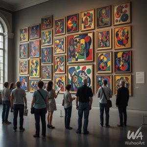
1951. Oil On Canvas.

§ 1Katalogovni podatki


To umetniško delo je zaščiteno z avtorskimi pravicami
Umetniška dela, prikazana na tej strani, so zaščitena z avtorskimi pravicami, kar pomeni, da po zakonu ne moremo ustvarjati ali prodajati identičnih reprodukcij. Ta zaščita se izvaja v skladu z mednarodnimi sporazumi, kot so Bernska konvencija in po nacionalnih zakonih, vključno s tistimi, ki jih določa Zakon o avtorskih pravicah ZDA – naslov 17.
Kot spoštljiva in zakonita alternativa ponujamo prilagojena, ročno slikana umetniška dela, navzornena na original. Naši sposobni in profesionalni umetniki skrbno preučijo stil, vzdušje in umetniško bistvo originala, da ustvarijo novo, edinstveno delo, ki vzbudi enak občutek – pri čemer ostaja popolnoma nova, samostojna izvirna stvar.
Ta način v celoti upošteva zakonodajo o avtorskih pravicah, saj ne vključuje kopiranja ali podvajanja zaščitenga umetniškega dela. Namesto tega gre za kreativno preinterpretacijo – novo sliko, ki je navdihnjen rezultat originala, vendar ni z njim identična.
 Preberi več
§ 2Abstraktno
Opis zbirateljskega predmeta
No.18 by Mark Rothko – A striking color field painting featuring layered hues of red, white, and orange, created in 1951 amidst the backdrop of Latvian Jewish heritage.
Biografija umetnika
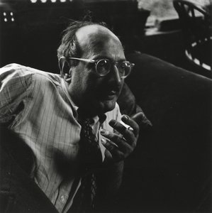
Mark Rothko (1903-1970) je bil ameriški slikar, znan po svojih barvnih poljih in prispevku k abstraktnem ekspresionizmu. Odkrijte čustveno globino njegovih del, kot so Seagram Murals in Rothko Chapel, ter njegovo pomembnost v moderni umetnosti.
§ 3Komentacija
A Symphony of Saturated Silence
Mark Rothko’s No.18 stands as a profound testament to the enduring power of color field painting, a movement that fundamentally revolutionized artistic expression in the mid-20th century. Created in 1951, this monumental canvas embodies Rothko's signature approach: the deliberate layering of saturated hues onto a textured surface to evoke a deep, visceral emotional resonance. To gaze upon No.18 is to enter a space where the boundaries between the viewer and the canvas begin to dissolve. The painting eschews traditional representational imagery, opting instead for amorphous, bleeding rectangles of crimson red and luminous white that seem to pulse with a life of their own. This technique was never merely about visual aesthetics; it was a conscious effort by Rothko to bypass intellectual analysis and tap directly into the subconscious mind, inviting a sensory engagement that transcends the spoken word.
The technical mastery behind this piece lies in its subtle, tactile complexity. Through the application of multiple coats of oil paint, Rothko achieved a surface depth that invites the eye to wander through layers of light and shadow. The composition is dominated by a striking contrast: a powerful red area commands the left side of the frame, bleeding softly into a vast expanse of white that covers much of the right. A sudden, unexpected flicker of orange in the top right corner provides a momentary spark of warmth, breaking the tension between the primary tones. This interplay of color and texture creates a breathing, living organism of paint, making it an extraordinary centerpiece for any collection or a sophisticated focal point in a thoughtfully curated interior.
Echoes of History and Spiritual Yearning
To understand the gravity of No.18, one must look toward the historical landscape from which it emerged. The painting was birthed in the aftermath of World War II, an era defined by widespread disillusionment and a global sense of existential questioning. Rothko himself carried a profound personal history of loss—most notably the death of his father in 1937—which fueled his lifelong preoccupation with themes of mortality and spiritual yearning. These themes, deeply rooted in Jewish mysticism, find their way into the very fabric of the canvas. The painting serves as a bridge between the trauma of the post-war world and a search for transcendence.
The symbolism within the work is both universal and deeply personal. The choice of red and white is far from arbitrary; it reflects Rothko's belief in the primal language of color. Red symbolizes passion, vitality, and the raw energy of human existence, while the expansive white represents purity, light, and spiritual illumination. Together, they create a dialectic between the earthly and the divine, the heavy and the ethereal. For collectors and designers alike, No.18 offers more than just visual beauty; it offers an invitation to contemplation. It is a piece that demands presence, making it an ideal acquisition for those seeking to infuse their spaces with a sense of profound peace, intellectual depth, and timeless elegance.
Vprašanja in odgovori
Kakšen občutek izraža "No.18" avtorja Mark Rothko?
Zapisani vzdušje dela "No.18" avtorja Mark Rothko je Serene, njegov čustveni ton pa je Reflective.
Ali so barve dela "No.18" avtorja Mark Rothko nasičene ali utemeljene?
Barve dela "No.18" avtorja Mark Rothko imajo Clear Color Presence zasičenost. Zasičenost opisuje, kako živahne ali utišane so barve.
Iz katerega obdobja izvira "No.18"?
Delo "No.18" avtorja Mark Rothko izvira iz obdobja Modern, ki predstavlja zgodovinski kontekst umetninine.


 Preklop na tiskanine


 Za umetniška dela ali reprodukcije, ki so po katerikoli strani širše od 105 cm (približno 41 palč), bo okvir poslan v razstavljeni obliki kot komplet. Ta metoda zagotavlja varno dostavo in preprečuje poškodbe med transportom.