Jamstvo za povračilo denarja · 100 dni Brezplačna svetovna dostava
449.581umetninine 30.617umetniki 4.705muzeji 32jeziki
Valuta
    Jezik
      Atelje · Zakor. 2015 · Pariz, Francija
      AllPaintingsStore
      allpaintingsstore.com
      Preverite v realnem okolju Predogled v AR Preklop na tiskanine Preklop na digitalno sliko Pošlji kot čestitko
      Podrobnosti Priročnik Dodaj v priljubljene Prenesi Podobni artefakti Rentgenski posnetek Predvajaj diaporama Statistika

      Red and Orange

      Experience Mark Rothko's 'Red and Orange': A vibrant color field masterpiece evoking passion & emotion through bold hues & textured canvas. Explore its legacy & artistic significance.

      Mark Rothko (1903-1970) je bil ameriški slikar, znan po svojih barvnih poljih in prispevku k abstraktnem ekspresionizmu. Odkrijte čustveno globino njegovih del, kot so Seagram Murals in Rothko Chapel, ter njegovo pomembnost v moderni umetnosti.

      Umetniška dela, prikazana na tej strani, so zaščitena z avtorskimi pravicami, kar pomeni, da po zakonu ne moremo ustvarjati ali prodajati identičnih reprodukcij. Ta zaščita se izvaja v skladu z mednarodnimi sporazumi, kot so Bernska konvencija in po nacionalnih zakonih, vključno s tistimi, ki jih določa Zakon o avtorskih pravicah ZDA – naslov 17.

      Kot spoštljiva in zakonita alternativa ponujamo prilagojena, ročno slikana umetniška dela, navzornena na original. Naši sposobni in profesionalni umetniki skrbno preučijo stil, vzdušje in umetniško bistvo originala, da ustvarijo novo, edinstveno delo, ki vzbudi enak občutek – pri čemer ostaja popolnoma nova, samostojna izvirna stvar.

      Ta način v celoti upošteva zakonodajo o avtorskih pravicah, saj ne vključuje kopiranja ali podvajanja zaščitena umetniškega dela. Namesto tega gre za kreativno preinterpretacijo – novo sliko, ki je navdihnjen rezultat originala, vendar ni z njim identična.

      Ročno izdelana oljna reprodukcija

      Ročno slikano olje na platnu v vaši izbiri velikosti in okvirja, izdelano po naročilu naših umetnikov. ( Preklop na tiskanine Preklop na digitalno sliko)

      Corner sample of the P118B picture frame: izoblit polistiren, 5 cm wide and 3 cm thick
      P118B 10
      Corner sample of the P118H picture frame: izoblit polistiren, 5 cm wide and 3 cm thick
      P118H 10
      Corner sample of the P118W picture frame: izoblit polistiren, 5 cm wide and 3 cm thick
      P118W 10
      Corner sample of the P438Z picture frame: izoblit polistiren, 5.5 cm wide and 3.5 cm thick
      P438Z 10
      Corner sample of the P508JH picture frame: izoblit polistiren, 7 cm wide and 3.5 cm thick
      P508JH 12
      Corner sample of the P508YH picture frame: izoblit polistiren, 7 cm wide and 3.5 cm thick
      P508YH 12
      Corner sample of the P805H picture frame: izoblit polistiren, 5 cm wide and 3.5 cm thick
      P805H 10
      Corner sample of the P805Z picture frame: izoblit polistiren, 5 cm wide and 3.5 cm thick
      P805Z 10
      Corner sample of the P919BZ picture frame: izoblit polistiren, 7 cm wide and 3.5 cm thick
      P919BZ 10
      Corner sample of the P919G picture frame: izoblit polistiren, 7 cm wide and 3.5 cm thick
      P919G 10
      Corner sample of the P919XJ picture frame: izoblit polistiren, 7 cm wide and 3.5 cm thick
      P919XJ 10
      Corner sample of the P959ZH picture frame: izoblit polistiren, 5 cm wide and 3 cm thick
      P959ZH 10
      Corner sample of the P968JZ picture frame: izoblit polistiren, 6 cm wide and 4 cm thick
      P968JZ 12
      Corner sample of the W106C picture frame: masivno drevo, 5 cm wide and 3 cm thick
      W106C 8
      Corner sample of the W218G picture frame: masivno drevo, 5 cm wide and 3 cm thick
      W218G 10
      Corner sample of the W218JH picture frame: masivno drevo, 5 cm wide and 3 cm thick
      W218JH 8
      Corner sample of the W218Y picture frame: masivno drevo, 5 cm wide and 3 cm thick
      W218Y 10
      Corner sample of the W307PJ picture frame: masivno drevo, 6 cm wide and 3 cm thick
      W307PJ 10
      Corner sample of the W316G picture frame: masivno drevo, 6 cm wide and 3 cm thick
      W316G 10
      Corner sample of the W316PJ picture frame: masivno drevo, 6 cm wide and 3 cm thick
      W316PJ 8
      Corner sample of the W316Y picture frame: masivno drevo, 6 cm wide and 3 cm thick
      W316Y 10
      Corner sample of the W398PJ picture frame: masivno drevo, 5 cm wide and 3 cm thick
      W398PJ 8
      Corner sample of the W4111J picture frame: masivno drevo, 6.5 cm wide and 3.5 cm thick
      W4111J 10
      Corner sample of the W500HY picture frame: masivno drevo, 7 cm wide and 5 cm thick
      W500HY 15
      Corner sample of the W500JH picture frame: masivno drevo, 7 cm wide and 5 cm thick
      W500JH 15
      Corner sample of the W692G picture frame: masivno drevo, 8 cm wide and 4 cm thick
      W692G 12
      Corner sample of the W849H picture frame: masivno drevo, 5 cm wide and 3 cm thick
      W849H 8
      Corner sample of the W940BG picture frame: masivno drevo, 7.5 cm wide and 4.5 cm thick
      W940BG 15
      Corner sample of the W953PJ picture frame: masivno drevo, 6 cm wide and 3.5 cm thick
      W953PJ 8

      Standardna velikost
      po meri
      CM
      INCH

      Izberite eno od naših vnaprej določenih velikosti, ki ustrezajo prvotnim proporcijam umetničkega dela.

      širina
      višina

      Svoje dimenzije lahko vnesete tako, da se prilagodite določenemu okvirju ali prostoru. Če izbrana velikost ne ustreza razmerjem originalne slike, bomo umetniško delo obrezali ali sliko dopolnili z dodatnimi ročno naslikanimi elementi. Pred začetkom proizvodnje vam bo poslan digitalni osnutek v odobritev.
      Upoštevajte, da predogled na zaslonu ne odraža dejanskega obrezovanja ali podaljšanja. Le osnutek bo natančno prikazal končno kompozicijo.
      Čeprav so na voljo velikosti po meri, priporočamo izbiro dimenzije s preddefiniranega seznama, da ohranimo originalne razmere.

      Primeri možnih sprememb: Zamenjava obraza s fotografijo stranke; Dodajanje hišnega ljubljenčka (npr. zamenjava mačke s psom); Vključitev skritega sporočila v ozadje; Sprememba pokrajine ali elementov v ozadju.
      Po oddaji naročila bo ekipa AllPaintingsStore.com stranki po e-pošti poslala navodila in predogled digitalnega predogleda.

      Mednarodna dostava () v 3/4 tednih namesto običajnih 5 tednov. (13 oktober). Brez kompromisov pri kakovosti.

      Brezplačna ekspresna dostava po vsem svetu
      Visokokakovostno laneno platno
      Popolno zavarovanje pošiljke
      Garancija povračila carine in uvoznih davkov
      Garancija popolnega barvnega ujemanja
      Politika vračila v 100 dneh (le v primeru okvar)
      Garancija 100% povračila denarja
      Popust pri večjem naročilu

      Skupna cena

      € 222

      Red and Orange

      Tehnika reprodukcije

      Velikost reprodukcije

      -

      Skupna cena

      € 222

      Hitri podatki

      • Artist: Mark Rothko
      • Location: Various collections
      • Medium: Oil on canvas
      • Artistic style: Color field painting
      • Movement: Abstract Expressionism

      Kviz o umetnosti

      Pri vsakem vprašanju je na voljo le eden pravilen odgovor.

      Vprašanje 1:
      What is the primary movement to which Mark Rothko’s ‘Red and Orange’ belongs?
      Vprašanje 2:
      Which of the following best describes the dominant color scheme in ‘Red and Orange’?
      Vprašanje 3:
      The texture of ‘Red and Orange’ is characterized by:
      Vprašanje 4:
      According to the text, what did Rothko believe his paintings could evoke?
      Vprašanje 5:
      What technique did Rothko use to achieve the luminosity often associated with his color field paintings?

      Red and Orange: A Journey Through Rothko’s Emotional Landscape

      Mark Rothko, one of the towering figures of 20th-century art, didn't simply paint pictures; he crafted portals into the depths of human emotion. His work, particularly pieces like ‘Red and Orange,’ invites a profound engagement, demanding that we surrender to its quiet intensity rather than seeking immediate visual gratification. This painting, a cornerstone of his mature style, exemplifies Rothko’s revolutionary approach to color field abstraction – a deliberate move away from representational imagery towards pure feeling expressed through the luminous interaction of hues. It's a piece designed not to be ‘looked at,’ but *felt*. The genesis of ‘Red and Orange’ lies within the vibrant, yet turbulent, context of Abstract Expressionism, a movement that emerged in post-war America as artists sought new ways to grapple with the anxieties and uncertainties of the time. Rothko, however, forged his own distinct path within this broad movement. He wasn't interested in grand gestures or dramatic narratives; instead, he focused on distilling emotion into its most elemental form – color itself. His technique involved applying layers upon layers of oil paint, often mixed with turpentine to achieve a remarkable luminosity and subtle textural variations. The canvas isn’t merely a surface for pigment; it becomes an active participant in the creation of atmosphere, absorbing and reflecting light in ways that subtly shift the painting's mood throughout the day. Notice the delicate blending at the heart of the composition – a deliberate ambiguity that encourages contemplation rather than definitive interpretation. The painting’s structure is deceptively simple: two dominant rectangles of color—a rich, pulsating red on the left and an equally vibrant orange on the right—are juxtaposed within a larger field of muted tones. However, this apparent simplicity belies a complex interplay of visual and emotional forces. Rothko wasn't simply placing colors side-by-side; he was creating a dynamic tension between them, suggesting both harmony and discord. The red, often associated with passion, energy, and even danger, dominates the left portion of the canvas, while the orange—linked to warmth, optimism, and vitality—takes precedence on the right. This division isn’t rigid or absolute; rather, it creates a sense of movement and flow as the eye travels across the surface, drawn into the merging point where the two colors meet. The subtle gradations within each rectangle, achieved through meticulous layering and blending, add depth and complexity to the composition, preventing it from feeling flat or static. Rothko’s intention wasn't to depict a specific scene or object but to evoke universal human emotions – tragedy, ecstasy, doom—as he famously articulated in his writings. In ‘Red and Orange,’ the bold hues can be interpreted as symbols of these fundamental experiences. The intensity of the red might represent moments of profound sorrow or struggle, while the warmth of the orange suggests hope, joy, or a sense of transcendence. It’s important to recognize that Rothko deliberately avoided providing viewers with easy answers; he wanted them to project their own feelings and associations onto the canvas, creating a deeply personal experience. The painting becomes a mirror reflecting our own inner landscape. The legacy of ‘Red and Orange,’ and indeed of Mark Rothko's entire body of work, is undeniable. His color field paintings have profoundly influenced generations of artists, from abstract expressionists to contemporary painters exploring the expressive potential of color. Reproductions of this piece offer a remarkable opportunity to bring Rothko’s emotional intensity into any space, transforming interiors into contemplative sanctuaries. Consider how the rich hues interact with your existing décor – will they enhance the sense of warmth and tranquility, or add a touch of dramatic tension? The choice is yours, but one thing is certain: ‘Red and Orange’ remains a powerful testament to the transformative power of art.

      The Artistic Movement: Abstract Expressionism and Rothko's Place Within It

      Rothko’s work stands as a pivotal contribution to Abstract Expressionism, a movement that fundamentally shifted the focus of American art away from representational imagery towards subjective experience and emotional expression. Emerging in the aftermath of World War II, Abstract Expressionism was characterized by its emphasis on spontaneity, gesture, and the artist's inner world. Artists like Jackson Pollock, Willem de Kooning, and Barnett Newman sought to capture the raw energy and anxieties of the post-war era through large-scale canvases and unconventional techniques. However, Rothko distinguished himself from his contemporaries with his deliberate restraint and focus on color as a primary means of communication. Unlike the gestural brushstrokes favored by Pollock or the fragmented figures of de Kooning, Rothko’s paintings are defined by their smooth, almost meditative surfaces. He rejected the notion of the artist's hand as a visible element in the work, striving instead to create an illusion of seamlessness and luminosity. This pursuit of pure color was deeply influenced by his interest in spirituality and Eastern philosophy, which he believed could provide access to profound emotional states. Rothko’s paintings aren’t about depicting something; they *are* the feeling itself – a distillation of experience rendered in pigment and light. The influence of earlier artistic traditions is also evident in Rothko's work. He drew inspiration from Byzantine icons, which are characterized by their flattened forms, luminous colors, and symbolic content. Similarly, he was fascinated by the color theories of Goethe, who proposed that colors could be understood as having specific psychological effects. Rothko’s use of complementary colors – red and orange in ‘Red and Orange,’ for example – is a deliberate attempt to create visual tension and evoke particular emotional responses. He wasn't simply arranging colors on a canvas; he was conducting an experiment in color psychology, seeking to harness the power of hue to communicate profound human experiences.

      The Painting: 'Red and Orange' - A Detailed Examination

      ‘Red and Orange’ is a prime example of Rothko’s distinctive technique and his unwavering commitment to expressing emotion through color. The painting measures approximately 39 ½ x 31 ¾ inches (100.5 x 80.6 cm), a size that allows the colors to dominate the viewer's field of vision, creating an immersive experience. As mentioned previously, the composition is built around two rectangular fields of color: a deep, saturated red on the left and a vibrant orange on the right. These rectangles are not sharply defined; rather, they bleed into one another at their edges, creating a sense of fluidity and ambiguity. The layering technique employed by Rothko is crucial to understanding the painting’s luminosity. He applied multiple thin layers of oil paint, often mixed with turpentine to achieve a translucent effect. This process allowed light to penetrate through the pigments, creating an almost ethereal glow. The texture of the canvas itself plays a significant role in this effect – it's subtly uneven and slightly rough, adding depth and complexity to the surface. Notice how the red seems to vibrate and pulsate within its rectangular frame, while the orange radiates warmth and vitality. The subtle variations in color intensity are also noteworthy. Rothko didn’t simply apply a uniform shade of red or orange; he carefully modulated the hues throughout each rectangle, creating areas of lighter and darker tones. This technique adds depth and dimension to the composition, preventing it from feeling flat or static. The blending at the point where the two colors meet is particularly intriguing – it creates a sense of ambiguity and suggests that the painting is in a state of constant flux. It’s as if the red and orange are merging and separating simultaneously, reflecting the complexities of human emotion.

      Emotional Resonance: Rothko's Pursuit of Universal Feeling

      Rothko believed that color possessed the power to evoke profound emotional responses in viewers – tragedy, ecstasy, doom—as he himself articulated. He wasn’t interested in creating beautiful or aesthetically pleasing paintings; his primary goal was to communicate these fundamental human experiences directly and without mediation. This conviction stemmed from his belief that art could serve as a bridge between individuals, fostering empathy and understanding. The success of ‘Red and Orange,’ and indeed of Rothko's entire body of work, lies in its ability to tap into these universal emotions. The painting doesn’t require any specific interpretation or explanation; it simply *is* – a luminous field of color that invites the viewer to contemplate their own feelings and associations. It’s not uncommon for people to experience tears or a sense of profound emotion when viewing Rothko's paintings, suggesting that he has succeeded in creating works that resonate deeply with our shared human condition. Rothko’s approach was radical for its time, challenging traditional notions of art as representation and inviting viewers to engage with the work on an emotional level. His paintings are not meant to be ‘looked at’; they are meant to be *felt*. They are a testament to the transformative power of color and a profound exploration of the human psyche.

      Vprašanja in odgovori

      Kakšen občutek vzbudi "Red and Orange" avtorja Mark Rothko?

      "Red and Orange" avtorja Mark Rothko izraža Melanholičen občutek znotraj splošnega Mirnovolno vzdušja.

      Kakšen je splošni vzduh dela "Red and Orange" avtorja Mark Rothko?

      "Red and Orange" ima Mirnovolno vzdušje.

      Kakšna je percepcija svetlobe pri delu "Red and Orange" avtorja Mark Rothko?

      Zaznavana svetlina dela "Red and Orange" avtorja Mark Rothko je senča. Lahko se prilagodi svetlobi v namenjenem prostoru.

      Ali so barve dela "Red and Orange" avtorja Mark Rothko živahne ali utemljene?

      Barve dela "Red and Orange" avtorja Mark Rothko prikazujejo Živahna barva zasičenost z intenzivnostjo Živopisno.

      Ali je "Red and Orange" avtorja Mark Rothko slika, risba ali grafika?

      "Red and Orange" avtorja Mark Rothko je razvrščeno v kategorijo Stenska umetnost. Ta kategorija opisuje vrsto umetniškega dela, da je original.

      Kakšno vzdušje bi v prostor prineslo "Red and Orange"?

      "Red and Orange" avtorja Mark Rothko ima Mirnovolno vzdušje in se priporoča za Dnevna soba. Razpoloženje je tisto, kar delo vnese v okoliški prostor.

      V katero umetnostno smernico in v katero dobo je uvrščeno delo "Red and Orange" avtorja Mark Rothko?

      "Red and Orange" avtorja Mark Rothko uvrščamo v smer Abstract Expressionism, v obdobje Moderna doba svojega ustvarjalca.

      Kolikšno je intenzivno barvno dojemanje v delu "Red and Orange" avtorja Mark Rothko?

      "Red and Orange" avtorja Mark Rothko prikazuje Živopisno intenzivnost barv.


      Biografija umetnika

      Mark Rothko: Barva, Čustvo in Iskanje Duše

      Mark Rothko, rojen kot Markus Yakovlevič Rotkovič v Daugavpilsu, Latviji, leta 1903, je bil slikar, katerega življenje in delo sta globoko prepleteni z iskanjem smisla, čustvene izraznosti in duhovne transcendence. Že zgodnja leta so bila zaznamovana s negotovostjo in strahovi, ki so jih prinašali antisemitizem in politična nestabilnost v njegovem rodu. Emigracija v Portland, Oregon, leta 1913 je predstavljala kulturni šok, a hkrati tudi začetek potovanja, ki ga je vodilo k umetnosti kot sredstvu za raziskovanje človeške duše. Čeprav je študiral na Yaleu, se je Rothko kmalu odločil slediti svoji strasti in se preselil v New York, kjer je obiskoval Art Students League. Te začetne izkušnje so oblikovale njegovo razumevanje sveta in ga usmerile k umetnosti kot sredstvu za izražanje globih čustev, ki jih je nosil v sebi.

      Od Figurativizma do Abstraktnega Ekspresionizma: Evolucija Stil

      Rothkovo zgodnje delo se je opiralo na figurativno slikanje, prikazujoč mestne prizore in portrete z natančnostjo in pozornostjo do podrobnosti. Vendar pa so že takrat v njegovih slikah sijoči psihološki odtenki, ki napovedujejo njegovo kasnejšo abstraktno pot. Z nastopom druge svetovne vojne se je Rothkovo umetniško razumevanje začelo dramatično spreminjati. Vpliv surrealizma in mitologije ga je spodbudil k premiku stran od reprezentacije, da bi izrazil univerzalna človeška čustva skozi simbolične oblike. Ta prelomnica se je pokazala v nastajanju večplastnih slik – platnes, poslikanih z nedoločenimi, biomorfnimi oblikami, ki so se zdile kot lebdeče med figuracijo in abstrakcijo. Te slike niso bile le eksperimenti z obliko; temveč globoko čustvene odzive na negotovost in strahove vojne. Do konca štiridesetih let je Rothko dosegel svoj prepoznavni slog: platna velikega formata, poslikana s pravokotnimi bloki barv, ki so se zdela lebdeti in resonirati drug z drugim. Odstranil je vse sledove prepoznave, da bi se osredotočil na čisti čustveni vpliv barve in oblike. To je zaznamovalo ključni trenutek v razvoju abstraktnega ekspresionizma in Rothka uveljavilo kot vodilno figuro tega revolucionarnega gibanja.

      Barvna Polja in Duhovna Potovanja

      Rothkovo zrelo delo je definirano s pojmom "barvnih polj" – obsežnimi prostori svetleče barve, ki obdajo gledalca v imersivni izkušnji. Te slike niso o tem, *kaj* prikazujejo, ampak o tem, *kakšne* čustve sprožajo. Rothko je verjel, da bi morala umetnost angažirati gledalca visceralno, obide intelektualno analizo in govoriti neposredno s čusti. Skrbno je nanašal tanke plasti barve, ustvarjaje subtilne variacije v tonu in teksturi, ki so se zdile izvirati iz platna samega. Robovi njegovih pravokotnih oblik so pogosto zamegljeni, kar omogoča njihovo mešanje in interakcijo, s čimer ustvarja občutek globine in gibanja. Rothko je namerno izogibal imenovanju slik razen številk – "Št. 1", "Št. 6" – da bi spodbudil gledalce, naj se soočijo z deli brez predhodnih zamisli in naj vodijo svoje čustvene odzive. Hotel je ustvariti prostor za kontemplacijo, zatočišče, kjer se lahko gledalci povežejo s čim večjim kot so sami. Njegov cilj ni bil nič manj kot izzvati globoke duhovne izkušnje skozi jezik barve.

      Pomembni Dosežki in Trajna Zapuščina

      Med Rothkovimi najpomembnejšimi dosežki sta "Št. 10 (1950)", ključno delo, ki uteleša njegovo razvijajočo se zvrst, in Seagram Murals (1958). Ko so bili naročeni za restavracijo Four Seasons v New Yorku, jih je Rothko kmalu zavrnil, saj je menil, da bodo ogroženi s predvidenim okoljem. Namesto tega jih je podaril Tate Gallery v Londonu, kjer še danes navdihujejo občudovanje in kontemplacijo. Morda njegov najambicioznejši projekt pa je bila Rothko Chapel (1971) v Houstonu, Texas – neverniška svetišče, ki gosti štirinajst njegovih slik. Zasnovana kot prostor za tiho razmišljanje, kapela velja za svet pri mnogih in uteleša Rothkovo prepričanje o duhovni moči umetnosti. Rothkov vpliv na naslednje generacije umetnikov je bil ogromen. Odprl je pot minimalističnemu slikarstvu in še danes navdihuje sodobne slikarske ustvarjalce, ki raziskujejo čustvene možnosti abstrakcije. Kljub dolgotrajni depresiji, ki se je končala s tragično samomorilnostjo leta 1970, ostaja Mark Rothko eden najpomembnejših in najbolj vplivnih umetnikov 20. stoletja – mojster barve, katerega delo še danes odzvanja pri občinstvu po vsem svetu.

      Trajna Moč Čustvene Resonanc

      • Rothkove slike so proslavljene zaradi svoje sposobnosti izražanja univerzalnih človeških čustev – tragedije, evforije, obupa in upanja.
      • Njegova raziskava barve kot sredstva za čustveno izražanje je revolucionirala abstraktno slikanje.
      • Rothko Chapel stoji kot priča njegovemu prepričanju o duhovni moči umetnosti.
      • Ostaja ključna figura v abstraktnem ekspresionizmu in pomemben vpliv na sodobne umetnike.
      Rothkova zapuščina sega onkraj sveta zgodovine umetnosti. Njegova dela nas vabijo, da se soočimo s smrtjo, raziskujemo kompleksnost človeške eksistence in iščemo smisel v svetu, ki pogosto manjka. Spominja nas, da umetnost ni le o estetiki; gre za povezavo – povezavo z nami samimi, z drugimi in s čim večjim kot smo mi. Trajna moč njegovih slik je v njihovi sposobnosti, da izzovejo ta globoka čustva, nudijo tolažbo, navdih in vpogled v globine človeške duše.
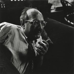
      Mark Rothko

      Mark Rothko

      1903 - 1970 , Latvija

      Ključne informacije

      • Datum Rojstva: 25. september 1903
      • Država Rojstva: Latvija
      • Narodnost: Ameriški
      • Pod Vplivom: ['Minimalizem']
      • Polno Ime: Mark Rothko
      • Pomembna Dela:
        • Št. 10 (1950)
        • Seagram Murals
        • Rothko Chapel
      • Rojen V Mestu: Daugavpils
      • Umrl: 25. februar 1970
      • Zvrst Umetnosti: Abstraktni ekspresionizem
      Raziščite umetniška dela, razvrščena po temah, slogih in značilnostih.