1951. Oil On Canvas.

§ 1Katalog podaci


Ovo umetničko delo je zaštićeno autorskim pravima
Umetničko delo prikazano na ovoj stranici zaštićeno je autorskim pravima, što znači da zakonski nismo u mogućnosti da kreiramo niti prodajemo identičnu reprodukciju. Ova zaštita se sprovodi u skladu sa međunarodnim sporazumima kao što su Bernska konvencija i nacionalnim zakonima, uključujući i one koji su definisani u Američki zakon o autorskom pravu – Naslov 17.
Kao poštovana i legalna alternativa, nudimo prilagođene, ručno oslikane umetničke radove inspirisane originalom. Naši stručni i profesionalni umetnici pažljivo proučavaju stil, ambijent i umetničku suštinu originala kako bi kreirali novo, unikatno delo koje budi istu emociju – ostajući pritom potpuno autentično stvaranje.
Ovaj metod je u potpunosti usklađen sa regulativama o autorskim pravima jer ne podrazumeva kopiranje ili dupliranje zaštićenih umetničkih dela. Umesto toga, reč je o kreativnoj reinterpretaciji – novom slikarskom delu koje je inspirisano originalom, ali nije identično njemu.
 Pročitajte više
§ 2Apstraktno
Opis predmeta
No.18 by Mark Rothko – A striking color field painting featuring layered hues of red, white, and orange, created in 1951 amidst the backdrop of Latvian Jewish heritage.
Biografija umetnika
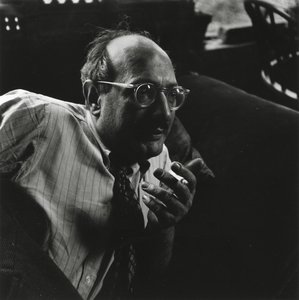
Mark Rothko je bio američki umetnik koji je poznat po svojim velikim bojnim poljima – monumentalnim slikama koje su osvojile gledaoce intenzivnom emocionalnom snagom. Najvažnije njegove slike uključuju "No. 10 (1950)", Seagram Murale i Rothko Chapel, koje su revolucionisale umetnost druge polovine veka i ostavio nezaboravno mesto u istoriji moderne umetnosti.
§ 3Komentar
A Symphony of Saturated Silence
Mark Rothko’s No.18 stands as a profound testament to the enduring power of color field painting, a movement that fundamentally revolutionized artistic expression in the mid-20th century. Created in 1951, this monumental canvas embodies Rothko's signature approach: the deliberate layering of saturated hues onto a textured surface to evoke a deep, visceral emotional resonance. To gaze upon No.18 is to enter a space where the boundaries between the viewer and the canvas begin to dissolve. The painting eschews traditional representational imagery, opting instead for amorphous, bleeding rectangles of crimson red and luminous white that seem to pulse with a life of their own. This technique was never merely about visual aesthetics; it was a conscious effort by Rothko to bypass intellectual analysis and tap directly into the subconscious mind, inviting a sensory engagement that transcends the spoken word.
The technical mastery behind this piece lies in its subtle, tactile complexity. Through the application of multiple coats of oil paint, Rothko achieved a surface depth that invites the eye to wander through layers of light and shadow. The composition is dominated by a striking contrast: a powerful red area commands the left side of the frame, bleeding softly into a vast expanse of white that covers much of the right. A sudden, unexpected flicker of orange in the top right corner provides a momentary spark of warmth, breaking the tension between the primary tones. This interplay of color and texture creates a breathing, living organism of paint, making it an extraordinary centerpiece for any collection or a sophisticated focal point in a thoughtfully curated interior.
Echoes of History and Spiritual Yearning
To understand the gravity of No.18, one must look toward the historical landscape from which it emerged. The painting was birthed in the aftermath of World War II, an era defined by widespread disillusionment and a global sense of existential questioning. Rothko himself carried a profound personal history of loss—most notably the death of his father in 1937—which fueled his lifelong preoccupation with themes of mortality and spiritual yearning. These themes, deeply rooted in Jewish mysticism, find their way into the very fabric of the canvas. The painting serves as a bridge between the trauma of the post-war world and a search for transcendence.
The symbolism within the work is both universal and deeply personal. The choice of red and white is far from arbitrary; it reflects Rothko's belief in the primal language of color. Red symbolizes passion, vitality, and the raw energy of human existence, while the expansive white represents purity, light, and spiritual illumination. Together, they create a dialectic between the earthly and the divine, the heavy and the ethereal. For collectors and designers alike, No.18 offers more than just visual beauty; it offers an invitation to contemplation. It is a piece that demands presence, making it an ideal acquisition for those seeking to infuse their spaces with a sense of profound peace, intellectual depth, and timeless elegance.
Pitanja i odgovori
Kakav osećaj prenosi „No.18”, autor Марк Ротко?
Zabeleženo raspoloženje dela „No.18”, autor Марк Ротко je Serene, a njegov emocionalni ton je Reflective.
Da li su boje dela „No.18”, autor Марк Ротко zasićene ili prigušene?
Boje dela „No.18”, autor Марк Ротко imaju Clear Color Presence zasićenost. Zasićenost opisuje koliko su boje jarke ili prigušene.
Iz kog je doba "No.18"?
Delo „No.18”, autor Марк Ротко potiče iz perioda Modern, što mu daje važan istorijski kontekst.


 Pređi na štampu


 Za umetnička dela ili reprodukcije čija je bilo koja strana veća od 105 cm (približno 41 inč), okvir će biti isporučen u obliku rastavljenog seta za sklapanje. Ovaj metod osigurava bezbednu dostavu i sprečava oštećenja tokom transporta.