


 Переглянути в інтер'єрі
 Надіслати як листівку
 Поділитися
 Деталі витвору
 Посібник

 Завантажити
 Схожі екземпляри
 Рентгенівське дослідження
 Слайд-шоу
 Q&A
Q&A Статистика
Colored alphabet


 Розгорнути текст
Мистецький твір, представлений на цій сторінці, захищений законом про авторське право, що унеможливлює легальне створення або продаж його ідентичної репродукції. Цей захист забезпечується відповідно до міжнародних угод, таких як Бернська конвенція та національним законодавством, зокрема положеннями, що викладені в Законодавство США про авторське право — Розділ 17. Всі права захищені. Будь-яке використання без дозволу заборонено.
Цей метод повністю відповідає нормам авторського права, оскільки він не передбачає копіювання чи дублювання захищеного твору мистецтва. Натомість це творче переосмислення — створення нового малюнка під впливом оригіналу, який не є його точним відтворенням.
Гікле / Художній принт
Друк جيкле або на полотні музейної якості з оперативним виготовленням та різноманітними варіантами фінішної обробки. ( Замовити картину ручної роботи Перейти до цифрових зображень)
P118B ₴10
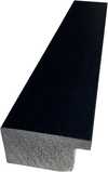
P118H ₴10
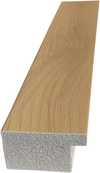
P118W ₴10
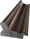
P438Z ₴10
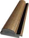
P508JH ₴12

P508YH ₴12
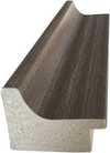
P805H ₴10
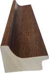
P805Z ₴10
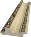
P919BZ ₴10
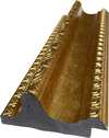
P919G ₴10
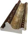
P919XJ ₴10
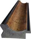
P959ZH ₴10
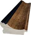
P968JZ ₴12
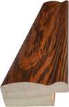
W106C ₴8

W218G ₴10

W218JH ₴8
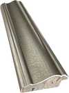
W218Y ₴10
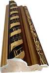
W307PJ ₴10

W316G ₴10
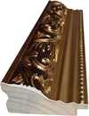
W316PJ ₴8

W316Y ₴10
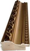
W398PJ ₴8

W4111J ₴10

W500HY ₴15
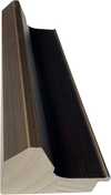
W500JH ₴15

W692G ₴12

W849H ₴8
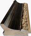
W940BG ₴15
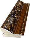
W953PJ ₴8
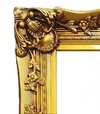
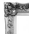
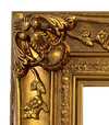
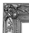
Обирайте з наших стандартних розмірів, що відповідають оригінальним пропорціям твору мистецтва.

Введіть необхідну ширину та висоту, щоб принт ідеально підійшов до вашої рами або стіни. Принт можна лише обрізати, але не можна зробити більшим за оригінал, тому при зміні пропорцій частина зображення буде втрачена. Перед друком ми надсилаємо вам цифровий макет для затвердження. Зображення на цій сторінці не відображає реальну обрізку — її можна побачити лише на макеті.
Доставка по всьому світу () за 2 тижні замість стандартних 4/5 тижнів. (29 Жовтень)

Безкоштовна експрес-доставка по всьому світу

Високоякісне лляне полотно

Повне страхове покриття доставки

Гарантія повернення митних зборів

Гарантія точного відтворення кольорів

Політика повернення протягом 100 днів (лише у разі виявлення дефектів)

Гарантія повернення 100% коштів

Пропозиція на оптові замовлення
 Скляний варіант доступний лише для розмірів до 110 см

Colored alphabet
Гікле / Художній принт
Розмір репродукції
-


Підсумкова вартість
₴ 2863
Jasper Johns’ ‘Colored Alphabet’: A Play of Symbols and Perception
Jasper Johns' "Colored Alphabet," created around 1959, stands as a deceptively simple yet profoundly complex work within the artist’s evolving body of exploration. This painting isn’t merely an arrangement of letters; it’s a meticulously crafted meditation on perception, representation, and the very nature of meaning itself – themes central to Johns' groundbreaking approach to art in the mid-20th century. The piece immediately draws the eye with its vibrant palette, a deliberate departure from the monochrome often associated with Abstract Expressionism, aligning it subtly with the burgeoning Pop Art movement that would soon challenge traditional artistic hierarchies.
- Subject Matter: The core subject is undeniably the alphabet – 26 letters, both uppercase and lowercase, presented in isolation.
- Color as a Key Element: Each letter is rendered in a distinct color, creating a visually arresting composition that elevates the mundane to the extraordinary. This chromatic layering isn’t arbitrary; it's a calculated strategy to disrupt conventional reading and viewing habits.
- Abstract Arrangement: The letters are arranged without any discernible order or pattern, further emphasizing their symbolic weight rather than their functional purpose.
The Roots of Iconography in Johns’ Work
Understanding the context surrounding “Colored Alphabet” is crucial to appreciating its significance. Johns emerged during a period of intense artistic experimentation following World War II. The Abstract Expressionists, with their emphasis on raw emotion and gestural abstraction, had dominated the art scene, but Johns sought to move beyond purely subjective expression. He began to incorporate recognizable imagery – maps, flags, numbers, and, crucially, letters – into his work, transforming them into symbols that carried layers of cultural and personal meaning. This fascination with iconography reflects a broader postwar anxiety about identity, national narratives, and the increasingly mediated nature of reality.
As documented in The Art Institute of Chicago’s collection, Johns utilized stencils as a key component of his process, adding another layer of complexity to the work. This technique is evident in "Colored Alphabet," where the precise execution of each letter suggests a deliberate engagement with the tools and methods of mass production – a subtle commentary on the role of images in contemporary society.
Technique and Materiality
The painting’s surface reveals Johns' meticulous attention to detail. The letters are rendered with a smooth, almost enamel-like finish, achieved through careful layering of paint. This technique creates a tactile quality that invites close examination, encouraging the viewer to consider not just what they see but also how it was made. The use of bright, saturated colors further enhances this sense of materiality, emphasizing the physicality of the artwork and challenging the traditional notion of painting as purely an illusionistic medium.
Symbolic Resonance and Emotional Impact
"Colored Alphabet" transcends a simple depiction of letters; it becomes a potent symbol of communication, knowledge, and perhaps even the limitations of language itself. The isolated letters disrupt our ability to read and comprehend, forcing us to confront the inherent ambiguity of representation. Johns’ work invites contemplation on how we interpret images and symbols, and how these interpretations shape our understanding of the world. It's a piece that resonates with a quiet intensity, prompting viewers to question their own perceptions and assumptions – a hallmark of Johns’ enduring artistic legacy.
Питання та відповіді
Чи можу я побачити «Colored alphabet» роботи Джеспер Джонс при іншому освітленні?
Сторінка Рентгенівське дослідження для твору «Colored alphabet» роботи Джеспер Джонс — це інтерактивний візуалізатор, що дозволяє досліджувати одинадцять оптичних шарів зображення, включаючи рентгенівський зріз.
Хто є автором та в якому стилі виконано "Colored alphabet"?
Автором твору "Colored alphabet" є Джеспер Джонс, що належить до течії Pop Art.
Про що твір "Colored alphabet" і яку атмосферу він передає?
«Colored alphabet» змальовує alphabet, jasper johns, color blocks, abstract art, iconography, pop art, visual symbols, а його емоційний настрій можна описати як Calm.
Схожі твори мистецтва


Біографія митця
A Life Painted in Symbols: The World of Jasper Johns
Jasper Johns emerged as a pivotal figure in the landscape of American art, bridging the emotive intensity of Abstract Expressionism with the burgeoning Pop Art movement that would soon redefine artistic boundaries. Born in Augusta, Georgia, in 1930, his early life was marked by a sense of displacement following his parents’ divorce, an experience that perhaps subtly informed his later explorations of identity and belonging within the context of American iconography. His formative years unfolded across various schools before he briefly attended the University of South Carolina, but it wasn't until his move to New York City in 1949 that Johns truly began to forge his artistic path. A period of service during the Korean War further shaped his perspective, exposing him to a world far removed from the burgeoning art scene he was eager to embrace upon his return.Breaking with Abstraction: The Dawn of a New Visual Language
The post-war American art world was dominated by Abstract Expressionism—a style characterized by spontaneous gesture and deeply personal emotional expression. While initially influenced by this movement, Johns felt compelled to move beyond its purely non-representational approach. He sought a new visual language, one that incorporated recognizable imagery not as illustrations but as vehicles for deeper contemplation. This wasn’t simply about *depicting* the world; it was about questioning how we perceive and interpret symbols within it. Key influences guided his departure: Marcel Duchamp's radical readymades challenged conventional notions of art-making, forcing a redefinition of what constituted “art,” while the emphasis on materiality in Abstract Expressionism informed Johns’ early techniques. However, it was the everyday objects and potent symbols of American culture—flags, targets, maps, numbers—that truly became central to his artistic vocabulary. He wasn’t interested in escaping representation; he wanted to dissect it, layer it with meaning, and ultimately reveal its inherent ambiguities. This deliberate shift away from pure abstraction signaled a profound change in the way art was conceived and experienced.Iconic Images: Flags, Targets, and the Language of Symbols
Johns' breakthrough works arrived in the mid-1950s, instantly establishing him as a force to be reckoned with. His paintings of flags, most notably *Flag* (1954–55), were not patriotic declarations but rather investigations into the very nature of representation. Rendered in a semi-abstract style, using encaustic—pigment mixed with hot wax—and collage techniques, these flags weren’t simply images; they were textured surfaces laden with symbolic weight. The *Flag* wasn't just a depiction of an American symbol; it was a meditation on the act of seeing, the nature of memory, and the complexities of national identity. The target series, beginning in 1958, further explored this fascination with recognizable forms, questioning perception and meaning through the seemingly straightforward image of a bullseye. *Map* (1961), with its fragmented and layered depictions of the United States, delved into themes of geography, identity, and the complexities of national representation. Works like *False Start* (1959) demonstrated his experimentation with language and visual codes, creating complex compositions that challenged viewers to decipher their underlying meanings. Even *White Flag* (1955), a seemingly simple monochrome canvas, prompted profound questions about absence, surrender, and the very act of seeing. These recurring motifs weren’t presented as straightforward symbols but rather as starting points for deeper inquiry.Influences and Techniques: A Hybrid Approach
Johns' artistic development was shaped by a diverse range of influences. He deeply admired the work of Marcel Duchamp, whose readymades challenged traditional notions of art and authorship. The emphasis on materiality in Abstract Expressionism—particularly the use of texture and surface—also played a crucial role in his early techniques. However, Johns’ approach went beyond simply incorporating these elements; he actively manipulated them to create layered meanings. He frequently employed encaustic, a technique involving pigment mixed with hot wax, which allowed him to build up complex textures and surfaces that seemed to shift and change depending on the viewer's perspective. Collage was another key element of his practice, often used to juxtapose recognizable imagery with abstract forms. Johns’ work can be seen as a synthesis of these diverse influences—a deliberate blending of abstraction, representation, and symbolism.Recognition and Enduring Impact
Jasper Johns has received numerous accolades throughout his illustrious career. He was awarded the Golden Lion at the Venice Biennale in 1988, the National Medal of Arts in 1990, and the Presidential Medal of Freedom in 2011—recognizing his profound contribution to American art. His works are held in major museum collections around the world, including the Museum of Modern Art, the Whitney Museum of American Art, the Metropolitan Museum of Art in New York, and Tate Modern in London. Beyond his paintings, Johns’ contributions extend to sculpture and printmaking, demonstrating his versatility and unwavering commitment to artistic innovation. His enduring legacy lies not only in the iconic images he created but also in the profound questions he raised about the nature of representation, symbolism, and the very essence of what it means to be an artist in a rapidly changing world. He remains an active artist, constantly evolving his approach and solidifying his position as one of the most important figures in 20th and 21st-century art.
Джеспер Джонс
1930 - , США
Короткі факти
- Artistic Movement Or Style: Поп-арт, Абстрактний експресіонізм
- Artists Or Movements Influenced By This Artist:
- Andy Warhol
- Roy Lichtenstein
- Artists Who Influenced This Artist: ['Marcel Duchamp']
- Date Of Birth: 15 травня 1930
- Full Name: Jasper Johns
- Nationality: Американський
- Notable Artworks:
- Flag
- Target
- Map
- Place Of Birth: А Augusta, США
Пов'язані статті

Топ-10 шедеврів геометричної абстракції: мистецтво для вашого інтер'єру від AllPaintingsStore.com
Відкрийте для себе 10 шедеврів геометричної абстракції від Кандинського, Малевича та Мондріана! Історія мистецтва, кольори та форми. Репродукції картин преміум-класу на AllPaintingsStore.com – ідеальний декор для вашого дому.
Джон Сінґер Са́рджент: 25 шедеврів американського імпресіонізму для вашого дому | AllPaintingsStore
Відкрийте 25 найкращих картин Джона Сінґера Са́рджента – американського імпресіоніста, майстра портретів та елегантного живопису. Історія мистецтва, техніки та натхнення для вашого дому від AllPaintingsStore.com! Дослідіть повну колекцію онлайн.
Топ-25 шедеврів Джона Констебла: пейзажі Англії для вашого дому | AllPaintingsStore
Відкрийте для себе 25 найкращих шедеврів Джона Констебла! Англійські пейзажі, романтизм та емоційне світло в живописі. Репродукції картин високої якості для вашого дому від AllPaintingsStore.com. Дослідіть повну колекцію онлайн!
Топ-25 шедеврів Василя Кандинського: подорож у світ абстрактного мистецтва | AllPaintingsStore.com
Відкрийте для себе 25 найвідоміших шедеврів Василя Кандинського! Пориньте у світ абстрактного мистецтва, експресіонізму та кольорових композицій. Репродукції картин Кандинського преміум-якості на AllPaintingsStore.com – для вашого інтер'єру з душею. Дослідіть повну колекцію онлайн!

Топ-10 шедеврів абстрактного експресіонізму: мистецтво, яке змінила епоху | AllPaintingsStore.com
Відкрийте для себе 10 шедеврів абстрактного експресіонізму! Дізнайтесь історію Поллока, Ротко та інших геніїв. Репродукції картин преміум-якості для вашого дому від AllPaintingsStore.com. Дослідіть колекцію онлайн!


