


 Переглянути в інтер'єрі
 Надіслати
 Поділитися
 Деталі
 Посібник

 Завантажити
 Схожі предмети колекціонування
 Рентгенівське дослідження
 Слайд-шоу
 Статистика переглядів
No. 10

 Читати далі
Мистецький твір, представлений на цій сторінці, захищений законом про авторське право, що унеможливлює легальне створення або продаж його ідентичної репродукції. Цей захист забезпечується відповідно до міжнародних угод, таких як Бернська конвенція та національним законодавством, зокрема положеннями, що викладені в Законодавство США про авторське право — Розділ 17. Всі права захищені. Будь-яке використання без дозволу заборонено.
Як шанобливу та законну альтернативу, ми пропонуємо унікальні картини ручної роботи, створені натхненням від оригіналу. Наші досвідчені професійні художники ретельно вивчають стиль, настрій та художню сутність оригіналу, щоб створити новий, неповторний твір, який викликає ті ж почуття, — залишаючись при цьому самобутнім творінням.
Цей метод повністю відповідає нормам авторського права, оскільки він не передбачає копіювання чи дублювання захищеного твору мистецтва. Натомість це творче переосмислення — створення нового малюнка під впливом оригіналу, який не є його точним відтворенням.
Олійная репродукція ручної роботи
Написана вручну олією на полотні у вашому розмірі та рамі, виготовлена на замовлення нашими художниками. ( Перейти до друку Перейти до цифрових зображень)

P118B ₴10
P118H ₴10
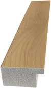
P118W ₴10

P438Z ₴10
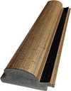
P508JH ₴12

P508YH ₴12
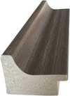
P805H ₴10
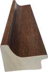
P805Z ₴10
P919BZ ₴10
P919G ₴10
P919XJ ₴10
P959ZH ₴10
P968JZ ₴12
W106C ₴8

W218G ₴10

W218JH ₴8

W218Y ₴10
W307PJ ₴10

W316G ₴10
W316PJ ₴8
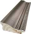
W316Y ₴10

W398PJ ₴8
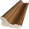
W4111J ₴10
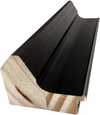
W500HY ₴15

W500JH ₴15
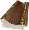
W692G ₴12
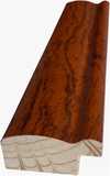
W849H ₴8
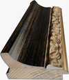
W940BG ₴15
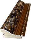
W953PJ ₴8

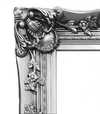
Обирайте з наших стандартних розмірів, що відповідають оригінальним пропорціям твору мистецтва.

Введіть необхідну ширину та висоту, щоб картина підійшла до вашої рами або стіни. Оскільки це ручний розпис, для розміру іншої форми художник може написати трохи більше навколо картини або трохи обрізати її — вибір за вами. Перед початком роботи ми надішлемо вам цифровий макет для затвердження. Зображення, показане на цій сторінці, не є реальним результатом — лише макет відображає майбутній вигляд.
Після оформлення замовлення команда AllPaintingsStore.com зв'яжеться з клієнтом електронною поштою для отримання інструкцій та надасть попередній макет
Доставка по всьому світу () за 3–4 тижні замість стандартних 5 тижнів. (24 Жовтень). Без жодних компромісів у якості.

Безкоштовна експрес-доставка по всьому світу

Високоякісне лляне полотно

Повне страхове покриття доставки

Гарантія повернення митних зборів

Гарантія точного відтворення кольорів

Політика повернення протягом 100 днів (лише у разі виявлення дефектів)

Гарантія повернення 100% коштів

Знижка на оптові замовлення
 Скляний варіант доступний лише для розмірів до 110 см

No. 10
Техніка репродукції
Розмір репродукції
-


Загальна вартість
₴ 11598
A Meditation on Color and Absence
The painting “No. 19,” by Mark Rothko, transcends mere visual representation; it’s an invitation into contemplation—a deliberate stripping away of form to reveal the profound power of color itself. Captured in a photograph that focuses intently on its surface, the artwork presents a deceptively simple composition: a rectangular expanse of deep indigo overlaid with two horizontal bands of luminous yellow. These bands aren't sharply delineated; rather, they bleed into each other, creating an ethereal haze that softens their edges and imbues them with an almost palpable warmth against the cool backdrop.- Style: Rothko’s signature style—known as Color Field Painting—rejects traditional depiction of subjects. Instead, he employs large canvases filled with blocks of color to evoke emotion and psychological states. This approach prioritizes feeling over intellectual analysis.
- Technique: The artist achieved this effect through a meticulous layering process. Rothko applied thin washes of pigment onto the canvas, building up multiple layers to create depth and luminosity. He utilized glazing techniques—applying translucent layers of color over opaque ones—to subtly modulate hues and enhance the overall tonal richness.
Historical Context: Abstract Expressionism and Its Roots
“No. 19” emerged during the height of Abstract Expressionism—a movement that revolutionized painting in postwar America. Artists like Jackson Pollock, Willem de Kooning, and Franz Kline sought to liberate art from representational constraints, prioritizing spontaneous gesture and emotional intensity. Rothko’s work stands apart from its contemporaries in its deliberate avoidance of recognizable imagery; however, it nonetheless embodies the spirit of rebellion against academic conventions that characterized earlier artistic traditions. The influence of Eastern Orthodox Christianity—Rothko's Jewish heritage—is evident in his use of color as a vehicle for spiritual contemplation.Symbolism and Emotional Resonance
The seemingly unassuming hues of indigo and yellow hold considerable symbolic weight. Indigo, often associated with spirituality and introspection, represents the darkness within which illumination emerges. The yellow bands symbolize hope, warmth, and transcendence—a visual counterpoint to the pervasive melancholy conveyed by the dominant color. Rothko’s intention wasn't to depict a specific scene or narrative but rather to create an immersive experience for the viewer—to provoke feelings of awe, sorrow, and ultimately, acceptance.Interior Design Considerations
“No. 19” would lend itself beautifully to interior spaces seeking tranquility and contemplation. Its muted palette harmonizes with natural light, creating a serene atmosphere that encourages reflection. When reproduced on high-quality canvas or paper, the artwork retains its luminosity and tonal subtlety—capturing the essence of Rothko’s artistic vision for discerning collectors and designers alike.Запитання та відповіді
Чи використовує «No. 10» Марк Ротко сильні контрасти чи м'які гармонії?
У творі "No. 10" Statement контраст поєднується з Softly Mixed Palette гармонією.
Як я можу придбати принт «No. 10» Марк Ротко?
«No. 10» доступний як художній принт на бавовняному полотні або архівному канвас-папері. Замовлення можна оформити на сторінці Художній принт у будь-якому обраному вами розмірі.
У якій техніці виконано «No. 10» Марк Ротко?
Для створення «No. 10» Марк Ротко використав(ла) техніку Acrylic. Саме ця техніка визначає матеріальну природу оригінального твору.
Схожі твори мистецтва


Біографія митця
Early Life and the Seeds of Artistic Vision
Mark Rothko, born Markus Yakovlevich Rothkowitz in Dvinsk, Latvia, in 1903, carried within him from the outset a sense of displacement that would profoundly shape his artistic journey. His early years were marked by the anxieties of a Jewish family living within the Pale of Settlement, shadowed by pogroms and political unrest. This atmosphere instilled a deep sensitivity to human suffering, a theme that would resonate throughout his oeuvre. The 1913 immigration to Portland, Oregon, represented not just a geographical shift but a cultural upheaval for the young Rothko. While his father, a pharmacist and intellectual with socialist leanings, fostered a home filled with debate and learning, the loss of Jacob Rothkowitz shortly after their arrival cast a long shadow. This early experience of loss, coupled with the challenges of assimilation, fueled a lifelong exploration of existential themes – mortality, trauma, and the search for meaning in a chaotic world. Though he excelled academically at Yale University, Rothko found himself drawn more to the vibrant energy of New York City, abandoning formal studies to pursue his passion for art at the Art Students League. These formative years laid the groundwork for an artistic vision that would ultimately challenge conventional notions of painting and redefine the emotional power of color.From Figurative Beginnings to Abstract Expressionism
Rothko’s initial artistic explorations were firmly rooted in realism, depicting urban scenes and portraits with a keen eye for detail. However, these early works already hinted at the psychological depth that would become his hallmark. As the 1940s unfolded, and the world grappled with the horrors of World War II, Rothko’s art underwent a dramatic transformation. Influenced by Surrealism and mythology, he began to move away from representational imagery, seeking instead to express universal human emotions through symbolic forms. This period saw the emergence of multi-form paintings – canvases populated by ambiguous, biomorphic shapes that seemed to hover between figuration and abstraction. These works were not merely experiments in form; they were deeply felt responses to the anxieties and uncertainties of a world at war. By the late 1940s, Rothko had arrived at his signature style: large-scale canvases featuring rectangular blocks of color that appeared to float and resonate with one another. He stripped away all vestiges of recognizable imagery, focusing instead on the pure emotional impact of color and form. This marked a pivotal moment in the development of Abstract Expressionism, and established Rothko as a leading figure in this groundbreaking movement.The Color Field and the Pursuit of Transcendence
Rothko’s mature work is defined by what came to be known as “Color Field” painting – vast expanses of luminous color that envelop the viewer in an immersive experience. These paintings are not about *what* they depict, but rather *how* they make you feel. Rothko believed that art should engage the viewer viscerally, bypassing intellectual analysis and speaking directly to the emotions. He meticulously layered thin washes of paint, creating subtle variations in tone and texture that seemed to emanate from within the canvas. The edges of his rectangular forms are often blurred, allowing them to blend and interact with one another, creating a sense of depth and movement. Rothko deliberately avoided titles beyond numbers – “No. 1,” “No. 6” – encouraging viewers to confront the paintings without preconceived notions and allow their own emotional responses to guide their experience. He sought to create a space for contemplation, a sanctuary where viewers could connect with something larger than themselves. His ambition was nothing less than to evoke profound spiritual experiences through the language of color.Major Achievements and Lasting Legacy
Among Rothko’s most significant achievements are “No. 10 (1950),” a pivotal work that exemplifies his evolving style, and the Seagram Murals (1958). Commissioned for the Four Seasons Restaurant in New York City, these murals were ultimately rejected by Rothko, who felt they would be compromised by their intended environment. He instead donated them to the Tate Gallery in London, where they continue to inspire awe and contemplation. Perhaps his most ambitious project was the Rothko Chapel (1971) in Houston, Texas – a non-denominational sanctuary housing fourteen of his paintings. Designed as a space for quiet reflection, the chapel is considered a sacred place by many, embodying Rothko’s belief in the spiritual power of art. Rothko's influence on subsequent generations of artists has been immense. He paved the way for Minimalist art and continues to inspire contemporary painters who explore the emotional possibilities of abstraction. Despite struggling with depression throughout his life, culminating in his tragic suicide in 1970, Mark Rothko remains one of the most important and influential artists of the 20th century – a master of color whose work continues to resonate with audiences around the world.- Rothko’s paintings are celebrated for their ability to convey universal human emotions—tragedy, ecstasy, despair, and hope.
- His exploration of color as a vehicle for emotional expression revolutionized abstract painting.
- The Rothko Chapel stands as a testament to his belief in the spiritual power of art.
- He remains a pivotal figure in Abstract Expressionism and a major influence on contemporary artists.
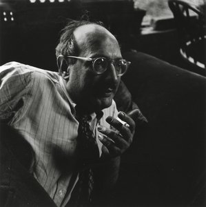
Марк Ротко
1903 - 1970 , Латвія
Довідкова інформація
- Artistic Movement Or Style: Поле кольору
- Artists Or Movements Influenced By This Artist: ['Мінімалізм']
- Date Of Birth: 25 вересня 1903 р.
- Date Of Death: 25 лютого 1970 р.
- Full Name: Маркус Якововвич Ротако́вський
- Nationality: Американський
- Notable Artworks:
- №10 (1950)
- Мюрали Се́грамм
- Хаппель Ро́тка
- Place Of Birth: Девґавпільс, Латвія
Схожі статті

Топ-10 шедеврів геометричної абстракції: мистецтво для вашого інтер'єру від AllPaintingsStore.com
Відкрийте для себе 10 шедеврів геометричної абстракції від Кандинського, Малевича та Мондріана! Історія мистецтва, кольори та форми. Репродукції картин преміум-класу на AllPaintingsStore.com – ідеальний декор для вашого дому.

25 шедеврів Марка Ротко: глибокі емоції та колірні симфонії для вашого дому | AllPaintingsStore
Відкрийте 25 найвідоміших шедеврів Марка Ротко! Пориньте у світ емоційного абстрактного експресіонізму, колірних симфоній та глибокого психологічного живопису. Купуйте репродукції картин Ротко преміум-якості для вашого дому на AllPaintingsStore.com.

Топ-10 шедеврів абстрактного експресіонізму: мистецтво, яке змінила епоху | AllPaintingsStore.com
Відкрийте для себе 10 шедеврів абстрактного експресіонізму! Дізнайтесь історію Поллока, Ротко та інших геніїв. Репродукції картин преміум-якості для вашого дому від AllPaintingsStore.com. Дослідіть колекцію онлайн!
Топ-25 шедеврів Василя Кандинського: подорож у світ абстрактного мистецтва | AllPaintingsStore.com
Відкрийте для себе 25 найвідоміших шедеврів Василя Кандинського! Пориньте у світ абстрактного мистецтва, експресіонізму та кольорових композицій. Репродукції картин Кандинського преміум-якості на AllPaintingsStore.com – для вашого інтер'єру з душею. Дослідіть повну колекцію онлайн!

The Sublimity of Color: Exploring the Emotional Landscapes of Mark Rothko's Abstract Expressionism
Explore the profound emotional depth of Mark Rothko's abstract expressionism. Discover the history, techniques & lasting impact of this pivotal Color Field painter. Expert insights for collectors and art enthusiasts.


