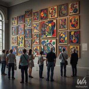
1949. Acrylic On Canvas, 229.0 x 112.0 cm.

§ 1Catalogue data
 Acrylic On Canvas
- WallArt
- Color Field Painting
 1949
1949 229.0 x 112.0 cm
هذا العمل الفني محمي بموجب حقوق الطبع والنشر
إن العمل الفني المعروض في هذه الصفحة محمي بموجب قوانين حقوق الطبع والنشر، مما يعني أنه لا يحق لنا قانوناً إنشاء أو بيع نسخ مطابقة له. وتُطبق هذه الحماية بموجب الاتفاقيات الدولية مثل الـ اتفاقية برن ووفقاً للقوانين الوطنية، بما في ذلك تلك المنصوص عليها في قانون حقوق الطبع والنشر في الولايات المتحدة - الباب 17.
وكبديل قانوني ومحترم، نقدم أعمالاً فنية مخصصة ومرسومة يدوياً مستوحاة من العمل الأصلي. حيث يقوم فنانونا المهرة والمحترفون بدراسة أسلوب العمل الأصلي، وأجوائه، وجوهره الفني بعناية فائقة لابتكار قطعة جديدة وفريدة تثير الشعور ذاته - مع بقائها عملاً أصيلاً بحد ذاته.
تتوافق هذه الطريقة تماماً مع لوائح حقوق النشر لأنها لا تتضمن نسخ أو تكرار العمل الفني المحمي، بل هي إعادة تفسير إبداعية؛ أي أنها لوحة جديدة مستوحاة من الأصل ولكنها ليست مطابقة له.
 اقرأ المزيد
§ 2Abstract
وصف المقتنيات
Experience Mark Rothko's 'Untitled' (1949) – a vibrant color field painting showcasing red, green, yellow, and brown hues. Explore its emotional depth and minimalist design in this iconic work by the American abstract expressionist.
نبذة عن الفنان
استكشف عالم مارك روثكو، الرائد في التعبيرية المجردة ولوحات الحقول اللونية. أعماله المؤثرة مثل "الرقصة" و"الكنيسة الروثكو" تعكس عمقًا عاطفيًا وتأثيرًا تاريخيًا هائلاً.
§ 3Commentary
The Genesis of a Field: Mark Rothko's 1949 Untitled
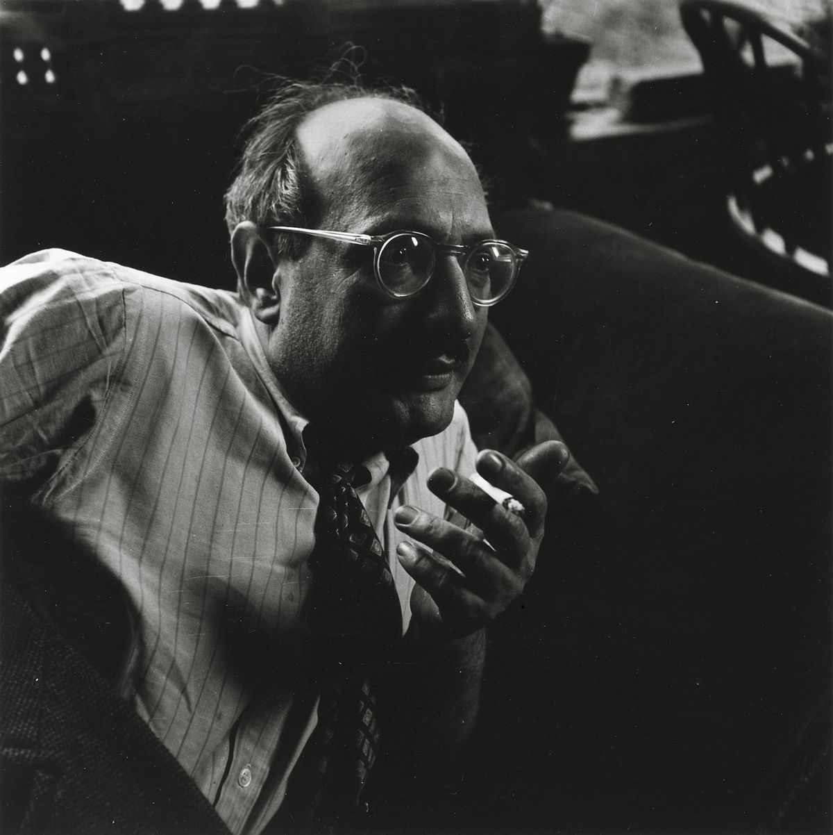
This captivating reproduction offers an intimate glimpse into one of the most significant works from Mark Rothko’s mature period, painted in 1949. At first glance, it appears deceptively simple – four distinct blocks of color: a vibrant red, a deep green, a sunny yellow, and a grounding brown – arranged across the canvas with an almost meditative precision. However, to reduce this piece to mere hues is to profoundly misunderstand Rothko’s revolutionary approach to abstraction. Born in Dvinsk (now Daugavpils), Latvia, in 1903, Mark Rothko's early life was shaped by displacement and a deep-seated sensitivity to human suffering – experiences that would become recurring themes in his art. His emigration to the United States in 1913, following the death of his father, marked a pivotal shift, yet the anxieties of assimilation and the lingering shadow of loss continued to inform his artistic vision. This particular painting, created during a period of intense experimentation with color and form, embodies Rothko’s core philosophy: to evoke profound emotional responses through the pure essence of color itself.
Color as Feeling: A Deeper Dive into Technique
Rothko’s technique is deceptively straightforward, yet incredibly complex in its execution. He applied the paint in thin layers, often building up multiple coats to achieve a luminous, almost velvety surface. Crucially, he avoided sharp edges or defined forms, opting instead for gradual transitions and blurred boundaries between the colors. This deliberate lack of definition isn’t an absence of detail; rather, it creates an immersive experience for the viewer – inviting them to lose themselves within the fields of color and allow their own emotions to resonate with the artwork. The pigments themselves were carefully chosen not just for their visual impact but also for their ability to interact optically, creating subtle shifts in hue and intensity as the light changes. Notice how the red seems to vibrate against the green, or how the yellow subtly bleeds into the brown – these are not merely aesthetic choices; they’re deliberate attempts to manipulate perception and evoke a specific emotional state.
The Language of Abstraction: Symbolism and Context
While Rothko vehemently resisted any attempt to interpret his paintings as representing concrete objects or narratives, there's no denying the profound symbolism embedded within these color fields. The choice of colors themselves is laden with meaning. Red often represents passion, energy, and even violence; green evokes nature, growth, and renewal; yellow symbolizes joy, optimism, and spirituality; and brown grounds the composition, suggesting stability and connection to the earth. The arrangement of these colors – the deliberate lack of hierarchy or focal point – suggests a state of equilibrium, a striving for harmony amidst existential uncertainty. This painting aligns with Rothko’s broader exploration of themes such as mortality, trauma, and the search for meaning—a quest that resonated deeply within his personal life and artistic practice. It's important to note that Rothko was part of the American Abstract Expressionist movement, a period marked by a shift away from representational art towards non-objective forms and an emphasis on subjective experience.
A Legacy in Light: The Rothko Chapel and Beyond
The influence of Mark Rothko extends far beyond this single painting. His work profoundly impacted the development of color field painting, inspiring generations of artists to explore the expressive potential of pure color. His later years were spent refining his style, culminating in monumental works like those installed at the Rothko Chapel in Houston, Texas – a space designed specifically to showcase and enhance the emotional impact of his paintings. The chapel’s octagonal shape and darkened interior create an environment that mirrors the contemplative atmosphere of Rothko's art, allowing viewers to fully immerse themselves in the experience. Reproductions like this offer a tangible connection to this extraordinary artist and his enduring legacy—a testament to the power of color to evoke profound emotion and transcend the boundaries of language.
الأسئلة والأجوبة
ما هو الحجم والاتجاه الموصى بهما لطباعة "Untitled"؟
بالنسبة لـ "Untitled"، فإن إعداد الطباعة الموصى به هو بحجم Medium وبوضعية Tall.
هل تُعد "Untitled" نموذجاً لما اعتاد مارك روثكو على إبداعه عادةً؟
يصور "Untitled" موضوعات color palette, rothko, abstraction, geometry, red green yellow, emotional, 1949, latvia، بينما تتمثل الثيمات المسجلة لـ مارك روثكو في jewish displacement, existentialism, color theory, trauma, abstract expressionism. وتُظهر المقارنة بينهما مدى ارتباط هذا العمل بالموضوعات المعتادة للفنان.
ما هو اللون الطاغي الذي ينساب عبر "Untitled" للفنان مارك روثكو؟
اللون السائد في "Untitled" للفنان مارك روثكو هو Golden Yellow Range. ويمثل هذا اللون النغمة الأساسية لمجموعة الألوان المستخدمة.


 التبديل إلى المطبوعات


 بالنسبة للأعمال الفنية أو النسخ المطبوعة التي يتجاوز طول أي من أضلاعها 105 سم (حوالي 41 بوصة)، سيتم شحن الإطار كمجموعة مفككة. تضمن هذه الطريقة سلامة التوصيل وتمنع حدوث أي أضرار أثناء النقل.