

1986. Acrylic On Canvas.

§ 1카탈로그 정보


본 작품은 저작권법의 보호를 받습니다.
이 페이지에 표시된 작품은 저작권법의 보호를 받으며, 이에 따라 동일한 복제품을 제작하거나 판매하는 것은 법으로 금지되어 있습니다. 이러한 권리 보호는 다음과 같은 국제 협약에 따라 시행됩니다. 베른 협약 또한 다음에서 명시하는 법률을 포함한 국내법에 의해 보호됩니다. 미국 저작권법 제17조.
저희는 존중을 담은 합법적인 대안으로서, 원작에서 영감을 받은 맞춤형 수제 유화 작품을 제공합니다. 저희의 숙련된 전문 화가들은 원작의 스타일, 분위기, 예술적 정수를 면밀히 연구하여, 그 자체로 독창적인 창작물이면서도 원작과 동일한 감동을 불러일으키는 새로운 작품을 만들어냅니다.
이 방식은 저작권 보호를 받는 예술 작품을 복제하거나 그대로 재현하는 것이 아니기에 저작권 규정을 완벽히 준수합니다. 대신, 이는 창의적인 재해석의 과정을 거칩니다. 즉, 원작에서 영감을 받되 원작과 동일하지 않은 새로운 회화 작품을 의미합니다.
 더 알아보기
§ 2추상
수집품 상세 설명
Experience Roy Lichtenstein's 'Imperfect Painting 2,' a vibrant Pop Art masterpiece featuring bold geometric shapes and iconic Ben-Day dots. Explore its dynamic composition and artistic legacy.
작가 프로필
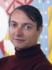
로이 리히텐슈타인은 팝 아트의 선구자로 유명하며, 베내데이 도트 기법과 만화책 영감을 바탕으로 대중 문화 비판적인 작품들을 선보였습니다. ‘와함!’ 등 대표작을 통해 미술사상에 혁명적인 변화를 이끌었습니다.
§ 3해설
Imperfect Painting 2: A Pop Art Revelation
Roy Lichtenstein’s “Imperfect Painting 2,” completed in 1986, isn't merely a canvas splashed with color; it’s an audacious declaration of the artist’s engagement with the visual language of mass media and the very nature of artistic representation. This vibrant abstraction, rendered primarily in acrylic on canvas, embodies the core tenets of Pop Art while simultaneously hinting at a deeper exploration of form, balance, and the inherent imperfections within even the most meticulously constructed compositions. The painting immediately commands attention – not through recognizable imagery, but through its dynamic arrangement of geometric shapes: predominantly triangles and circles, each defined by crisp, clean lines and an almost unsettlingly flat application of color.
The composition itself is deliberately ambiguous, eschewing a traditional focal point in favor of a carefully orchestrated dance between overlapping forms. Large, assertive triangles dominate the central space, their edges often partially obscured by smaller triangular elements scattered throughout the canvas. Interspersed amongst these angular shapes are circles – a subtle counterpoint that introduces an element of softness and visual rhythm. This interplay creates a sense of controlled chaos, mirroring the complexities of modern life as perceived through Lichtenstein’s uniquely critical lens. The color palette is boldly primary: yellows, blues, reds, greens, blacks, and greys collide in a manner both energetic and surprisingly harmonious. The deliberate use of unmixed colors – flat planes of hue rather than blended gradients – evokes the aesthetic of commercial printing, directly referencing the techniques Lichtenstein admired and sought to emulate.
Decoding the Ben-Day Dots and the Pop Art Aesthetic
At first glance, “Imperfect Painting 2” might appear deceptively simple. However, a closer examination reveals the meticulous craftsmanship that underpins Lichtenstein’s signature style. The painting is infused with the characteristic ‘Ben-Day dots,’ tiny colored squares meticulously applied to create the illusion of shading and texture – a technique borrowed directly from comic book printing. This deliberate nod to commercial illustration underscores Lichtenstein's fascination with popular culture and his desire to blur the boundaries between “high” art and “low” culture. The effect is both visually arresting and subtly ironic, elevating everyday imagery into the realm of artistic contemplation.
The painting’s flatness – a deliberate rejection of traditional perspective – further reinforces its Pop Art identity. There's no illusion of depth or three-dimensionality; instead, shapes appear to float on the surface of the canvas, creating a sense of immediacy and directness. This flattening effect mirrors the static quality often found in advertising and mass media, reflecting Lichtenstein’s critique of consumerism and the homogenization of visual culture. The deliberate lack of brushstrokes – achieved through a smooth, even application of paint – contributes to this sense of manufactured perfection, mirroring the idealized images prevalent in contemporary society.
A Reflection on Imperfection and Artistic Process
The title itself, “Imperfect Painting,” is profoundly significant. It’s not simply a descriptive label; it's an assertion of Lichtenstein’s artistic philosophy – a recognition that even the most carefully constructed works are inherently flawed. This imperfection isn’t a mistake or a failure; rather, it’s an integral part of the creative process, a testament to the artist’s engagement with the material and his willingness to embrace chance and spontaneity. The painting's slightly off-kilter arrangement, the subtle variations in color saturation, and the occasional misalignment of shapes all contribute to this sense of controlled imperfection.
“Imperfect Painting 2” stands as a powerful example of Lichtenstein’s ability to distill complex ideas into visually compelling forms. It's a work that rewards repeated viewing, revealing new layers of meaning with each encounter. More than just an abstract composition, it’s a meditation on the nature of art, the influence of popular culture, and the inherent beauty found within imperfection – a timeless masterpiece that continues to resonate with audiences today.
질의응답
로이 리히텐슈타인의 "Imperfect Painting 2"의 어떤 프린트 사이즈가 추천된 공간에 잘 어울릴까요?
Living Room 공간에는 로이 리히텐슈타인의 "Imperfect Painting 2" 작품을 Medium 크기로 인쇄하시는 것을 추천합니다.
로이 리히텐슈타인의 "Imperfect Painting 2"의 색감을 고려했을 때, 어떤 공간에 배치하는 것이 가장 좋을까요?
Neutrals 색조를 고려했을 때, "Imperfect Painting 2"은(는) Living Room에 추천합니다.
"Imperfect Painting 2"의 작가인 로이 리히텐슈타인는 다른 이름으로도 알려져 있나요?
로이 리히텐슈타인은(는) 로이 포스 리히텐슈타인라는 이름으로도 활동하고 있습니다.


 프린트 판매로 전환


 가로 또는 세로 중 어느 한 면이라도 105cm(약 41인치)를 초과하는 작품이나 복제화의 경우, 프레임은 분해된 키트 형태로 배송됩니다. 이는 안전한 배송을 보장하고 운송 중 발생할 수 있는 손상을 방지하기 위함입니다.


