


 Podgląd w skali 1:1
 Wyślij jako kartkę
 Udostępnij
 Szczegóły dzieła
 Przewodnik

 Pobierz obraz
 Podobne obiekty
 RTG
RTG Pokaz slajdów
 Q&A
Q&A Statystyki
Projekt Chopin


 Rozwiń treść
Dzieło sztuki prezentowane na tej stronie podlega ochronie prawem autorskim, co oznacza, że nie mamy prawa do tworzenia ani sprzedaży jego identycznej reprodukcji. Ochrona ta jest egzekwowana na mocy umów międzynarodowych, takich jak Konwencja berneńska oraz przez przepisy prawa krajowego, w tym te określone w Prawo autorskie USA – Tytuł 17.
Metoda ta jest w pełni zgodna z przepisami prawa autorskiego, ponieważ nie polega na kopiowaniu ani powielaniu chronionego dzieła. Stanowi ona kreatywną reinterpretację – nowy obraz, który czerpie inspirację z oryginału, ale nie jest z nim tożsamy.
Giclée / Wydruk artystyczny
Wydruki giclée lub płótna o jakości muzealnej, szybka realizacja i szeroki wybór opcji wykończenia. ( Zamów ręcznie malowaną reprodukcję Przejdź do wersji cyfrowej)
P118B zł10
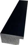
P118H zł10
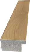
P118W zł10
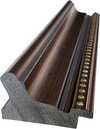
P438Z zł10
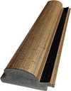
P508JH zł12

P508YH zł12
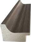
P805H zł10
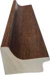
P805Z zł10
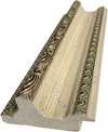
P919BZ zł10
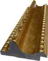
P919G zł10
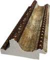
P919XJ zł10
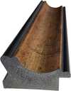
P959ZH zł10
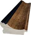
P968JZ zł12
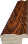
W106C zł8
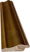
W218G zł10
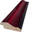
W218JH zł8
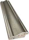
W218Y zł10
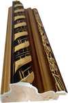
W307PJ zł10
W316G zł10
W316PJ zł8
W316Y zł10
W398PJ zł8
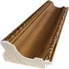
W4111J zł10
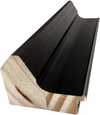
W500HY zł15
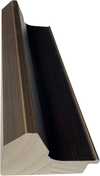
W500JH zł15
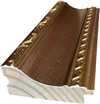
W692G zł12
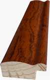
W849H zł8
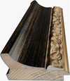
W940BG zł15
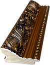
W953PJ zł8

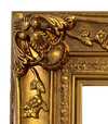
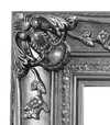
Wybierz spośród naszych standardowych rozmiarów, które zachowują oryginalne proporcje dzieła sztuki.

Wpisz wymaganą szerokość i wysokość, aby dopasować grafikę do ramy lub ściany. Wydruk można jedynie przyciąć, nigdy nie powiększając go poza oryginalny obraz, dlatego format o innych proporcjach spowoduje utratę części kompozycji. Przed rozpoczęciem druku prześlemy Ci cyfrowy podgląd do zatwierdzenia. Obraz wyświetlany na tej stronie nie pokazuje rzeczywistego przycięcia — jedynie podgląd oddaje ten efekt.
Dostawa na cały świat () w ciągu 2 tygodni zamiast standardowych 4/5 tygodni. (31 Październik)

Bezpłatna ekspresowa wysyłka na cały świat

Wysokiej jakości płótno lniane

Pełne ubezpieczenie przesyłki

Gwarancja zwrotu należności celnych i podatków importowych

Gwarancja wiernego odwzorowania kolorów

100-dniowa polityka zwrotów (tylko w przypadku wad)

Gwarancja 100% zwrotu pieniędzy

Zniżka przy zakupie wielu sztuk
 Opcja ze szkłem jest dostępna wyłącznie w rozmiarach poniżej 110 cm

Projekt Chopin
Giclée / Wydruk artystyczny
Wymiary reprodukcji
-


Cena całkowita
zł 249
Chopin Stamp Design - Leon Urbanski: A Legacy of Polish Typography
Leon Urbanski (1926 – 1998) stands as a monumental figure in the history of Polish graphic design and typography, shaping the visual landscape of his nation for decades. Born in Tarnów, Poland, Urbanski’s artistic journey began amidst the turbulent backdrop of post-war Europe, fostering an unwavering dedication to craftsmanship and innovation that would define his prolific career. He wasn't merely a designer; he was a storyteller who meticulously crafted images and lettering to convey meaning and emotion—a legacy that continues to inspire contemporary artists. Early Influences & Artistic Formation Urbanski’s formative years were marked by exposure to European avant-garde movements, particularly Surrealism and Constructivism. These influences instilled in him a belief in experimentation and a rejection of decorative excess, prioritizing clarity and functionality as guiding principles. Studying at Kraków Academy of Fine Arts honed his skills and cemented his commitment to exploring new visual languages. This intellectual curiosity would permeate his entire artistic output, resulting in designs that were both aesthetically striking and conceptually profound. The Chopin Stamp Design: A Singular Vision The “Chopin stamp design” exemplifies Urbanski’s distinctive approach—a masterful blend of historical reference and understated elegance. It's a project born from admiration for Fryderyk Chopin, Poland’s beloved composer, and imbued with the spirit of Polish national identity. Urbanski skillfully reimagined Delacroix’s portrait of Chopin, transforming it into a monochrome masterpiece using halftone printing. This technique—characterized by applying varying densities of dots to create tonal variations—was not simply a stylistic choice; it represented a deliberate effort to capture the essence of Chopin's character and artistic spirit. Technical Innovation & Artistic Detail The preparatory drawing reveals Urbanski’s meticulous attention to detail, demonstrating his mastery of illusion and simulation. He understood that visual impact could be achieved through subtle manipulations of texture and light—elements he expertly employed to elevate the design beyond mere representation. The halftone effect wasn't merely a technical gimmick; it was an integral part of Urbanski’s artistic vision, mirroring the graininess of vintage printing processes and evoking a sense of nostalgia for a bygone era. Symbolism & Emotional Resonance Beyond its formal qualities, the Chopin stamp design carries significant symbolic weight. The monochrome palette—primarily black and white—reflects the solemn dignity of Chopin's musical legacy and underscores the enduring power of simplicity. Furthermore, Urbanski’s use of halftone printing subtly suggests a connection to Polish artistic traditions, honoring the heritage of masters like Leon Kozłowski who championed innovative techniques. Ultimately, the design communicates an emotion: respect for Chopin’s genius and a celebration of Polish cultural identity—a testament to Urbanski's enduring contribution to visual art. Conclusion: An Artist's Enduring Influence Leon Urbanski passed away in 1998, leaving behind a remarkable body of work that continues to inspire artists today. His unwavering dedication to craftsmanship, combined with his profound understanding of artistic principles—particularly the transformative potential of halftone printing—solidifies his place as one of Poland’s most influential graphic designers. The Chopin stamp design stands as a poignant reminder of Urbanski's legacy: a beautifully executed piece that embodies both technical brilliance and artistic sensitivity.Pytania i odpowiedzi
Jaka paleta barw została wykorzystana w „Projekt Chopin” – Leon Urbanski?
Paleta dzieła „Projekt Chopin” – Leon Urbanski jest opisywana jako Barwy neutralne. Stanowi ona zwięzłe zestawienie barw użytych w pracy.
Jaki kolor dominuje w kompozycji „Projekt Chopin” – Leon Urbanski?
Dominującym kolorem dzieła „Projekt Chopin” – Leon Urbanski jest Beż szary (#e2dbd1).
Czy kolory dzieła "Projekt Chopin" są intensywne czy stonowane?
Kolorystyka dzieła "Projekt Chopin" charakteryzuje się nasyceniem na poziomie Przygaszone oraz intensywnością wynoszącą Monochromatyczność.
Podobne dzieła


Biografia artysty
The Architect of Polish Typography
Leon Urbanski (1926 – 1998) stands as a monumental figure in the history of Polish graphic design and typography, shaping the visual landscape of his nation for decades. Born in Tarnów, Poland, Urbanski’s artistic journey began amidst the turbulent backdrop of post-war Europe, fostering an unwavering dedication to craftsmanship and innovation that would define his prolific career. He was far more than a mere designer; he was a storyteller who meticulously crafted images and lettering to convey profound meaning and emotion—a legacy that continues to inspire contemporary artists today.
His formative years were deeply marked by exposure to the powerful currents of European avant-garde movements, particularly Surrealism and Constructivism. These influences instilled in him a lifelong belief in experimentation and a resolute rejection of decorative excess, prioritizing clarity, functionality, and structural integrity as his guiding principles. While studying at the Kraków Academy of Fine Arts, he honed his skills in painting and drawing, gaining a foundational understanding of visual composition that would later breathe life into his typographic endeavors. Notably, Urbanski collaborated closely with Leon Kozłowski, another prominent Polish artist and educator, whose mentorship solidified Urbanski's commitment to intellectual rigor alongside aesthetic sensitivity.
A Mastery of Form and Function
Urbanski’s true brilliance resided in his unparalleled mastery of typography, where he transformed the printed word into a visual experience. He embarked on a remarkable career designing over 200 books—a staggering accomplishment that cemented his reputation as Poland's foremost book designer. His approach was never simply about the arrangement of text; rather, it was about creating a rhythmic, visual dialogue between words and images, reflecting the unique spirit of each project with meticulous attention to detail. Renowned publishers such as Ossolineum, Państwowy Instytut Wydawniczy, Wydawnictwo Iskry, Wydawnictwo Czytelnik, and Nasza Księgarnia all benefited immensely from his expertise, commissioning him to create works that were as intellectually profound as they were aesthetically striking.
In his more ephemeral works, Urbanski demonstrated a remarkable ability to elevate even the smallest medium. His collection of over 100 low-circulation ephemera—including invitations, programs, and greeting cards created between the early 1960s and the early 1990s—serves as a testament to his versatility. Many of these pieces were commissioned for high-level diplomatic meetings and international delegations, making them rare historical documents that capture the social and organizational fabric of Poland during that era. In these works, he often drew upon Renaissance printing traditions and utilized the ancient Greek principle of the "golden ratio," ensuring that even a simple invitation possessed a timeless, classical harmony.
The Chopin Stamp: A Singular Vision
Perhaps his most celebrated achievement is the Chopin Stamp Design, a project commissioned by the Fryderyk Chopin Institute in Warsaw. This artwork encapsulates the very essence of his stylistic approach, demanding a delicate balance between honoring Poland's musical heritage and communicating its ethereal spirit through visual representation. To achieve this, Urbanski skillfully employed a monochrome halftone technique, mirroring the muted, nostalgic tones found in vintage printing processes. This method allowed him to create an illusionistic detail that felt both modern and deeply rooted in artistic tradition.
The historical significance of Leon Urbanski lies in his ability to bridge the gap between fine art and functional design. His work remains a cornerstone of Polish graphic identity, characterized by:
- Intellectual Rigor: A commitment to clarity and the rejection of unnecessary ornamentation.
- Technical Innovation: The masterful use of halftone printing and typographic experimentation.
- Cultural Preservation: The integration of classical proportions and historical printing traditions into modern graphic language.
- Narrative Depth: The ability to treat every letterform and image as a vital component of a larger story.

Leon Urbanski
1926 - 1998 , Poland
Krótka nota
- Full Name: Leon Urbanski
- Nationality: Polish
- Date Of Birth: 1926
- Date Of Death: 1998
- Place Of Birth: Tornow, Poland
- Notable Artworks: ['Chopin stamp design']
- Artistic Movement Or Style: Graphic Design
- Artists Who Influenced This Artist: ['Leon Kozłowski']
- Artists Or Movements Influenced By This Artist: ['Léon Bakst']
Powiązane artykuły

Timeless Elegance: A Procurement Guide to Sourcing Vintage-Style Artworks for Large-Scale Commercial Projects
Streamline large-scale commercial decor with professional art procurement solutions. Discover expert strategies for sourcing vintage-style oil reproductions, bulk orders, and custom multi-panel artworks designed for hotels, restaurants, and corporate spaces.


