

Acrylic On Canvas.

§ 1カタログデータ

§ 2抽象
作品解説
Delve into Paul Klee's 'Cote de Provence,' an abstract masterpiece blending geometric shapes and vibrant hues—a testament to his pioneering approach to color and form. Explore its intricate design at AllPaintingsStore.
 詳細を表示
詳細を表示
アーティストの略歴
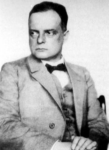
美しい色彩と豊かな表現で知られるパウル・クレーは、ドイツ生まれのスイス画家です。印象派やキュビズムなどの影響を受けながら独自の抽象的な絵画スタイルを確立し、「アンジェルス・ヌーヴァス」など数々の傑作を生み出しました。彼の作品は音楽との関連性も持ち合わせており、見る人に感動と知的な刺激を与えます。
§ 3解説
A Symphony of Shapes and Colors: Decoding “Cote de Provence” by Paul Klee
Paul Klee’s “Cote de Provence,” painted in 1927, stands as a testament to the artist's unwavering commitment to abstraction while simultaneously resonating with profound emotional depth. More than just a depiction of landscape—though undeniably inspired by the Provençal countryside—the painting embodies Klee’s pioneering exploration of visual language and his belief that art could transcend mere representation to communicate universal truths. This analysis delves into the intricacies of its composition, technique, historical significance, and enduring impact on viewers seeking artistic contemplation.Compositional Harmony: Vessels Amidst Geometric Forms
The artwork immediately captivates with its dynamic arrangement of geometric shapes—circles, squares, triangles—interwoven in a tapestry of muted hues predominantly dominated by earthy tones like ochre, terracotta, and slate grey. Scattered across the canvas are several boats, strategically positioned to create visual depth and guide the eye’s gaze. These vessels aren't merely decorative elements; they serve as symbolic representations of journeys, exploration, and perhaps even subconscious anxieties—a recurring motif in Klee’s oeuvre. The careful placement of these forms contributes to a sense of balance and order within the overall abstract landscape, mirroring Klee’s fascination with architectural plans and structural principles.Technique: Watercolor on Paper – Embracing Chance and Intuition
Klee employed watercolor on paper as his medium, a technique that championed spontaneity and allowed for an embrace of chance—a cornerstone of his artistic philosophy. Unlike traditional oil painting, watercolor relies on diluted pigments applied in thin washes, resulting in translucent layers that subtly blend together over time. This process fostered an atmosphere of fluidity and unpredictability, mirroring the artist’s desire to capture not just what he saw but also what he felt. The delicate textures achieved through layering and blotting contribute to the painting's ethereal quality, inviting viewers to contemplate its visual poetry.Historical Context: Bauhaus Influence and Artistic Avant-Garde
“Cote de Provence” emerged during Klee’s time at the Bauhaus School in Dessau, Germany—a crucible of artistic innovation that sought to unify art, craft, and technology. The Bauhaus ethos profoundly impacted Klee's aesthetic sensibilities, encouraging him to prioritize form and color over realistic depiction. This painting exemplifies the broader movement toward abstraction prevalent in European art during the 1920s, reflecting a rejection of academic conventions and an embrace of experimental approaches. It aligns with the Zeitgeist of a period marked by intellectual ferment and artistic experimentation—a desire to redefine visual expression as a tool for conveying emotion and exploring psychological landscapes.Symbolic Resonance: Vessels as Representations of Inner Reflection
Beyond its formal qualities, “Cote de Provence” is laden with symbolic significance. The boats themselves can be interpreted as representations of voyages into the subconscious mind—a preoccupation that characterized Klee’s artistic vision throughout his career. They symbolize aspiration, movement, and perhaps even a confrontation with uncertainty. Furthermore, the muted color palette evokes feelings of tranquility and contemplation, inviting viewers to immerse themselves in the painting's serene atmosphere. Like many of Klee’s works, “Cote de Provence” encourages introspection and prompts us to consider the deeper meanings embedded within its visual elements—a legacy that continues to inspire artists and collectors alike.Q&A
「Cote de provence」の色同士は、どのように調和していますか?
「Cote de provence」の色彩の調和は、Balanced Harmonyと表現されます。
「Cote de provence」のAbstract Expressionismには、どの国のルーツが反映されているのでしょうか?
「Cote de provence」は、作者の出生地を通じて、Abstract Expressionism運動とスイスを結びつけています。
「Cote de provence」の解説ページはどこにありますか?
パウル・クレー作「Cote de provence」には、解説資料ページをご用意しています。これは、学生や教室での学習用に設計された、印刷可能な作品解説シートです。


 プリント版に切り替え


 いずれかの辺が105 cm(約41インチ)を超えるアートワークまたは複製画の場合、フレームは分解されたキットの状態でお届けいたします。この方法は、輸送中の破損を防ぎ、安全に配送するために採用しております。


