Chromaticity is an objective specification of the quality of a color regardless of its luminance. Chromaticity consists of two independent parameters, often specified as hue (h) and colorfulness (s), where the latter is alternatively called saturatio...
When specifying art for a hotel lobby or a corporate lounge, the initial decision point is rarely about subject matter alone; it is about the objective quality of color. In technical terms, we look toward chromaticity—the specification of color quality independent of luminance. This involves managing two distinct parameters: hue and colorfulness, often referred to in design circles as saturation or chroma. For a procurement manager, selecting a palette with high excitation purity can dictate the entire energy of a room. A low-saturation, neutral scheme provides a quiet backdrop for architectural details, whereas a high-saturation approach demands immediate attention.
The history of color application shows us that these choices are never accidental. From the early functional theories found in the Nāṭya Shāstra to the more modern scientific frameworks, the interaction of hues has been used to direct movement and emotion. In contemporary practice, we see this through artists like Laurent Delcourt, whose work utilizes deeply saturated pigments to construct immersive environments. His ability to orchestrate color achieves a state of true chromatic harmony that can transform a sterile corridor into a visceral experience. When selecting works for large-scale projects, consider how the saturation level will interact with your lighting plan; high-chroma pieces require careful calibration to prevent them from overwhelming the surrounding textures.
Takeaway: Define the required energy of the space by first determining the necessary levels of hue and color saturation.
Managing Spatial Tension: Utilizing High-Contrast Palettes to Anchor Large Rooms
A Vision of Chromatic Intensity Immerse yourself in the electric energy of Electric Resonance: A Singular Vision of Bold Contours and Chromatic Intensity . This piece, a striking manifestation of Aggressive Confrontational Pop, commands immediate att...
In expansive hospitality settings, such as grand ballrooms or high-ceilinged atriums, a single, small-scale work often fails to command the necessary presence. To anchor these volumes, one must look toward high-contrast palettes that create visual tension. This is not merely about brightness, but about the strategic collision of opposing colors. The concept of color theory, particularly the study of complementary or opposing hues, allows a designer to create focal points that prevent a large room from feeling hollow.
We see a profound example of this tension in the movement known as Aggressive Confrontational Pop. Artists like Caroline Pelletier reject traditional harmony in favor of a deliberate, jarring discordance. By placing vivid, sun-scorched oranges against bruising purples or acidic greens against deep reds, she creates what is termed "the architecture of discomfort." For a designer, this technique is highly functional; it provides the necessary friction to stop a guest's gaze in a high-traffic area. Similarly, the use of heavy, structural contours in works like Electric Resonance can provide a sense of weight and permanence that prevents large-scale installations from appearing lost within the architecture.
Takeaway: Use high-contrast color pairings to create visual anchors that command attention in large architectural volumes.
Materiality and Permanence: Assessing Pigment Durability in High-Traffic Environments
A Luminescent Vision: The World of Mary E. Maxwell Mary E. Maxwell is an artist whose work quietly commands attention, a testament to the enduring power of meticulous technique and deeply personal vision. Emerging as a significant figure in contempor...
For the professional managing long-term assets, the aesthetic appeal of a painting is secondary to its durability. The chemistry of the medium determines how a work will age under the scrutiny of UV exposure and atmospheric pollutants. When commissioning or purchasing hand-painted oil reproductions, the technical composition is paramount. We prioritize the use of flexible gesso to prevent cracking and specific oils, such as saffernlow, for whites to prevent the dreaded yellowing effect over time. A final coat of Damar varnish is not merely a decorative finish; it is a protective barrier against dust and moisture.
The choice between a Giclée print and a handmade oil reproduction is a decision regarding tactile depth and longevity. While archival 12-color inks offer excellent stability, they lack the physical impasto—the raised, textured brushstrokes—that characterizes true oil on canvas. For high-end hospitality, where the goal is to create a sense of luxury and permanence, the deeper tonal range and physical presence of hand-painted works are superior. These pieces, often executed on 100% cotton canvas, offer a level of textural richness that resists the "flat" look of digital printing, ensuring the investment remains impactful for decades.
Takeaway: Prioritize oil paintings finished with protective varnishes and high-quality pigments to ensure long-term resistance to environmental degradation.
Architectural Integration: Scaling Multi-Panel Series and Large-Format Works
A Vision of Saturated Precision Experience the striking visual impact of Chromatic Spheres in Geometric Order: A Monumental Quadrant of Saturated Precision . This masterpiece represents a bold, modern evolution within the Aggressive Confrontational P...
Integrating art into a structured architectural plan requires a focus on scale and geometry. For wide walls, staircases, or expansive corridors, the "multi-panel" trend offers a sophisticated solution. Splitting a single composition across three, four, or five panels allows for a seamless flow of color and brushwork that follows the rhythm of the building. This approach is particularly effective in modern installations where the goal is to create a cohesive, rhythmic vitality across a large surface area.
Large-format works, such as murals or ceiling frescoes, can redefine the very boundaries of a room. We specialize in creating massive canvas rolls that can be installed similarly to high-end wallpaper, allowing for the recreation of historical grandeur on a contemporary scale. When working with geometric or structured compositions—such as the 2x2 matrix seen in Chromatic Spheres in Geometric Order—the art becomes an extension of the building's own structural logic. This level of integration ensures that the artwork does not merely sit upon the wall but becomes part of the architectural fabric.
Takeaway: Utilize multi-panel configurations and large-format murals to align the scale of the artwork with the architectural rhythm of the space.
Logistical Execution: Coordinating Custom Dimensions, Framing, and Global Delivery
The final stage of any professional art procurement is the management of logistics, from custom sizing to international customs compliance. For large-scale hospitality projects, precision in dimensions is non-negotiable. Our process is designed for the high-volume buyer, providing a streamlined workflow that includes digital mockups for complex orders. This allows you to see exactly how a specific color or size will appear on your wall before the painting begins, mitigating the risk of costly errors in large-scale installations.
Global distribution requires a robust infrastructure. We utilize 3mm industrial tubes for rolled art and reinforced double-walled boxes for framed pieces, partnering exclusively with DHL Express and FedEx to ensure secure delivery to over 70 countries. For our international clients, we manage the complexities of customs and VAT; for instance, we provide the necessary documentation for shipments to Italy or handle the specific tax ID requirements for Brazil (CPF) and Mexico (RFC). This level of operational reliability ensures that even the most complex, multi-piece commissions arrive on schedule and within budget.
Takeaway: Ensure seamless project completion by selecting a supplier with proven expertise in custom sizing, professional framing, and international logistics.
All the works discussed, from the historical depth of Rubens to the modern intensity of Caroline Pelletier, are available through AllPaintingsStore.com, where we provide the scale, customization, and reliability required for professional art procurement.
Explore the fascinating science behind art longevity. Discover why masterpieces fade or crack and learn how chemistry, pigments, and expert conservation preserve the world's greatest oil paintings for centuries.
A professional procurement guide to Geometric Abstraction for hotel designers. Discover how bold shapes, Suprematism, and Op Art can elevate hospitality interiors through large-scale, custom-sized oil reproductions and multi-panel sets tailored for high-volume commercial projects.
A professional procurement guide for hotel designers and managers. Learn to navigate high-volume art orders with ease, focusing on Giclée quality, archival durability, scalable sizing, and efficient global logistics for large-scale hospitality projects.


 Chromaticity
 Electric Resonance: A Singular Vision of Bold Contours and Chromatic Intensity
 Miss Mary E Maxwell
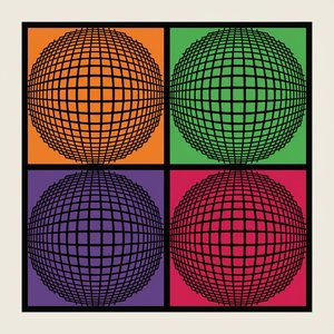 Chromatic Spheres in Geometric Order: A Monumental Quadrant of Saturated Precision


